Core loop: Senior Design Manager, Lead PM
Weekly reviews: Director of Design, Director PM
Monthly: Head of Design, CPO
MakeMyTrip Holidays
I led Split Stay as a 0→1 feature for MakeMyTrip Holidays, turning a premium Maldives booking behavior into a clear, customer-facing flow inside the existing holiday package journey. Maldives is MMT Holidays' premium category — enabling split stays meant activating booking intent that already existed but had no digital path.
1
Designer Lead IC
2–3
Room types supported in one stay
2
Platforms Desktop and mobile
My Role
Sole designer making a complex multi-room stay sequence legible and bookable inside an existing package system — without a separate flow or new booking model.
The Team
Core loop: Senior Design Manager, Lead PM
Weekly reviews: Director of Design, Director PM
Monthly: Head of Design, CPO
Timeline
Designed and submitted in 2025
Status
In the engineering pipeline.
Context
Travellers may want to begin in a Beach Villa, move into a Water Villa, or split the trip across multiple premium room experiences. That behavior is easy to sell in conversation, but much harder to make understandable inside a structured booking flow.
Split Stay focused on turning that premium stay pattern into something public users could actually understand and control inside MakeMyTrip Holidays, without creating a separate booking model for high-intent travellers.
Split Stay was a central feature of a broader Maldives initiative the business team estimated at ₹1.5 crore in projected upside — making its digital enablement a direct commercial priority, not just a product improvement.
Existing Holidays System
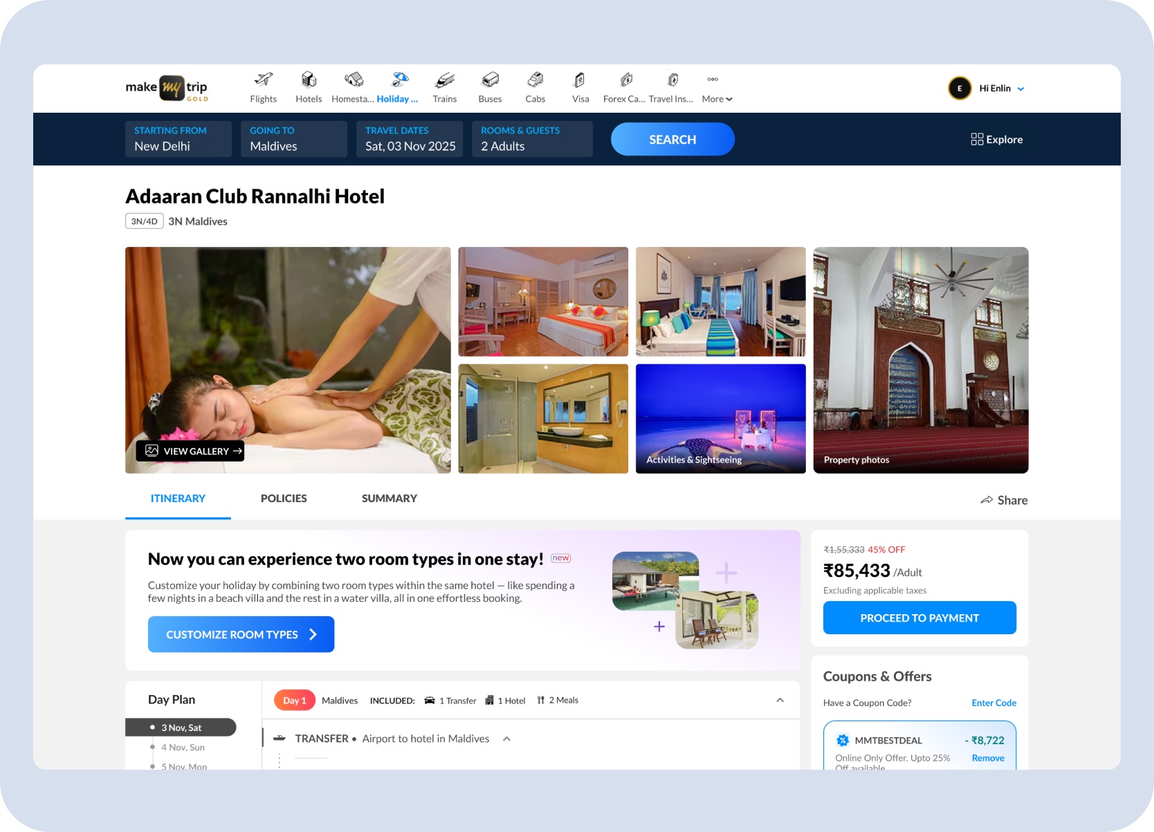
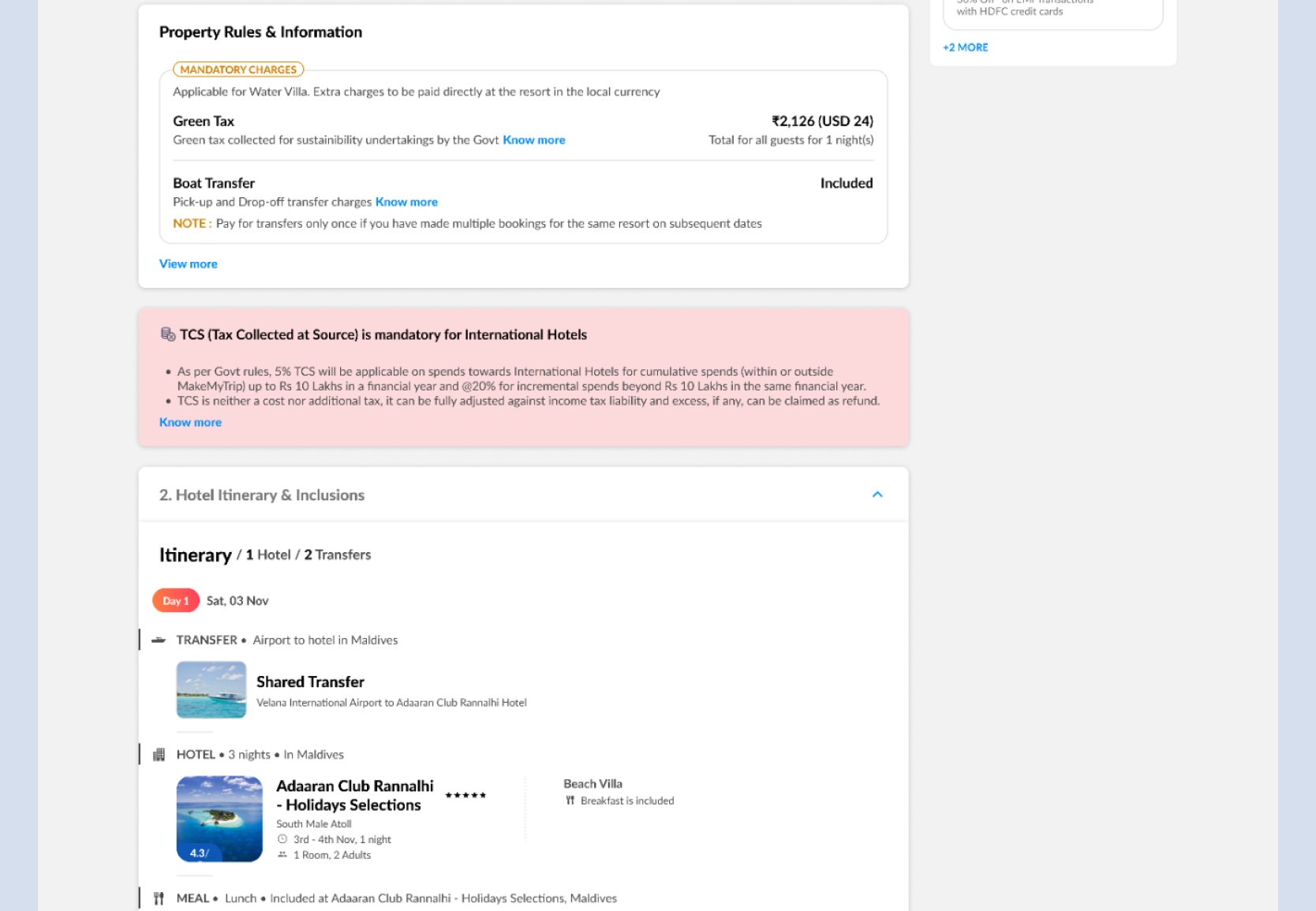
The opportunity was not to redesign the entire product. It was to translate a premium stay pattern into the existing hotel, itinerary, package pricing, coupon, and review surfaces customers already understood.
Existing Holidays model
What Split Stay needed
One primary room type for the stay
Two-room and three-room combinations
Room selection as a single choice
Room sequence plus nights per room
Package price shown as one total
Visible price delta before updating
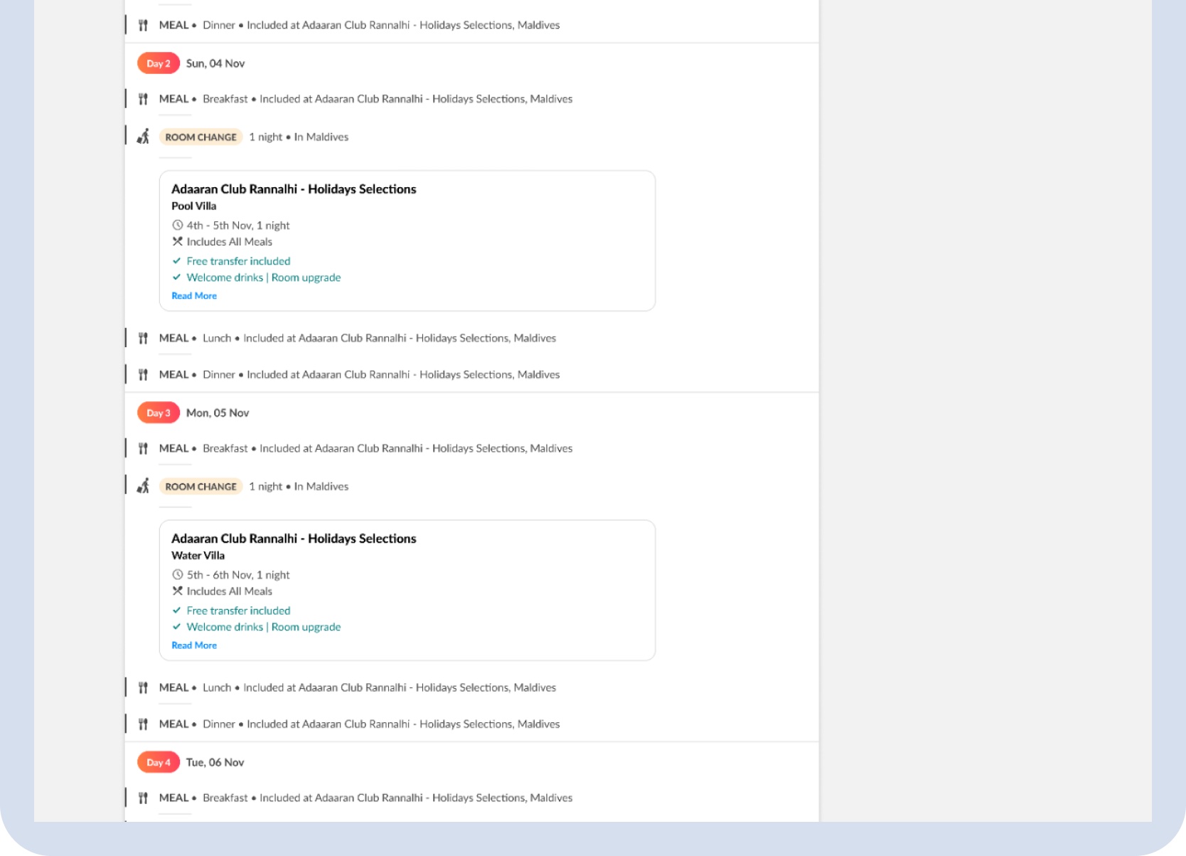
One hotel block in the itinerary
Room changes represented day by day
Review confirms a single room
Review confirms sequence, charges, and inclusions
MakeMyTrip Holidays already connected hotels, transfers, meals, coupons, pricing, and review. Split Stay needed to fit that connected model without becoming a separate premium-booking journey.
Existing package context — hotel, itinerary, and package pricing already operated as one connected journey.
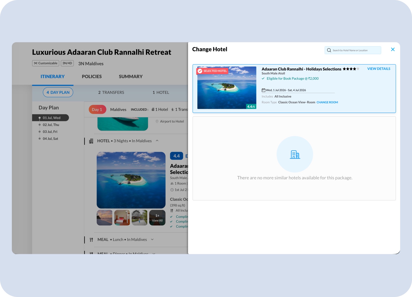
Existing interaction baseline — clicking Change Hotel already opened a familiar package-edit flow, so Split Stay needed to extend that behavior instead of replacing it.
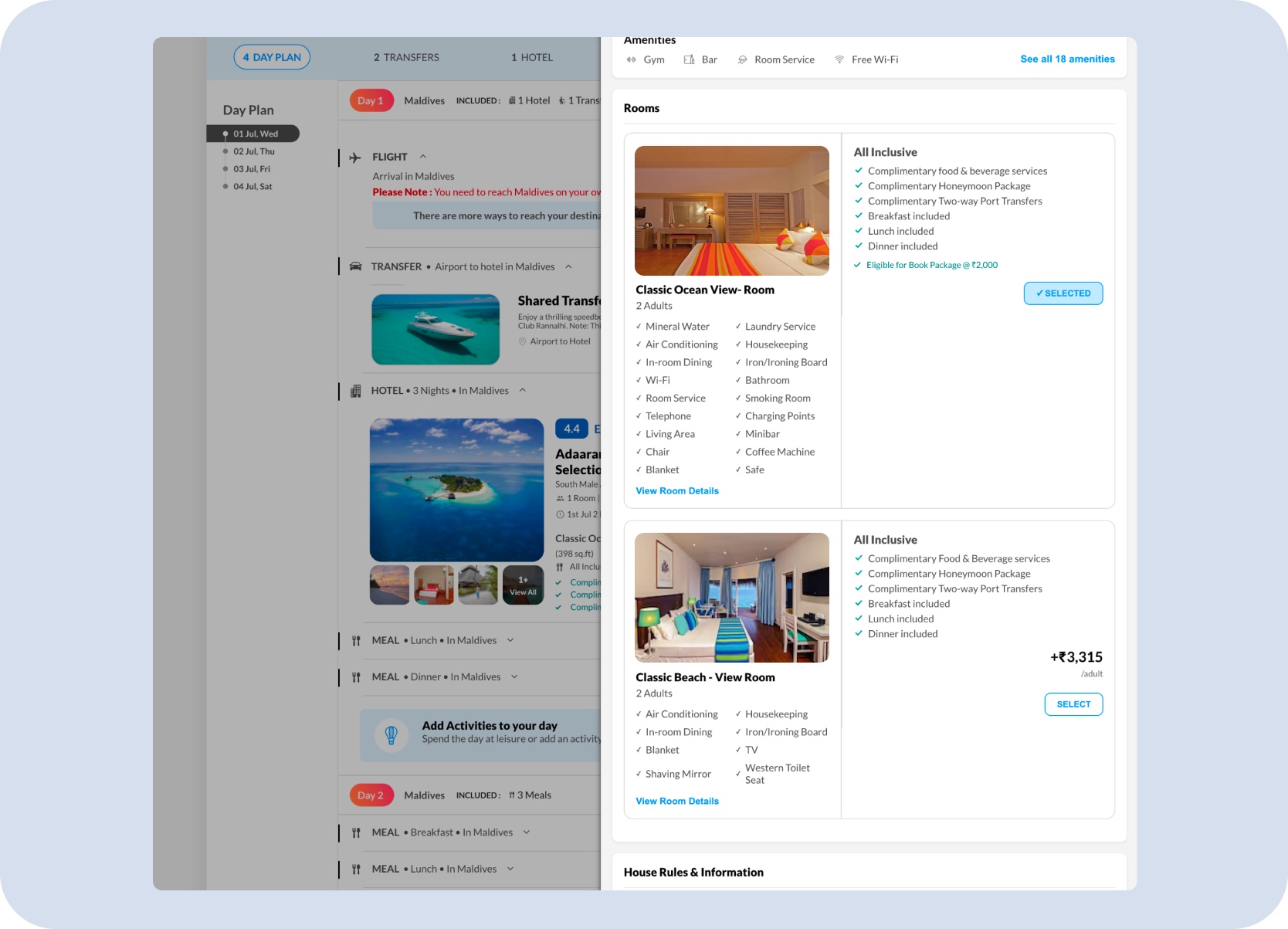
Connected system view — clicking More Room Options already exposed room-selection behavior, so Split Stay had to preserve that package context while introducing stay sequencing.
Problem
The challenge was not to add another room selector. It was to introduce a new mental model inside a product customers already knew — without making the existing journey feel more complex or uncertain.
Split Stay had to explain room sequence, night allocation, pricing, and final review without making the package journey feel complicated or fragile.
Design Challenge
Split Stay asked more of the user than a typical room picker. Each question had to resolve in sequence — concept first, then configuration, cost, and confirmation.
The concept needed to make sense to a public traveller without internal product knowledge or Holiday Expert assistance.
Users needed to understand the order of the stay, not just the set of selected room types.
Night allocation had to remain editable without turning the holiday booking into a spreadsheet.
Every room change affected package pricing, so the delta and updated total needed to be visible before confirmation.
The room sequence had to carry into the day-wise itinerary as one understandable holiday.
Inclusions, mandatory charges, room changes, and final totals still needed to resolve into one clean booking story.
Core Solution
The non-obvious call was designing Split Stay as a stay-sequencing experience — not a room-selection overlay. That single decision shaped everything else: where it lives in the flow, how rooms are shown, how price changes are communicated, and how the sequence carries into review.
Introduce it in package context
Place Split Stay near the hotel section, where travellers are already evaluating stay quality, room type, and inclusions.
Show sequence, not only selection
Reframe the feature as a stay editor with check-in, room order, nights, room details, and checkout.
Explain price before commitment
Keep the edited stay tied to the package while showing the incremental increase and updated total before update.
Treat review as part of the feature
Carry the selected room sequence into itinerary, review, and payment so the full trip reads as one trusted package.
Desktop Experience
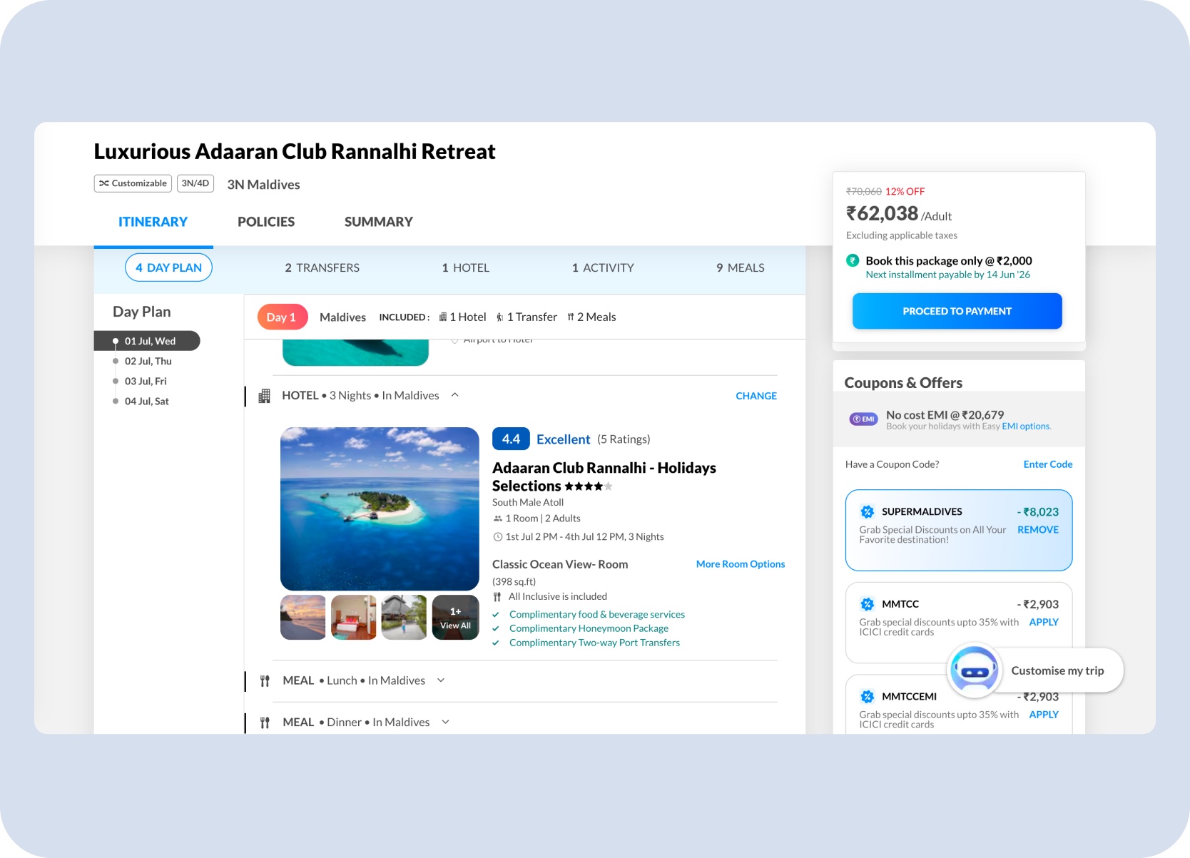
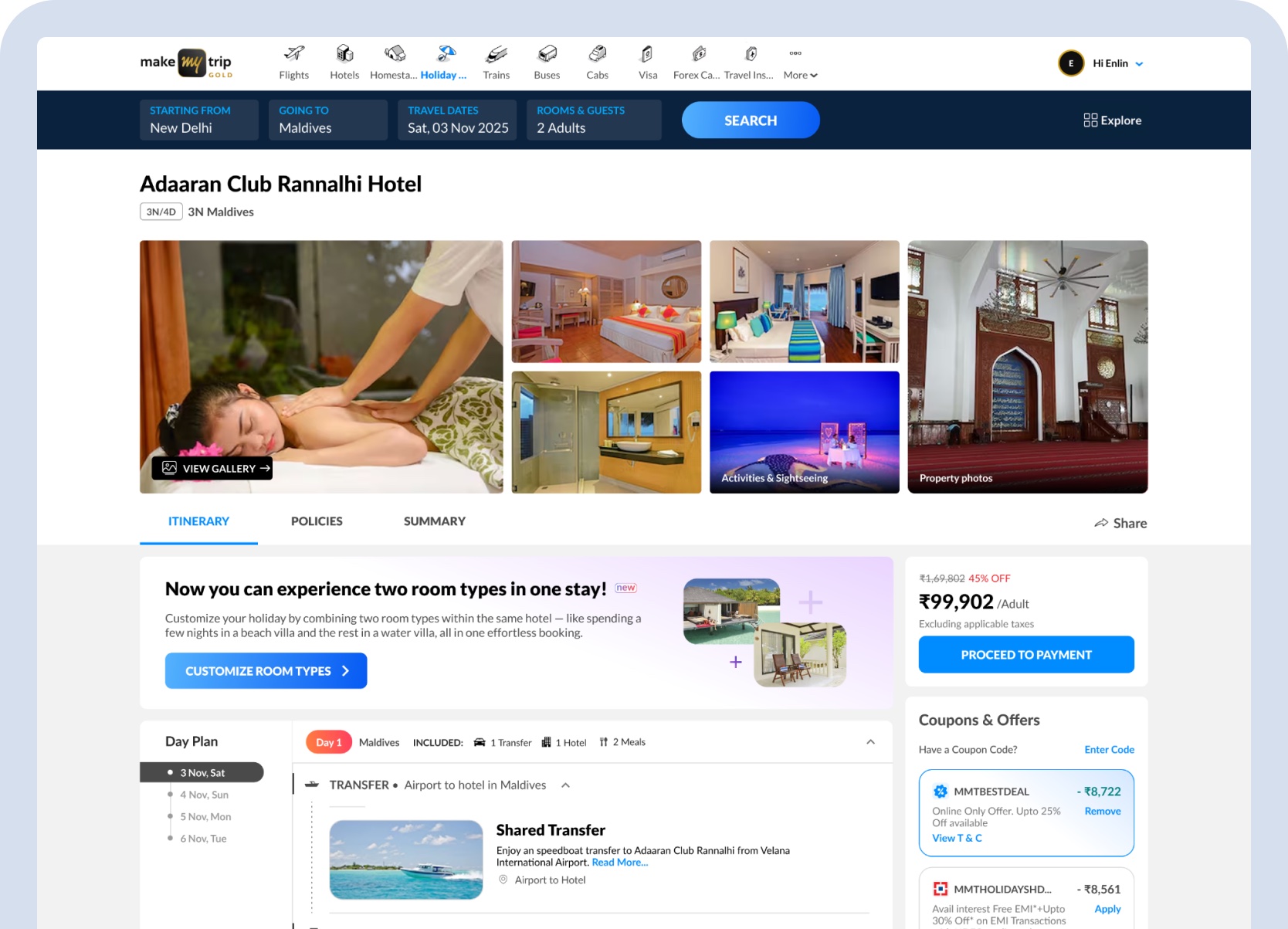
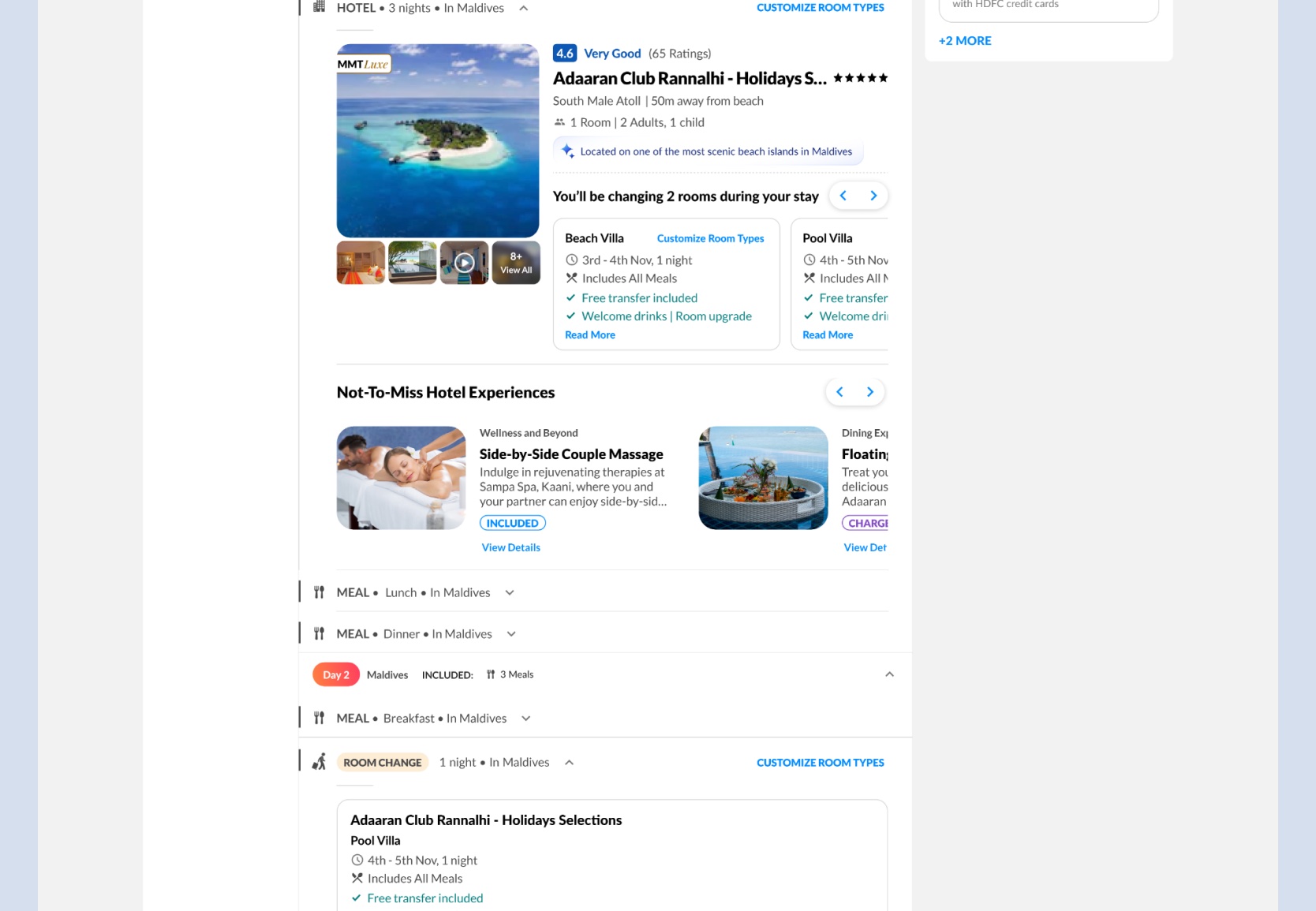
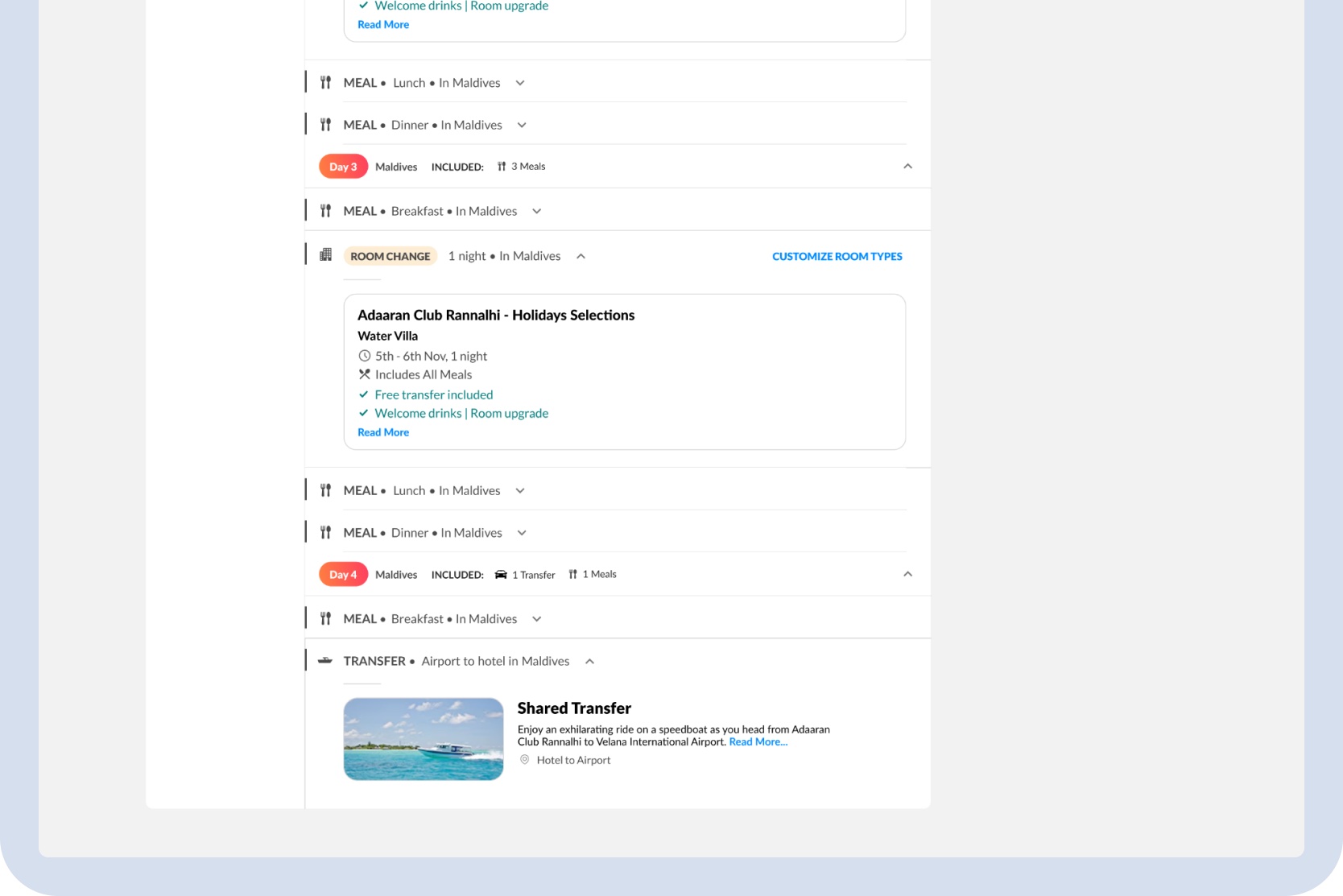
On desktop, the wider package layout kept the itinerary, room customization panel, pricing sidebar, coupons, and package update actions visible together — holding the full booking story in one view.
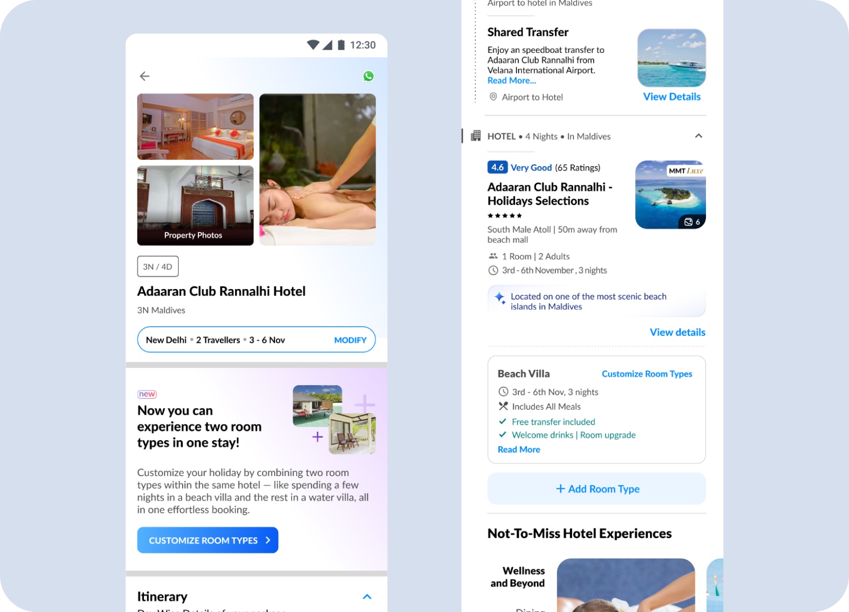
On desktop, Split Stay surfaces at two moments where users were already engaged with the stay — a dedicated introduction banner on the Itinerary tab, and the hotel block inside the day plan. Both kept the feature discoverable without requiring users to leave the flow they already understood.
Itinerary tab entry — a dedicated banner introduces Split Stay with a direct Customize Room Types CTA, positioned within the hotel section where users are already in a hotel evaluation mindset, before they move into pricing.
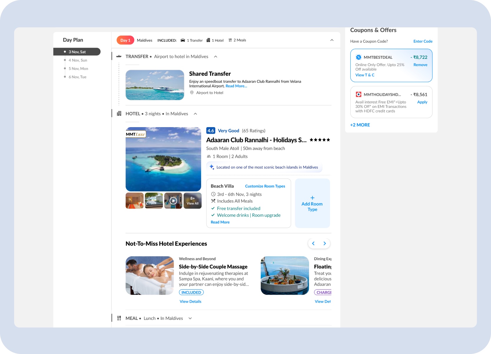
Day plan hotel block entry — the same customization is accessible directly from the hotel item in the itinerary, sitting alongside room details, inclusions, and an Add Room Type control so the feature feels native to the stay summary.
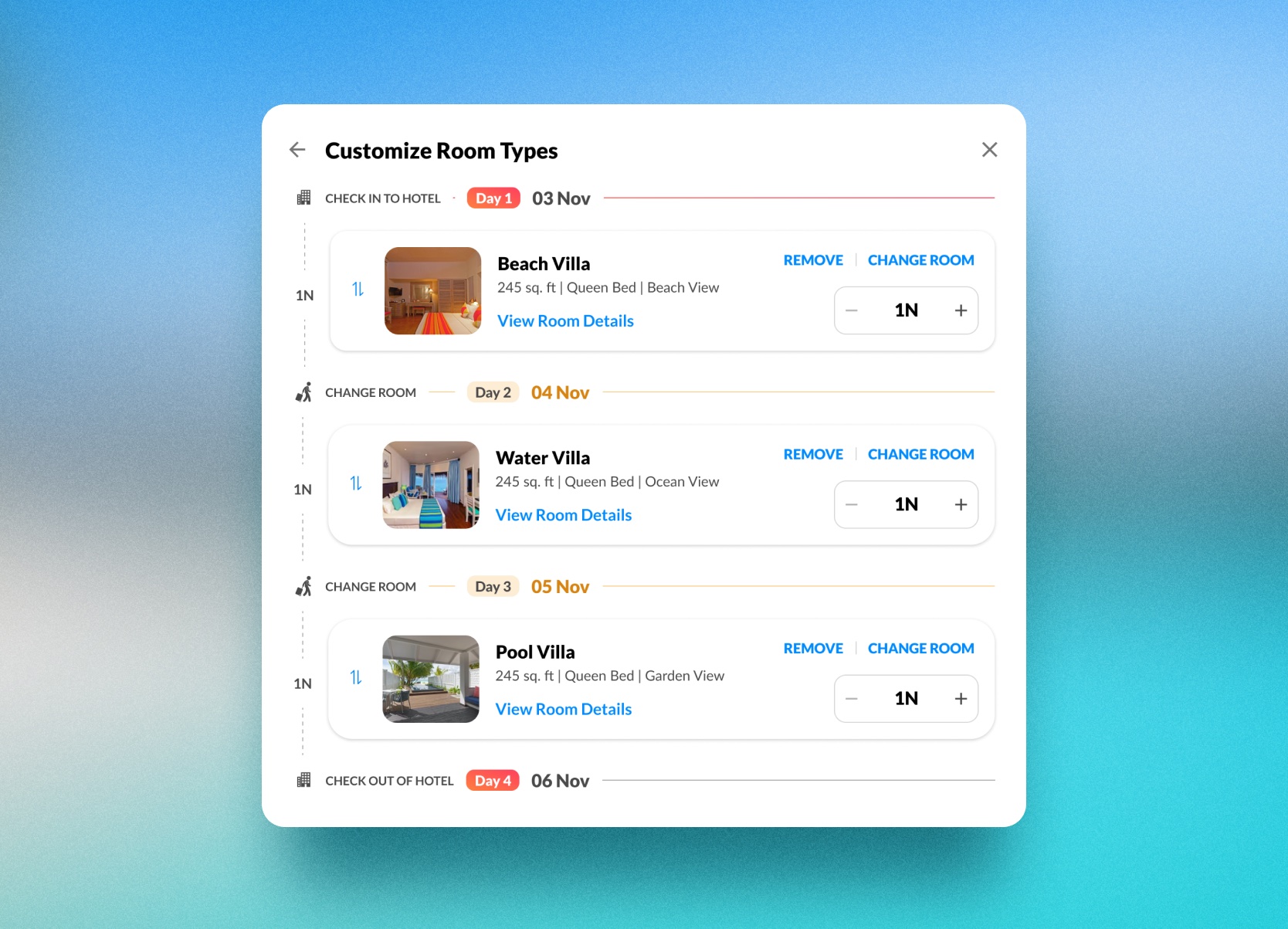
The customization surface organizes check-in, room order, nights per room, room details, and checkout into one timeline-like structure. That changes the mental model from choosing a room to editing the stay.
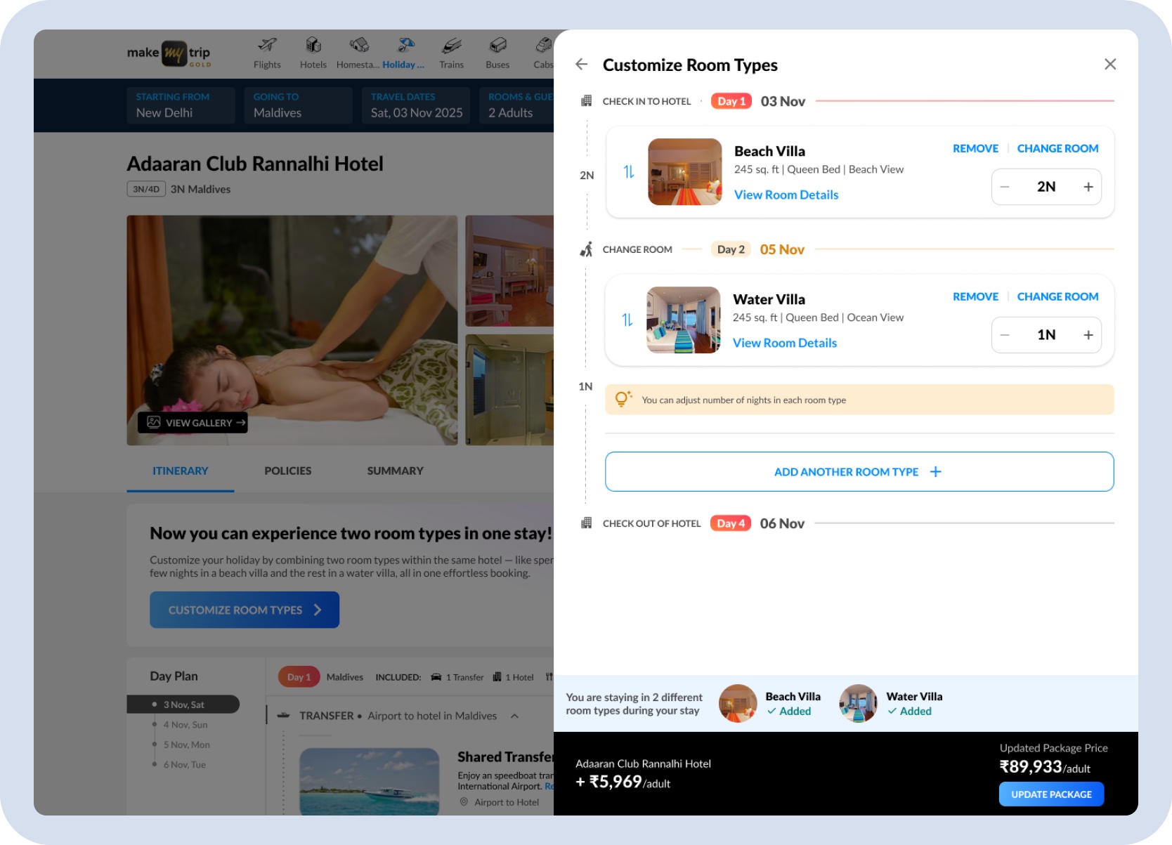
Desktop stay editor — room order, nights, details, and pricing come together in one structured editing surface.
Users can add, remove, change, and reorder rooms without learning a different pattern as the stay becomes more complex.
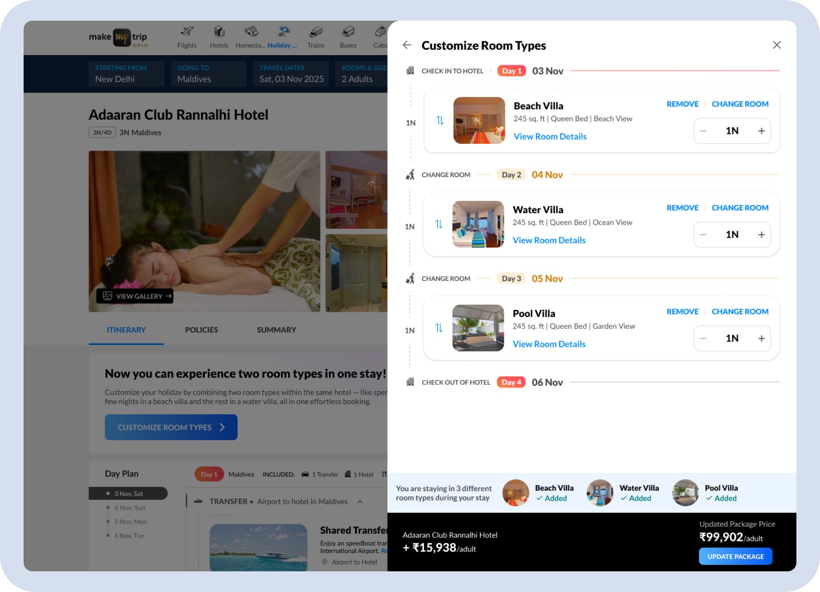
Room sequencing — the same interaction model supports a simple two-room split and a more complex three-room stay.
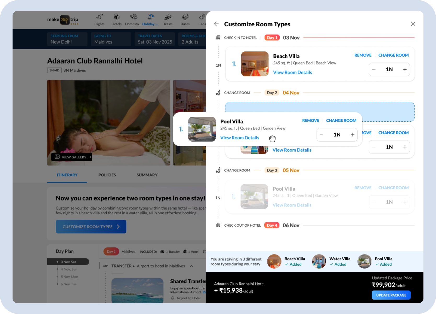
Room reorder mid-sequence — rooms can be dragged to any position in the stay sequence, keeping the confirmed rooms intact while the order is being rearranged.
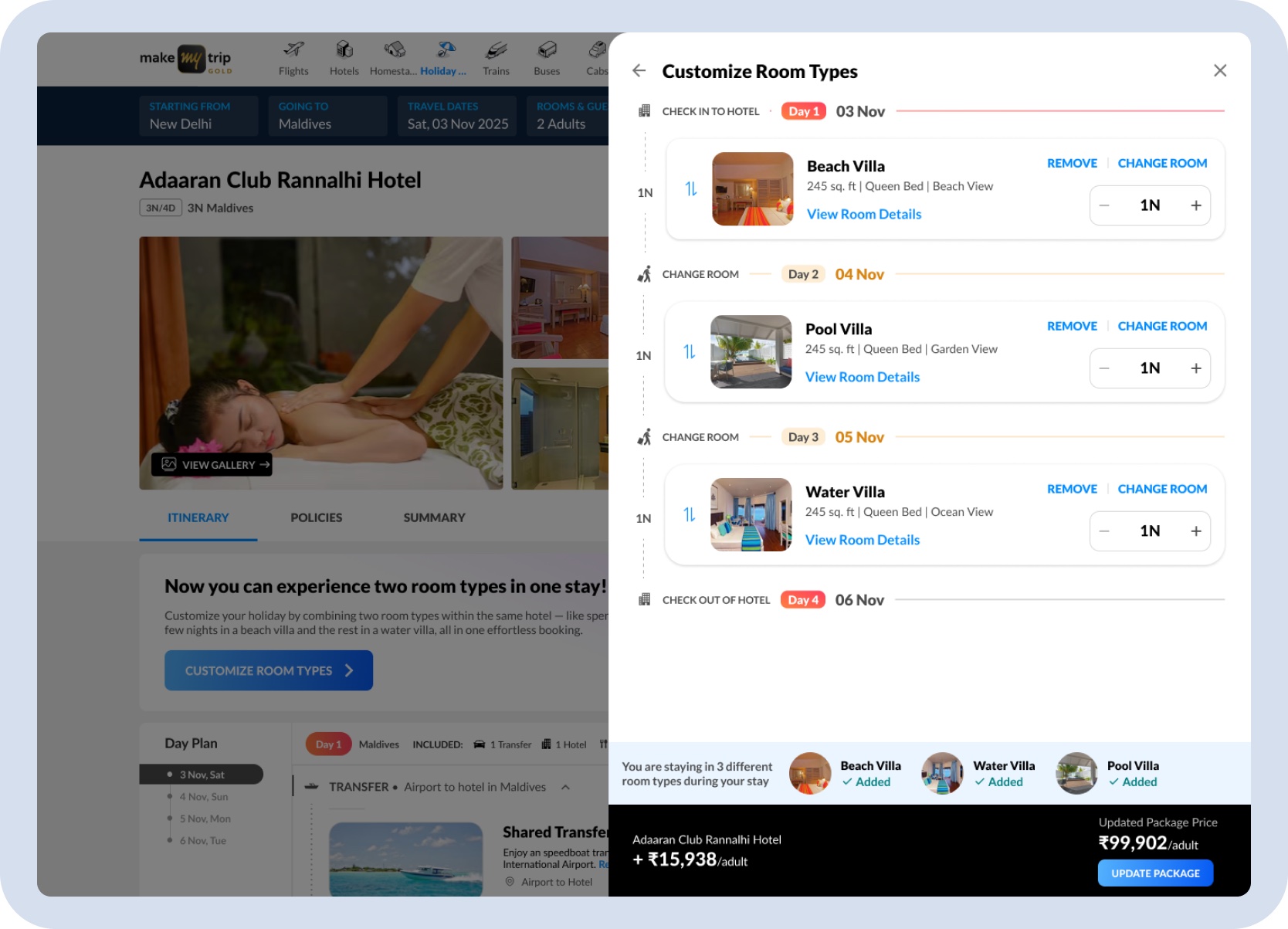
Three-room stay confirmed — Beach Villa, Pool Villa, and Water Villa across three nights, with room order, night counts, and the updated package price visible before committing to the update.
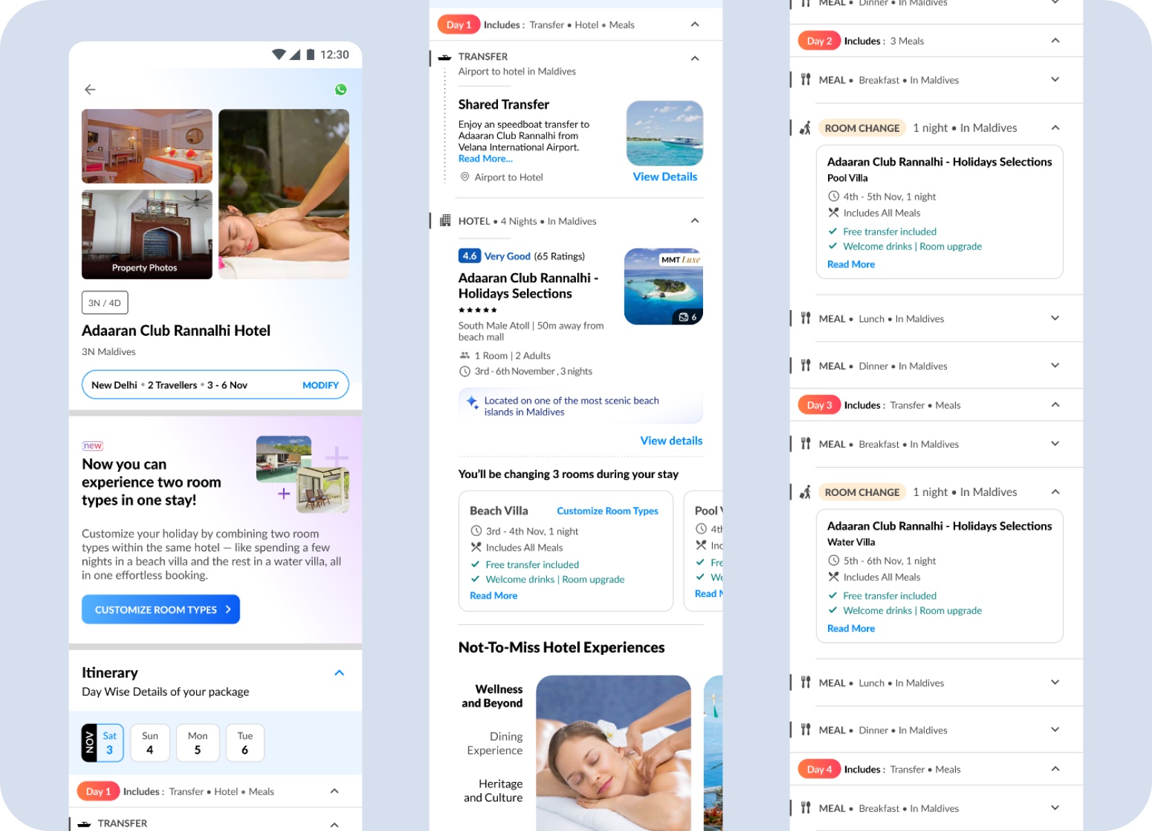
Mobile Experience
The desktop panel layout couldn't carry to mobile. The key adaptations were a linear stacked-card flow instead of a side panel, sticky pricing and action areas so cost stayed visible while scrolling, and a split entry point — banner on the package page, inline control on the hotel block.
Mobile entry points — the package page introduces Split Stay with a dedicated banner and Customize Room Types CTA, while the hotel block in the day plan surfaces the same option alongside room details and an Add Room Type control.
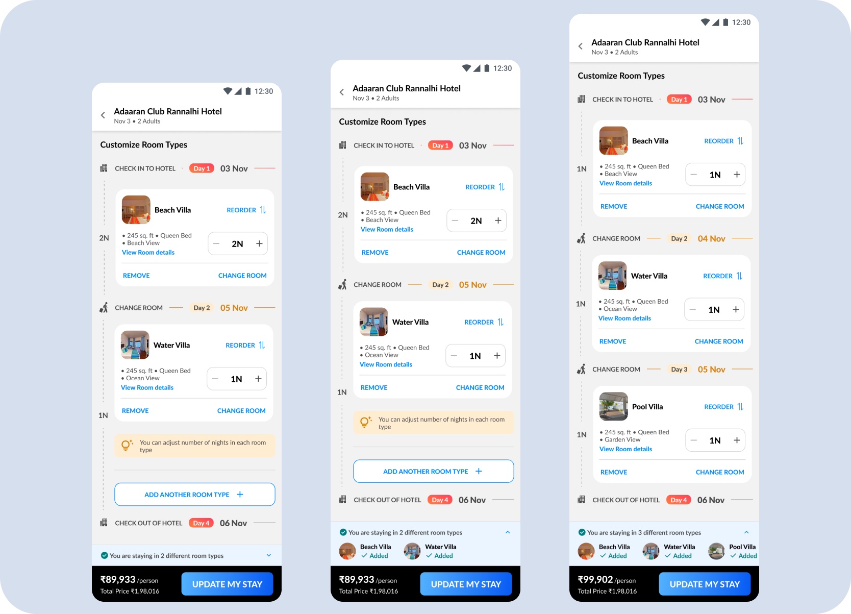
Building the room sequence — stacked room cards let users add one room at a time, with the sequence, night count, and running package price visible at each step from a single room to three.
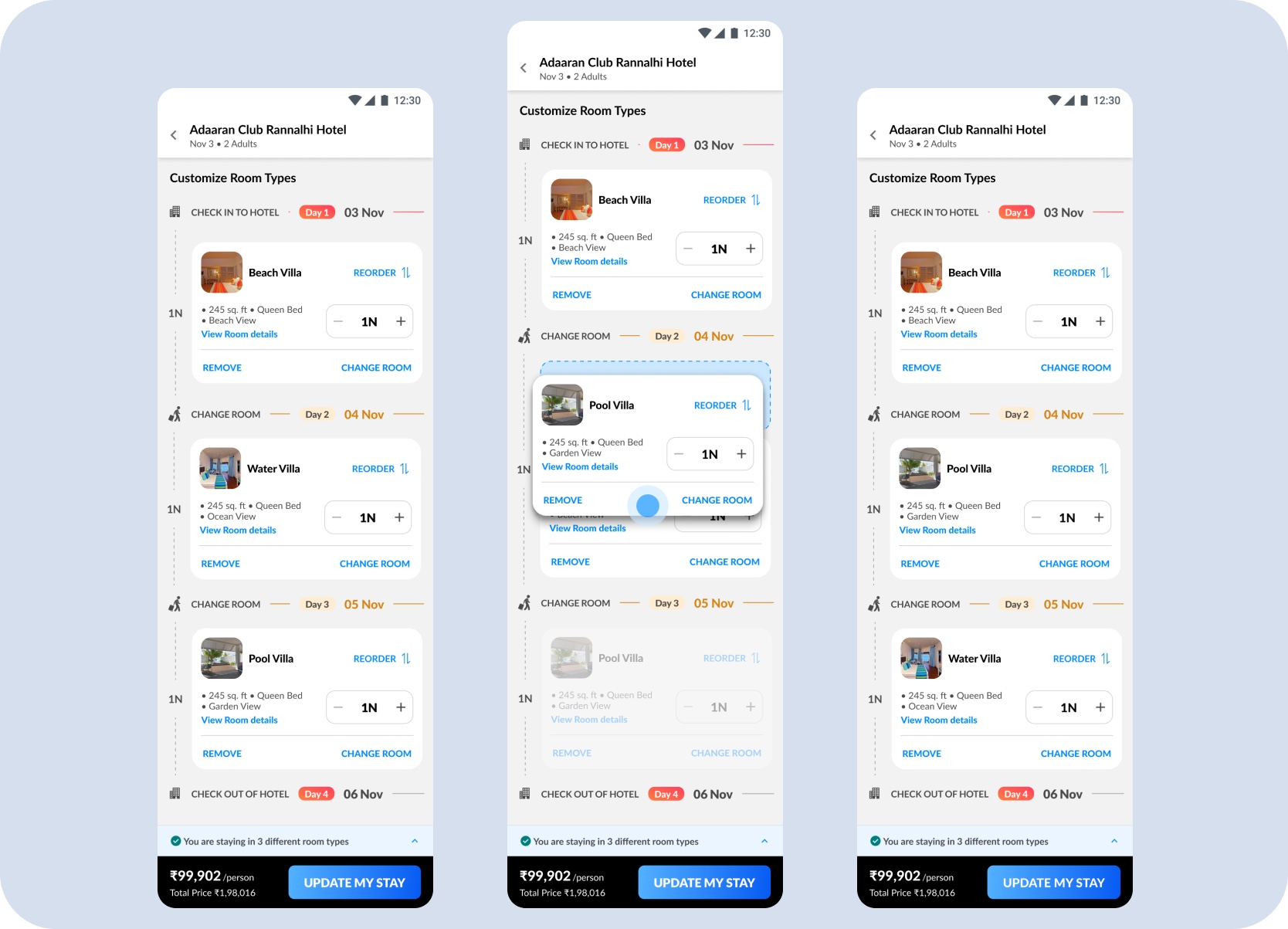
Changing a room mid-sequence — users can open Change Room from any position in the stay, select a different room type, and update the sequence without disrupting the other confirmed rooms.
Room details and inclusions stay visible inside the flow so travellers understand what they are moving into next, rather than discovering the consequences later.
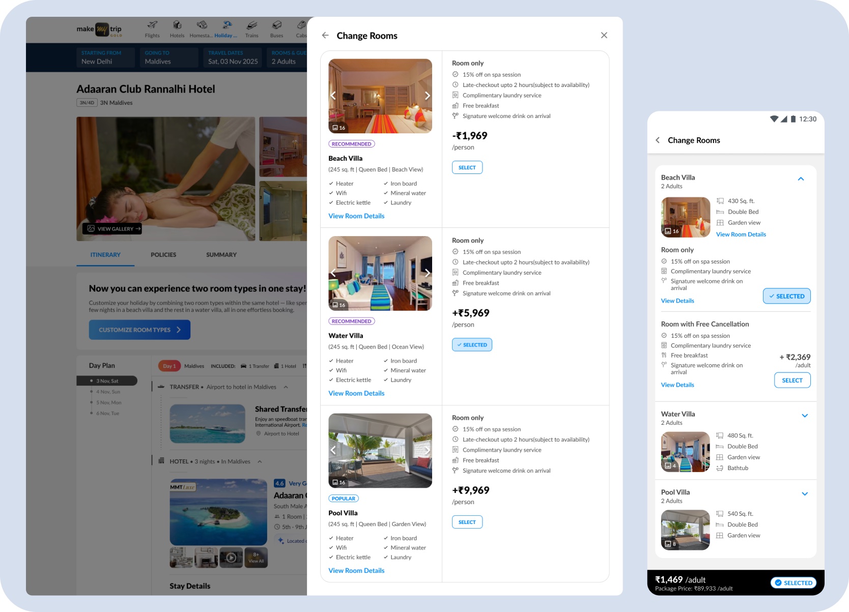
Change Rooms — a browsable list of available room types with photos, inclusions, and per-room price delta, so users can compare options before committing to a swap.
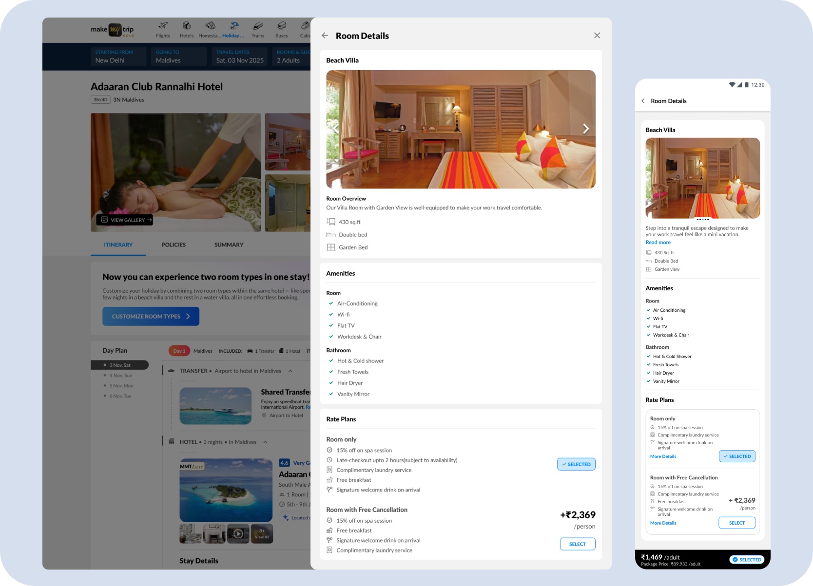
Room Details — tapping View Room Details expands full room information including size, amenities, rate plans, and free cancellation options, giving users enough context to make a confident next-room decision.
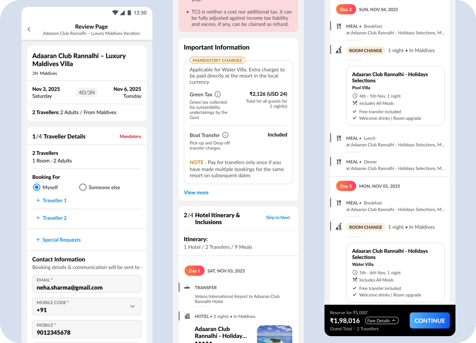
Review & Booking
Split Stay could not end at customization. Every room-level choice had to survive the handoff — carrying into itinerary, review, and payment without the traveller having to re-confirm what they had already decided.
The day-wise timeline shows where the traveller stays first, when the room changes, and how the nights are divided. That preserves trust when the traveller validates the final package before payment.
Mobile review — the selected room sequence, mandatory charges, inclusions, and final total carry into the booking summary, so the traveller can validate the full holiday before payment.
The payment page surfaced only the relevant updates — room types, mandatory charges, and the final total — without requiring the traveller to re-read the full booking.
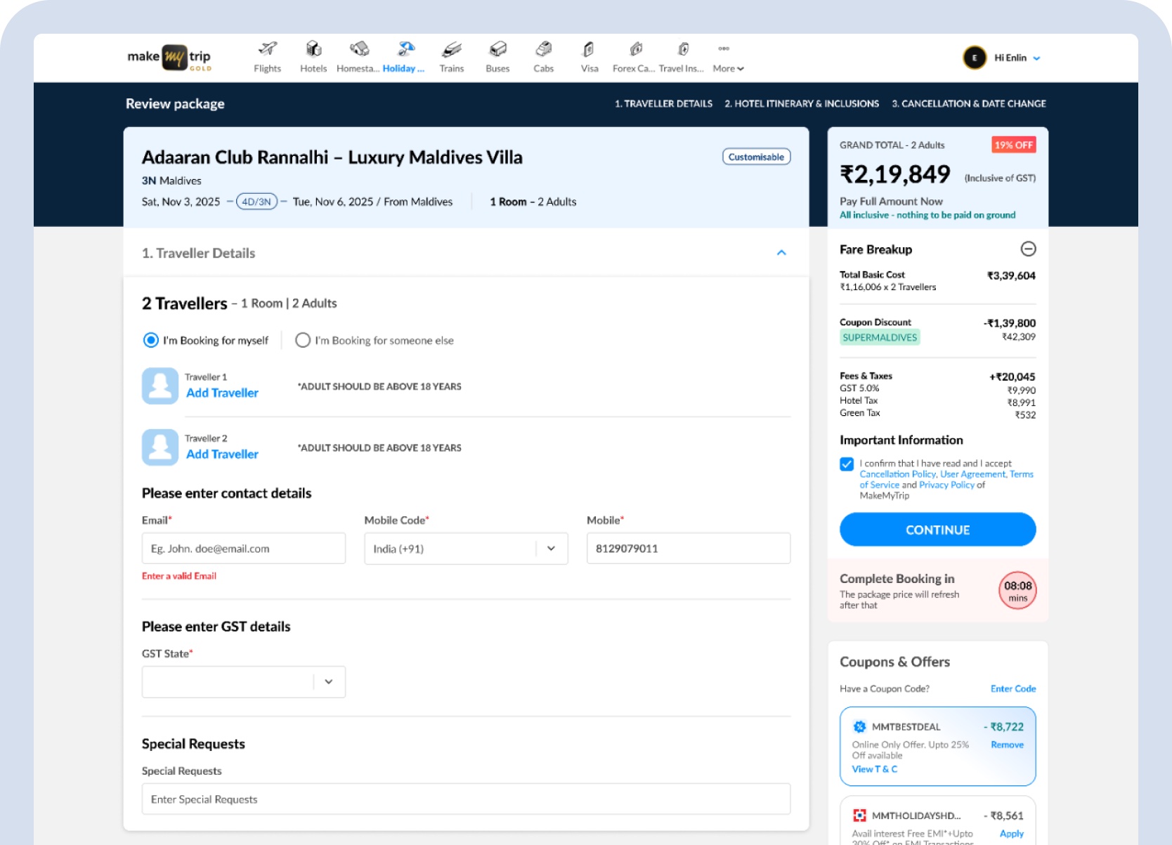
Mobile payment — the same room-level charges, inclusions, and final total surface at payment without requiring the traveller to navigate back to review.
Outcome
The final design connected discovery, customization, room sequencing, pricing, review, and payment across desktop and mobile without creating a parallel booking journey.
Current status
The direction was well received by the Lead PM, Director PM, and CPO. The complete design scope — feature model, room sequencing, pricing, review, and payment across desktop and mobile — was submitted in 2025 and is in the engineering pipeline.
The work introduced a new customer-facing booking behaviour — not a visual cleanup of an existing screen.
Each room change surfaced a price delta and updated total before confirmation — keeping cost legible across a multi-room sequence.
Desktop and mobile reached full feature parity — room sequencing, night allocation, and review — without building a parallel booking flow.
Room sequencing, pricing delta, coupons, itinerary, and review all had to remain coherent — the feature had to thread through an existing connected journey without disrupting any part of it.
Continue Browsing