Overwhelming Information Delivery
The site's reliance on lengthy bullet-point lists for features like 'High Quality Experience' and 'Collaboration Tools' overwhelmed new users, hindering their ability to quickly understand key benefits.
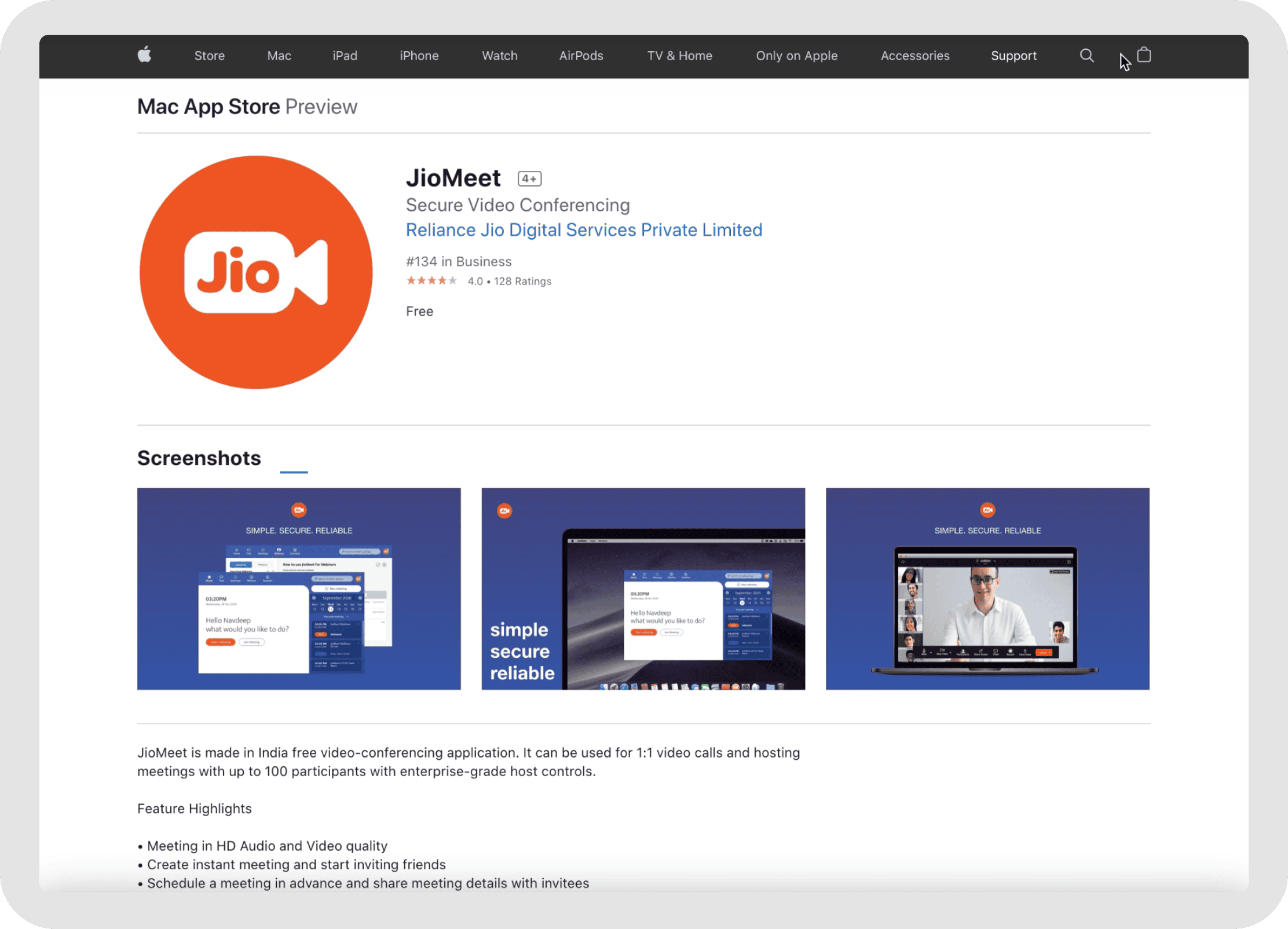
JioMeet Website Revamp
Led the redesign of the JioMeet website, turning an outdated, function-first experience into a more modern, responsive product surface with stronger storytelling, clearer enterprise positioning, and measurably better engagement.
30+
New enterprise clients acquired post-launch
47%
Increase in Daily Active Users (DAU)
22%
Rise in web app meetings hosted
My Role
Led User Research & Analysis to define problems, driving Ideation, Scenarios, Concept & UX Design, Prototyping, and User Testing.
The Team
1 senior designer,
1 motion designer,
1 lead designer,
1 design consultant,
5+ product managers, and 10+ engineers.
Timeline
Jul 2021 – Jan 2022
Live Project
View the live JioMeet websiteThe site may have changed since the Jan 2022 launch. Designs shown reflect my work during the 2021–2022 period.
Challenge
The existing JioMeet website, while packed with information, presented several key challenges that hindered its potential to effectively attract and convert users, especially in the competitive enterprise market. This initial impression was critical as it often represented the first touchpoint for potential customers.
The overall design aesthetic — characterized by dense text blocks, a cluttered layout, and standard form elements for enterprise registration — felt less modern and engaging compared to contemporary digital platforms. This visual datedness risked creating a perception that the product itself might not be cutting-edge.
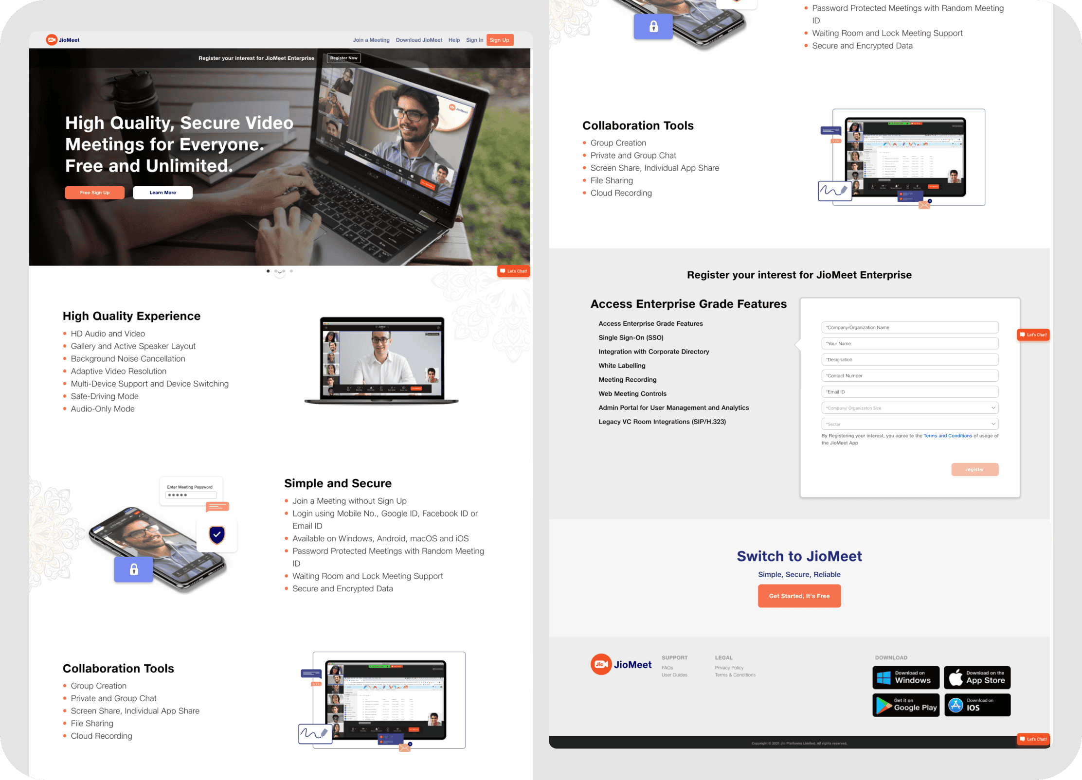
The site's reliance on lengthy bullet-point lists for features like 'High Quality Experience' and 'Collaboration Tools' overwhelmed new users, hindering their ability to quickly understand key benefits.
The site prioritized listing features over showcasing user benefits or a compelling problem-solving narrative. This functionally-focused design lacked an intuitive and inspiring customer journey.
Despite listing 'Enterprise Grade Features,' the simple 'Register your interest' CTA lacked the sophistication needed to effectively engage high-value enterprise clients.
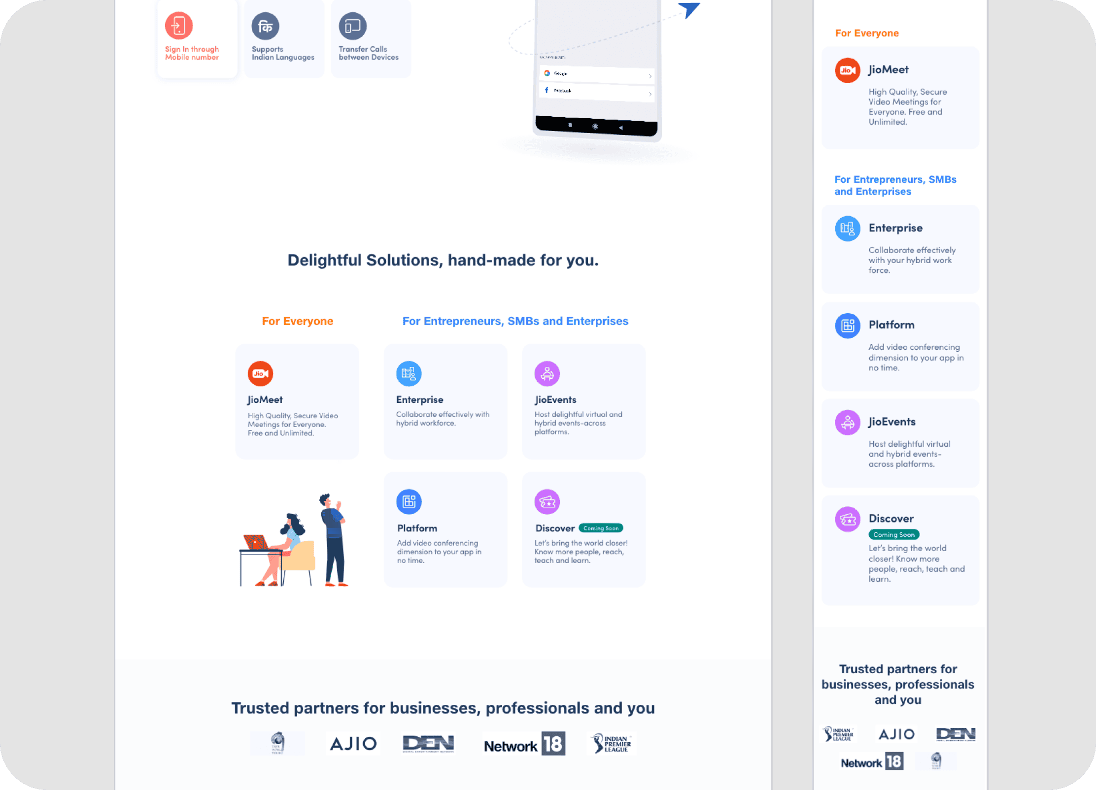
The one-size-fits-all approach failed to provide tailored information or intuitive journeys for its diverse user base: SMBs, large enterprises, individual professionals, developers, and educational institutions.
JioMeet's rapid evolution — launching new features and sister products like JioEvents and CPaaS — strained the existing website, hindering its ability to cohesively showcase the expanded portfolio.
The website didn't effectively use its structure and presentation to visually demonstrate product capabilities or tell a persuasive story about JioMeet's unique strengths.
Analysis
Beyond the general look and feel, a closer examination of key pages within the old website revealed specific usability and engagement issues that likely impacted the user journey:
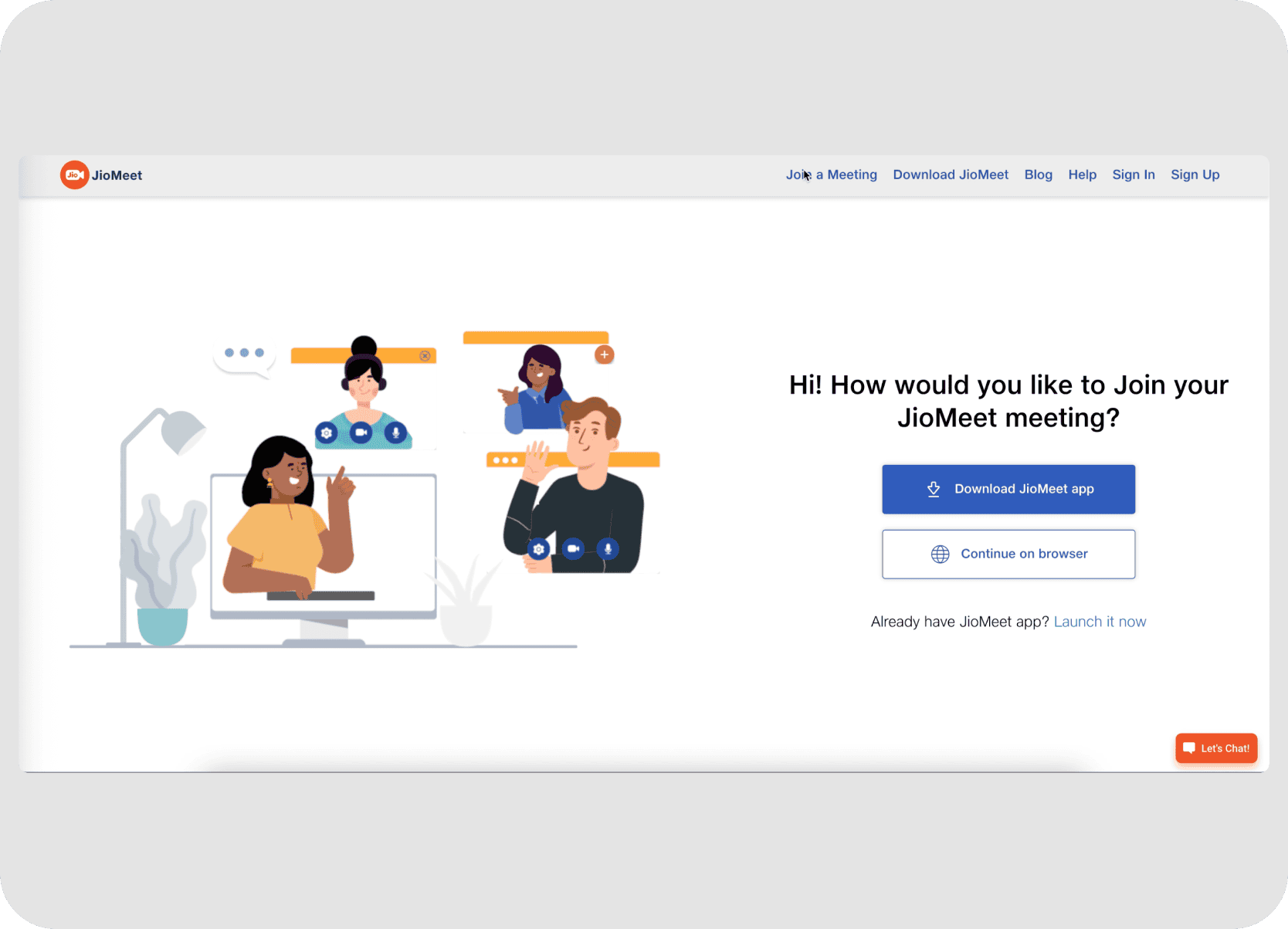
A key pain point was the absence of a centralized download page on JioMeet.com. Instead, users were directed to external app stores, meaning the site missed opportunities to present all app versions, provide platform-specific details, and confidently guide users, potentially causing confusion or drop-offs.
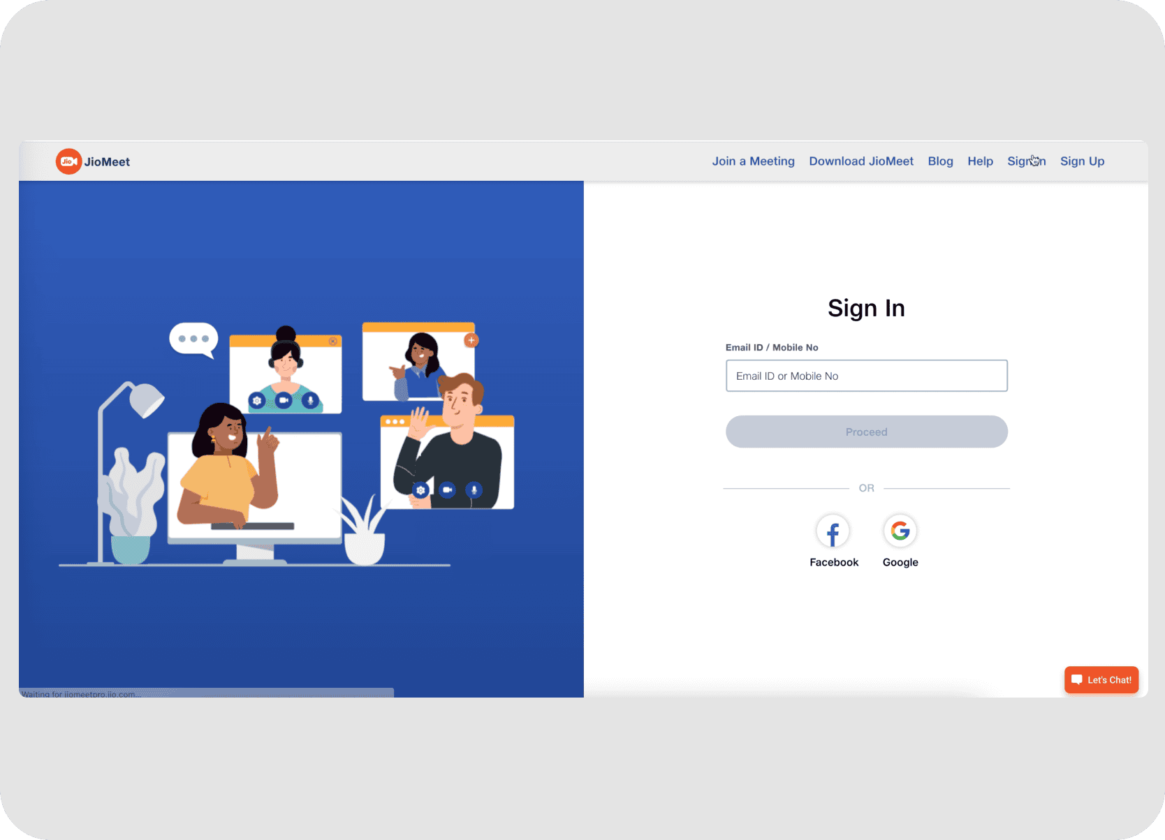
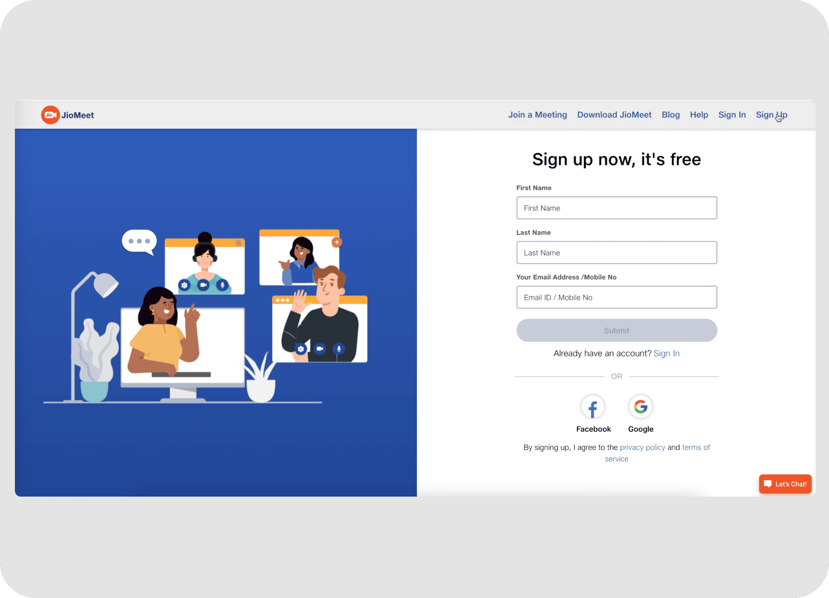
Essential pages like "Join a Meeting" and "Sign In" were highly utilitarian. They featured generic illustrations that didn't reflect the JioMeet brand or product interface and lacked visual elements to build trust or excitement. While functional, these critical touchpoints were unmemorable and did little to persuade or engage users.
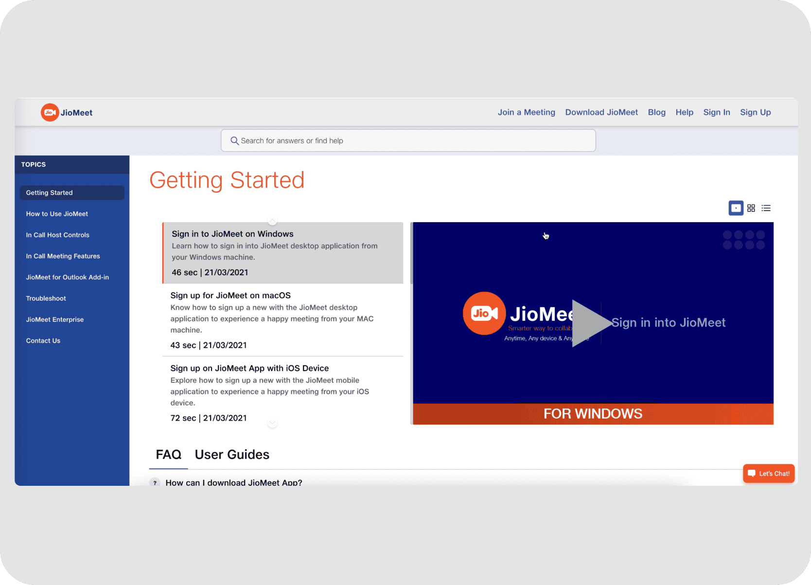
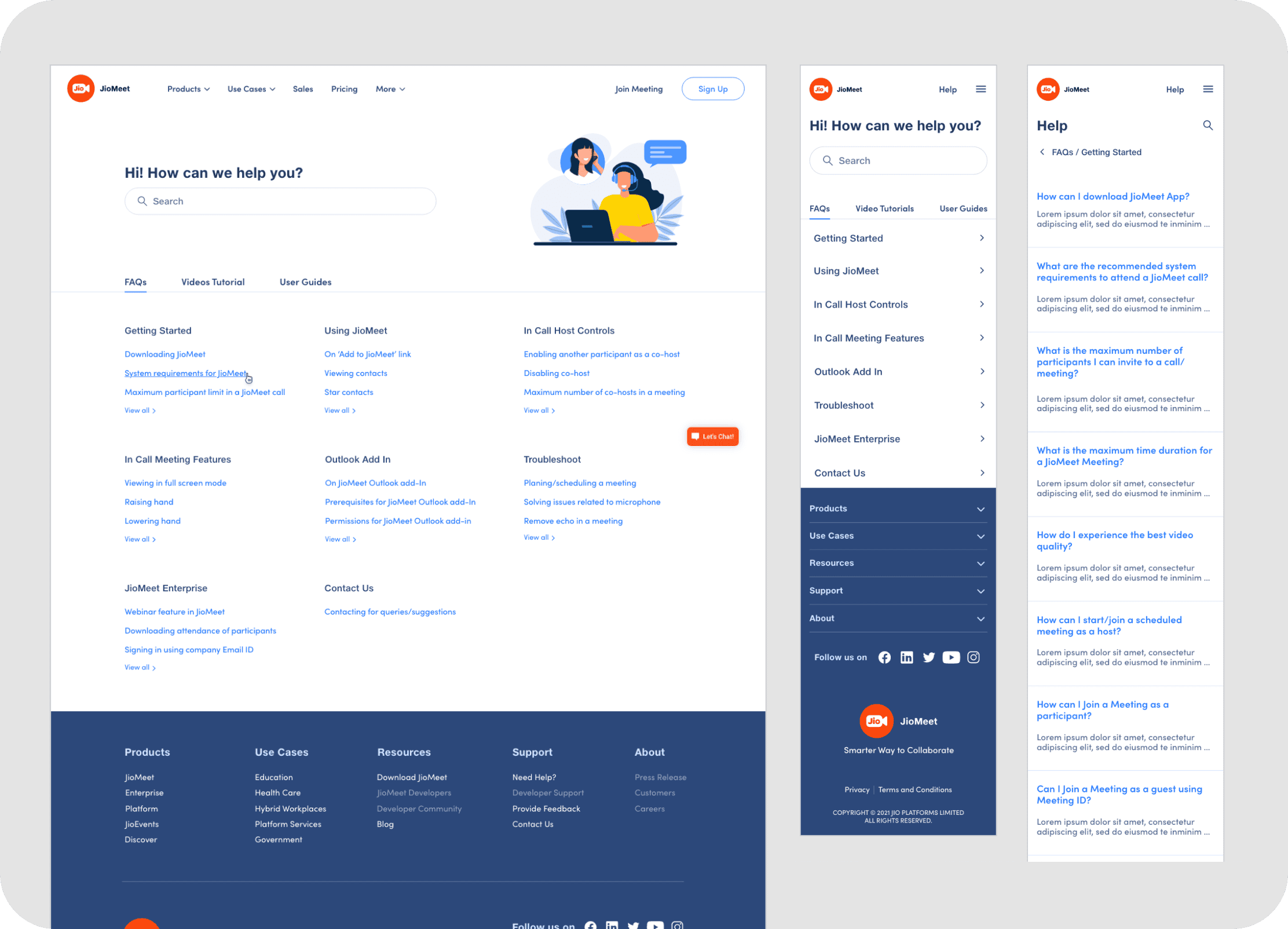
The "Getting Started"/Help section was presented as dense, text-heavy lists of topics and articles. While containing information, its purely functional design lacked user-friendliness, visual appeal, or intuitive navigation, making it potentially cumbersome for users seeking assistance.
While some pages shared a common illustration style, the overall user experience across different sections could feel disjointed. This lack of a cohesive, modern design language across the entire platform diluted brand perception.
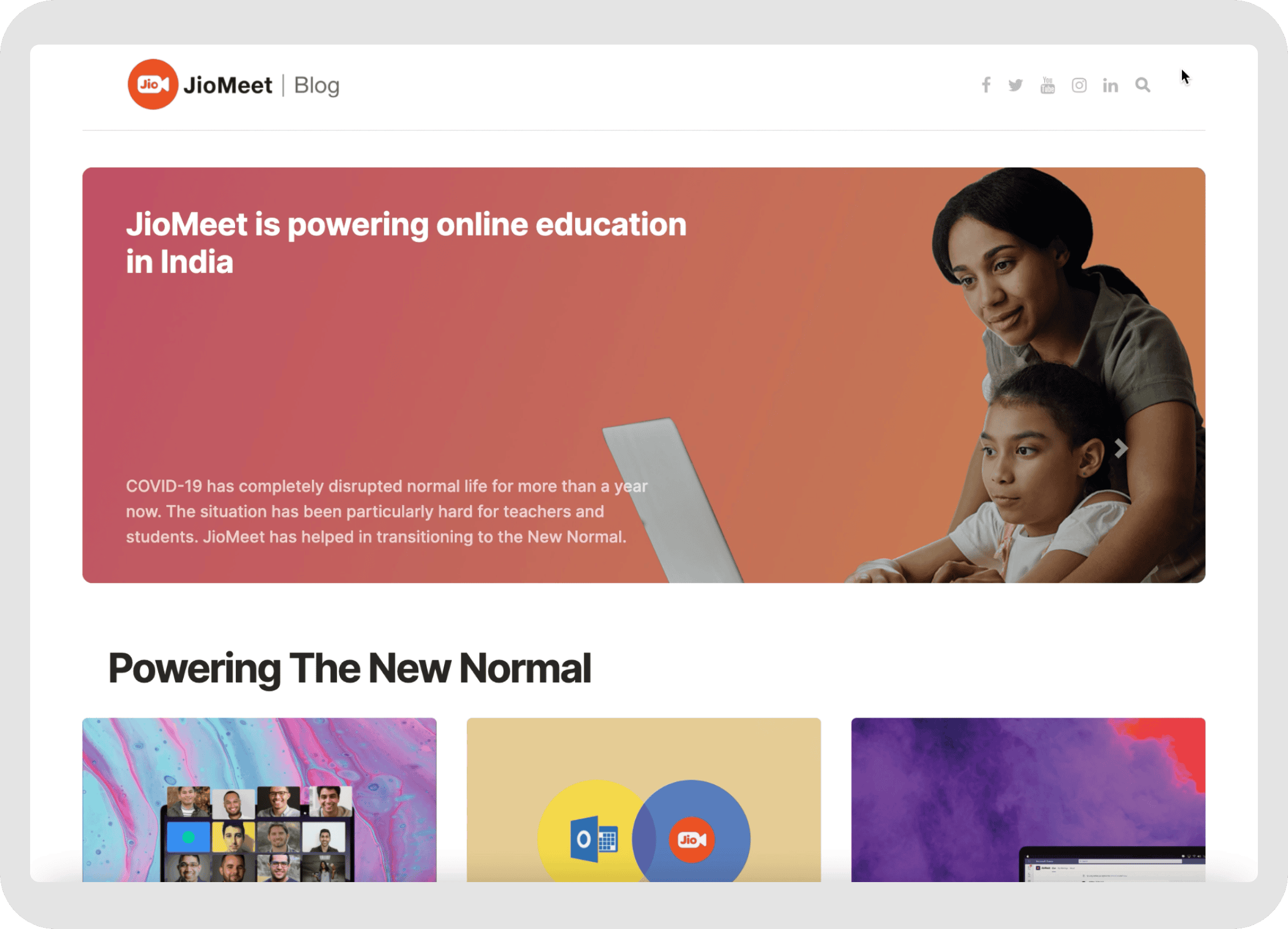
JioMeet maintained an active blog for company updates and articles via a third-party platform. This remained outside the scope of this redesign project, which focused on transforming the core website's user experience, information architecture, and conversion pathways.
My Role
As Senior Product Designer, I led the complete JioMeet website overhaul. Through strategic planning, hands-on design, and cross-functional collaboration, I transformed its outdated online presence into a modern, comprehensive, responsive platform aligned with JDS2.0 principles, delivering 10+ new pages. Additional responsibilities beyond visual design and Information Architecture included:
Leading foundational user and competitor research to inform design strategy.
Defining and structuring the website's IA in collaboration with stakeholders from diverse JioMeet verticals (Retail, Enterprise, Developers, etc.).
Guiding the entire design lifecycle from concept to visual execution and style definition, ensuring a cohesive user experience.
Facilitating content gathering and providing art direction for illustrations and imagery, ensuring alignment with brand colors and typography.
Defining key interaction patterns and animation concepts (including Lottie elements) to enhance engagement, and briefing the motion designer.
Working closely with Product Managers, a Lead Designer, a Design Consultant, 10+ Engineers, and the Motion Designer.
Ensuring designs met the upcoming JDS2.0 standards, user needs, and project constraints, including a critical end-of-2021 launch.
Process
The JioMeet website overhaul was a comprehensive initiative, undertaken with a structured process to ensure alignment with user needs and business goals:
In-depth competitor analysis and extensive internal stakeholder interviews (with PMs from Retail, Enterprise, Developers, etc.) established initial requirements.
Key product documentation provided insights into user personas (SMBs, Enterprise, Professionals, Education), project goals, and core design principles (Modern, Intuitive, Secure, Performant) that guided the project.
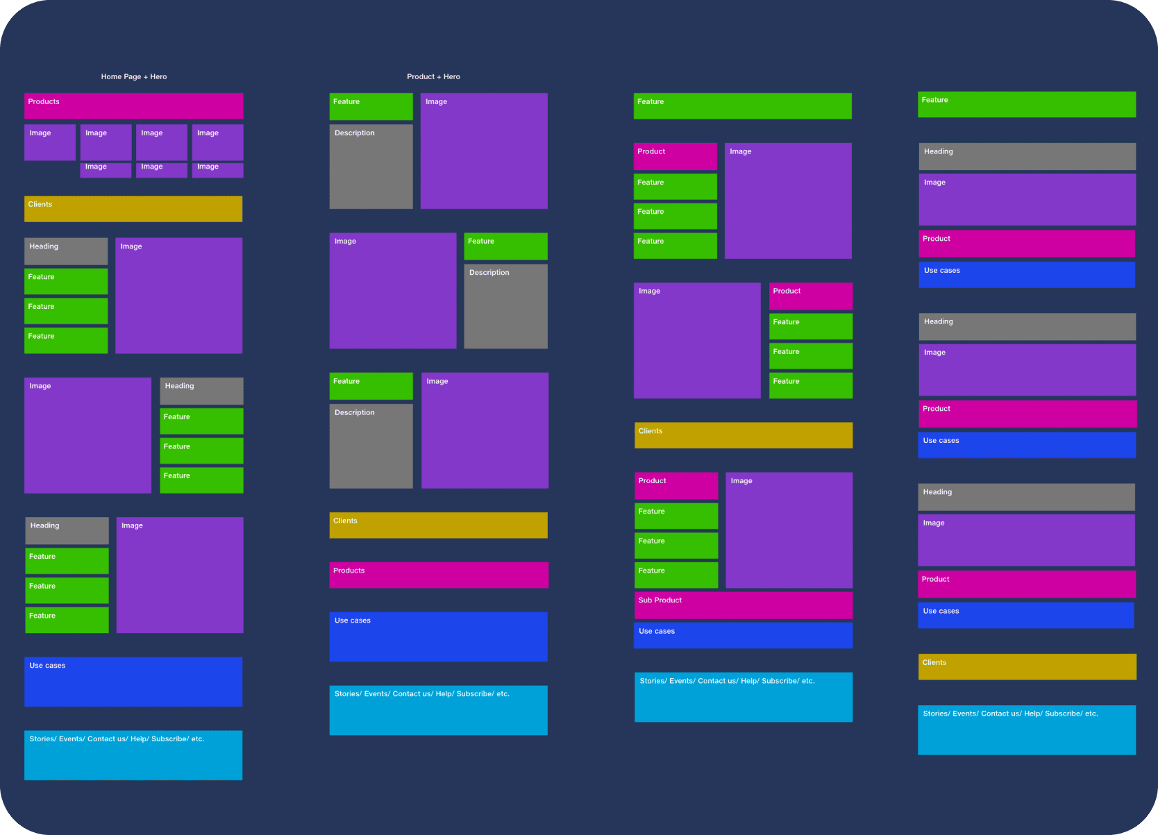
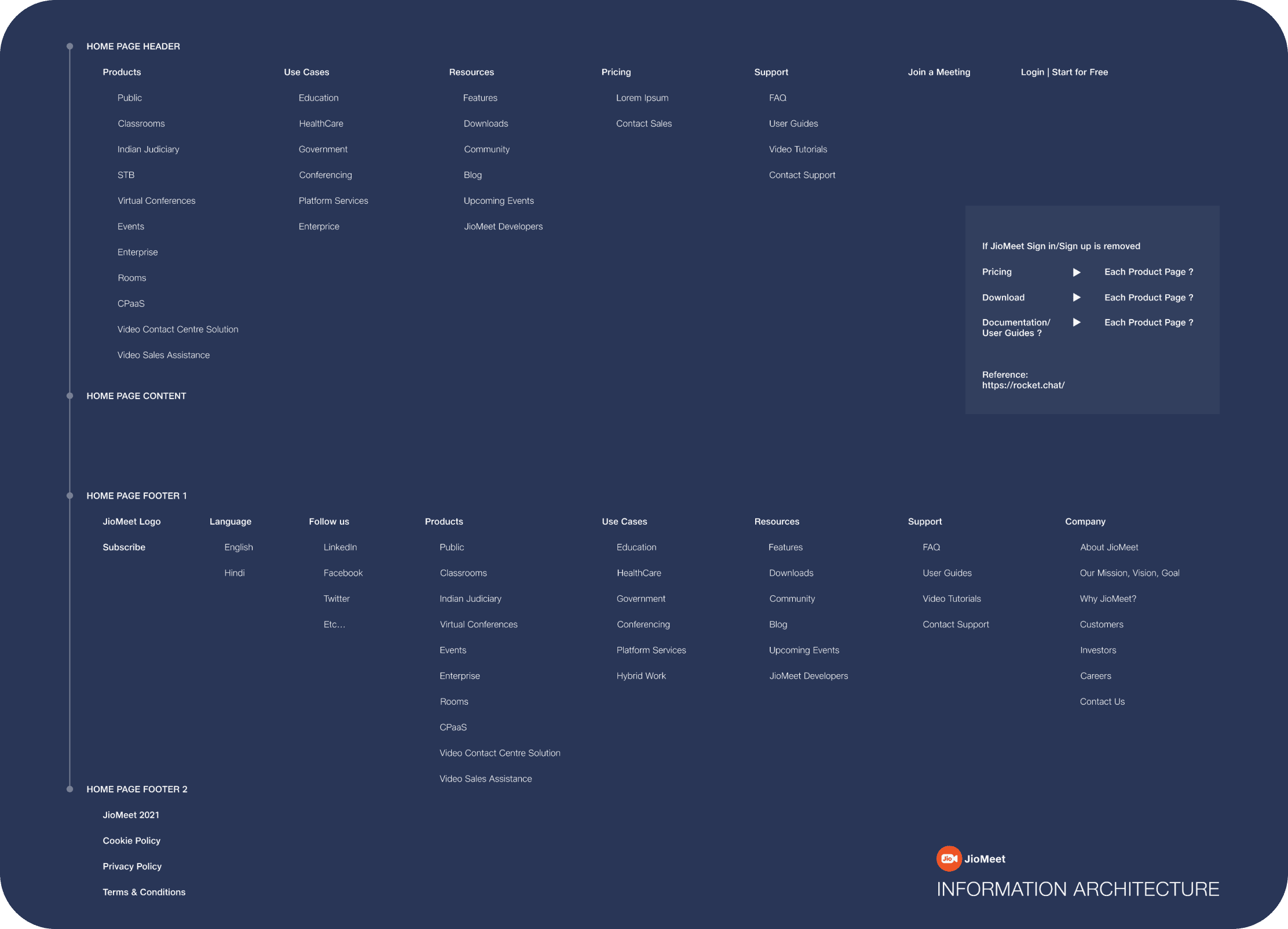
A comprehensive Information Architecture was developed, mapping the main site structure and navigation for all product verticals and user needs.
A 6-month content strategy phase involved defining messaging and coordinating with PMs. Illustrations were sourced (Shutterstock, Freepik) and art-directed for brand alignment, focusing on clear, abstract, and professional visuals — colorful yet professional, adhering to brand/product colors, and optimized for clarity and speed rather than distracting detail.
• Multiple low-fidelity wireframes explored various layouts for key pages, focusing on content hierarchy and user flow.
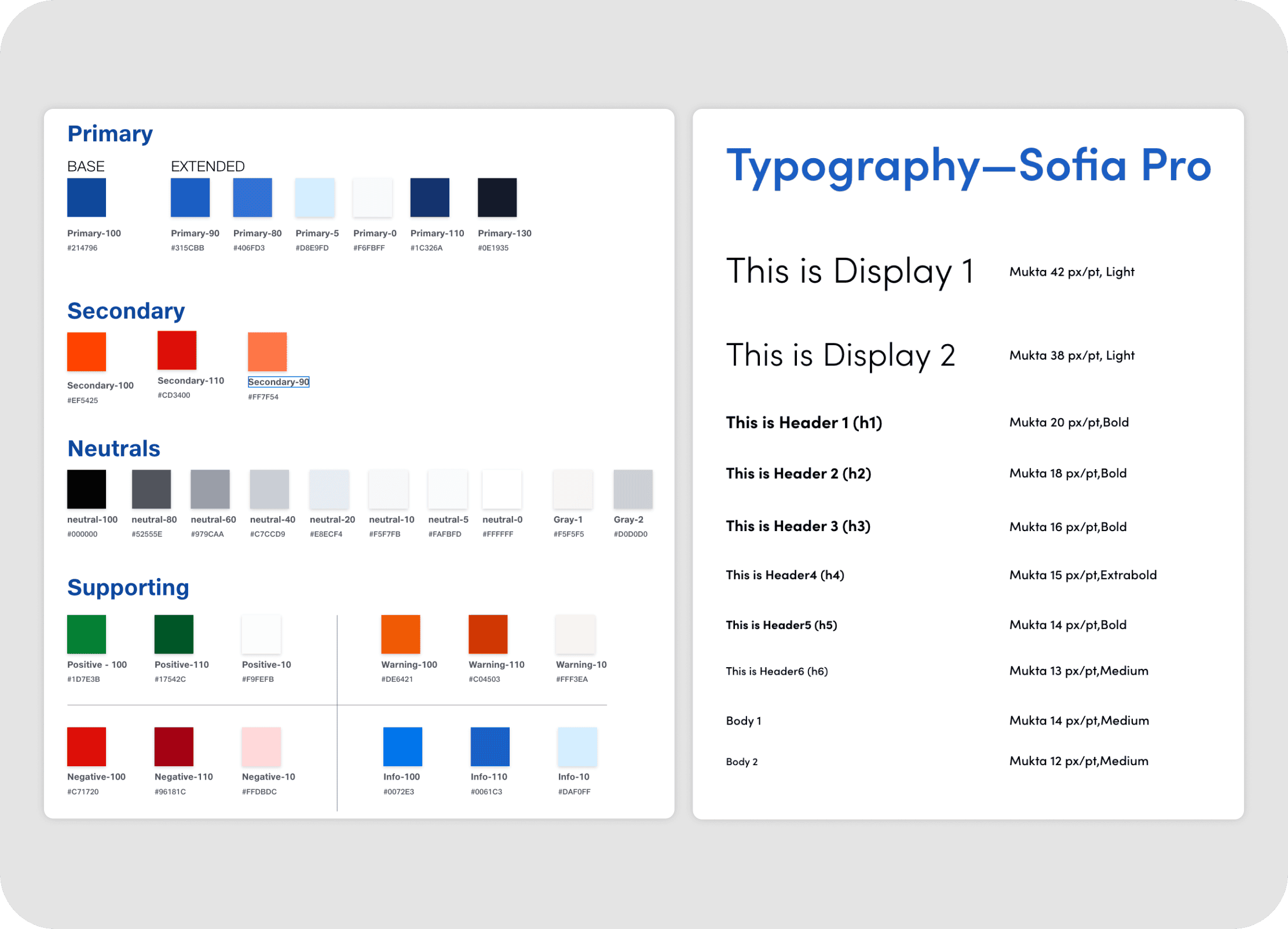
• The visual language was then defined through mood boards, UI style explorations, a harmonized color palette (based on JioMeet + Jio brand colors and app references), and a clear typography system.

• Key animation concepts (homepage banner, feature interactions) were developed to guide the motion designer.
• Early high-fidelity mockups began to visualize the intended aesthetic.
• All design explorations adhered to established constraints, prioritizing clarity and development speed ("Minimum Viable Interaction").
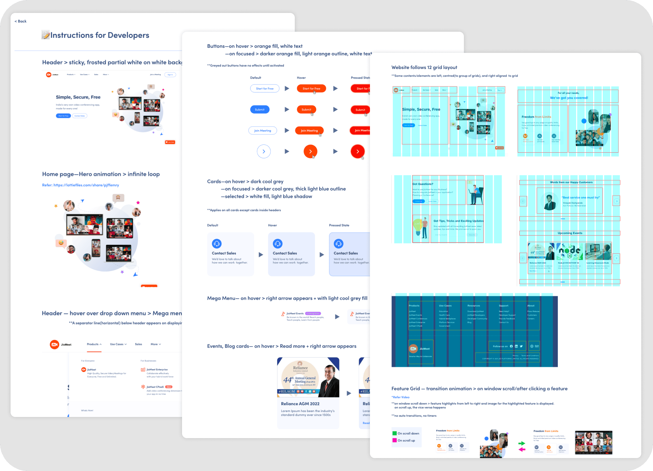
Detailed instruction sheets and style guides were prepared to ensure design fidelity during development, covering UI specs, interactive states, and component guidelines.
Solutions
Driven by clarity, modernity, user-centricity, performance, and upcoming JDS2.0 adherence, the JioMeet website overhaul transformed the outdated, functionally-focused platform into an engaging, informative, and intuitive digital presence.
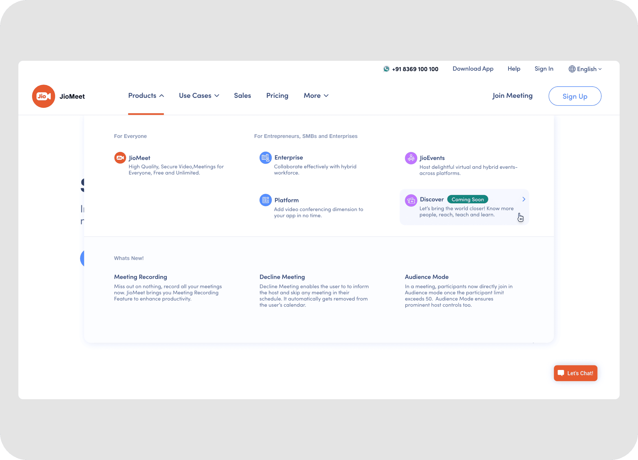
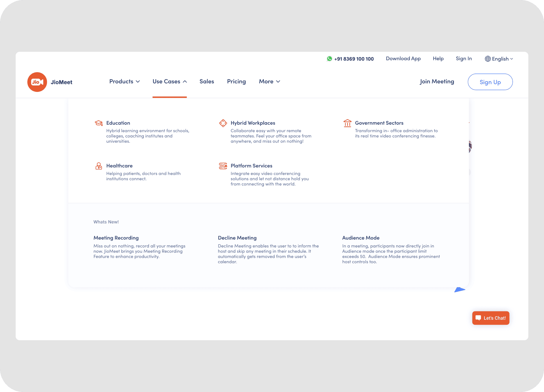
• Intuitive Header & Menus: The new header and navigation menus were designed for clarity and ease of use.
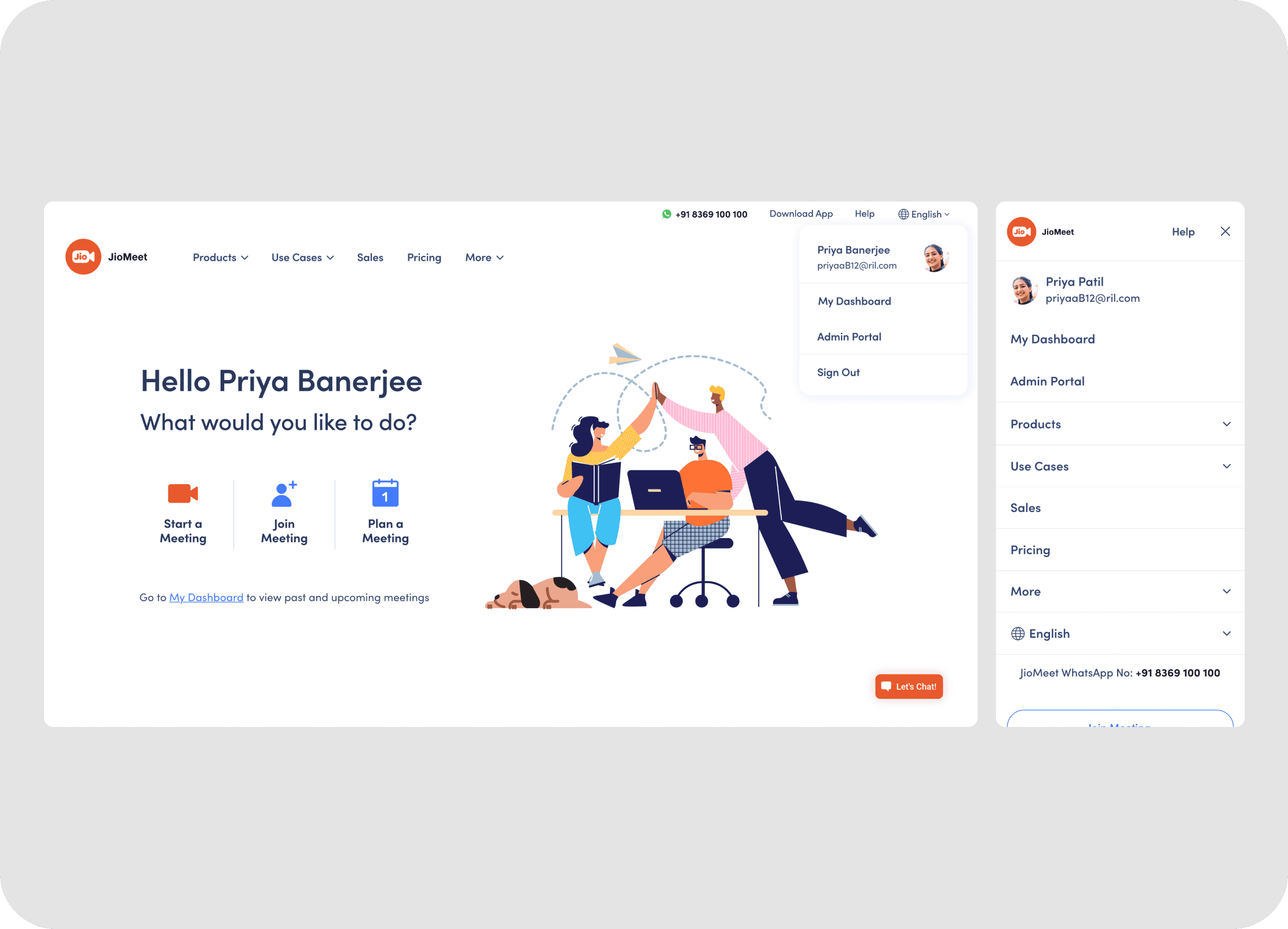
• Responsive Mobile Navigation: For mobile users, the menu and footer interactions were designed to be intuitive and accessible.
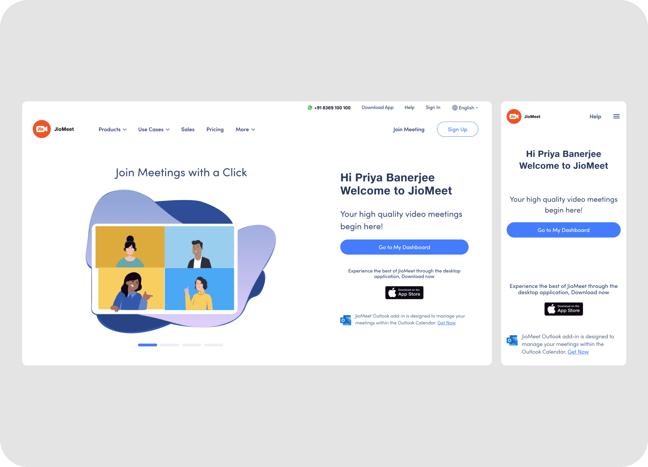
• Contextual Post-Login Navigation: Upon signing in, users are presented with a tailored navigation and landing experience.
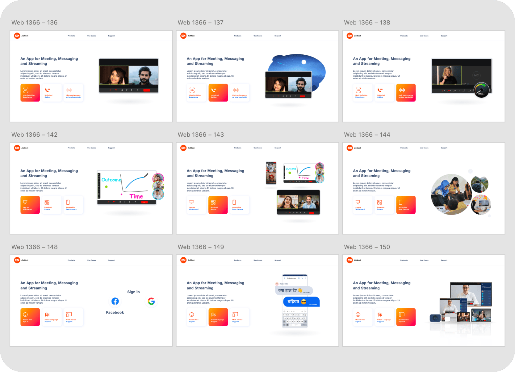
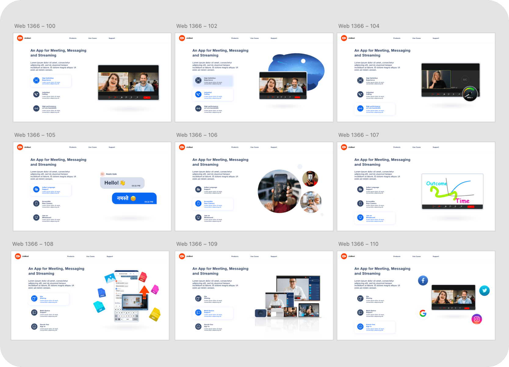
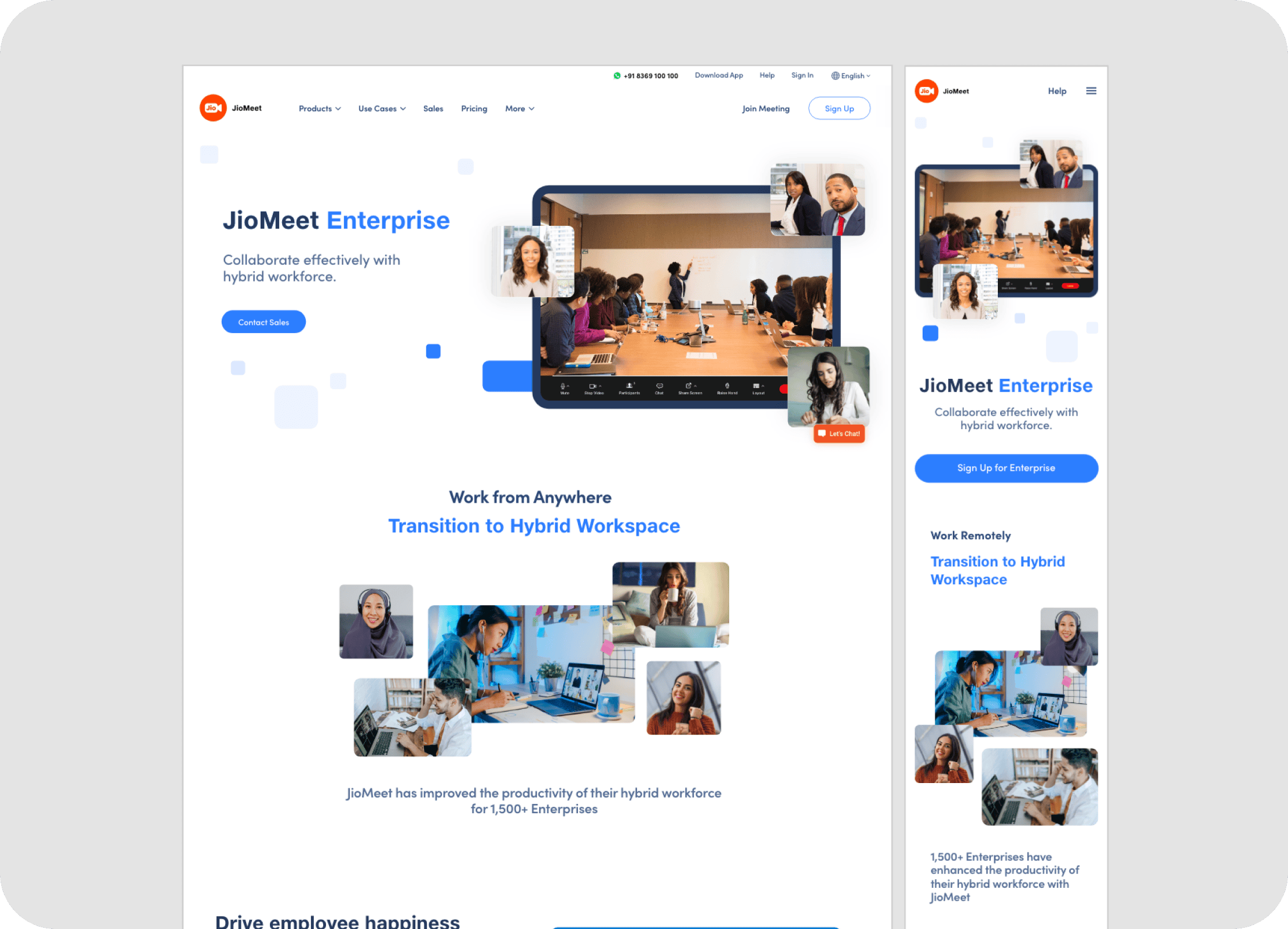
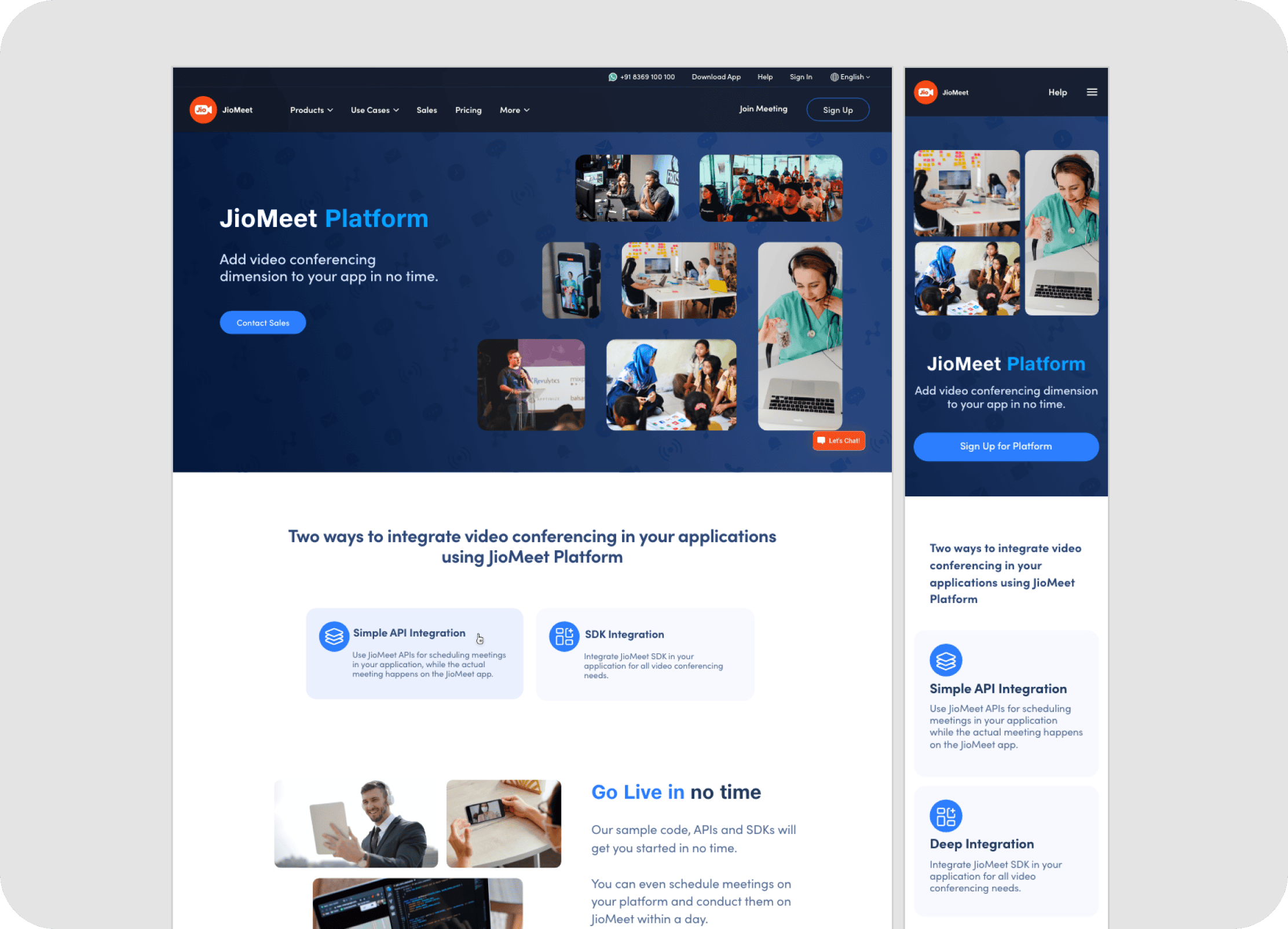
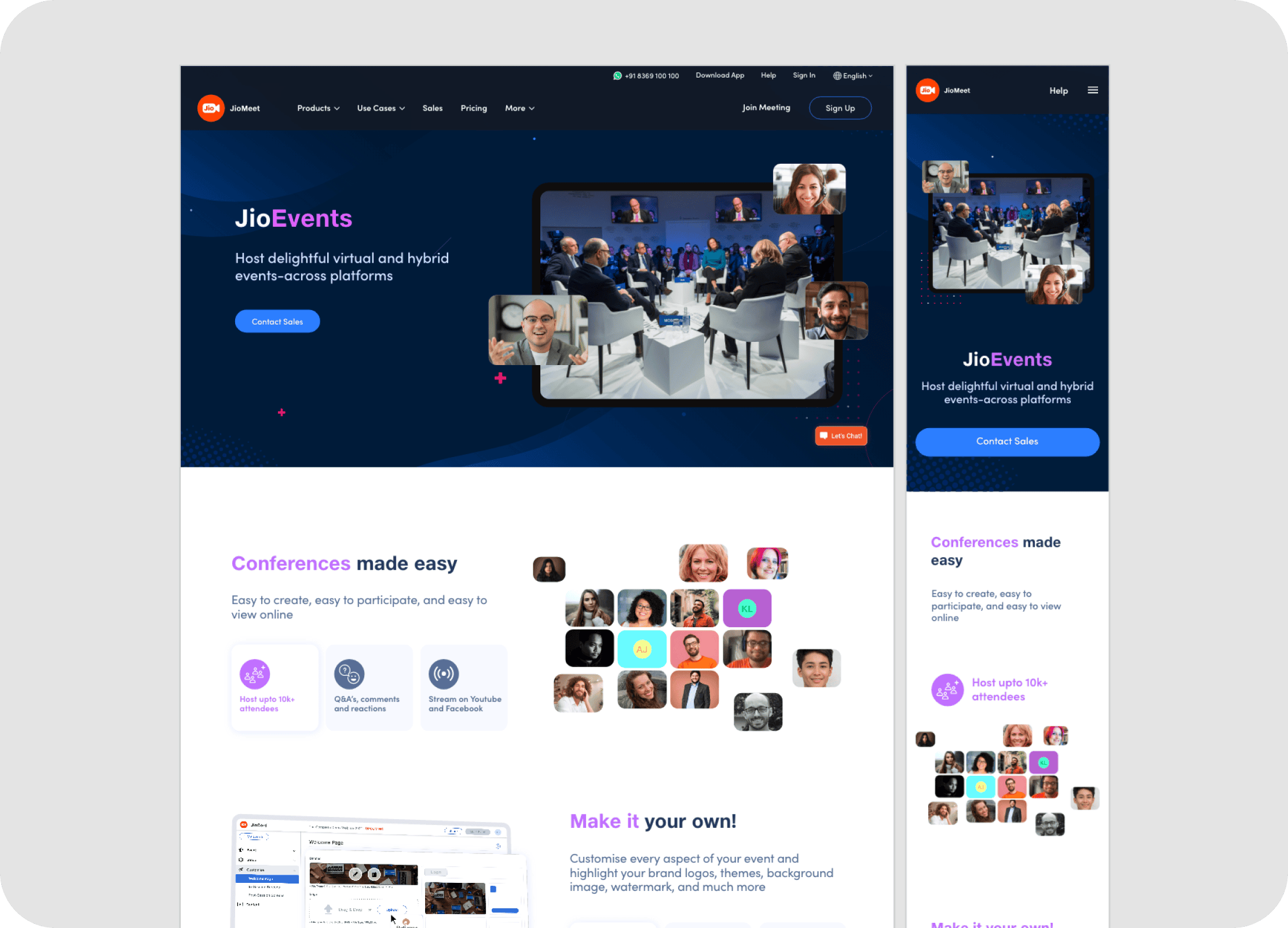
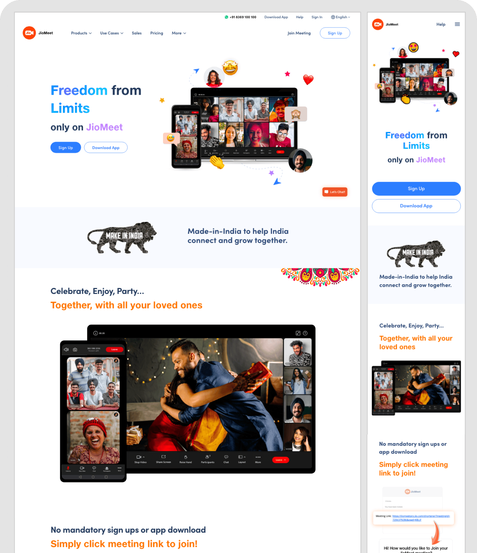
• Visually Rich & Modern Aesthetics: The new landing pages showcase a clean, vibrant design language.
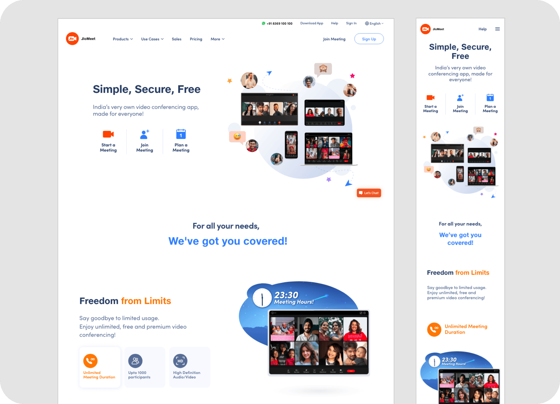
• Compelling Value Proposition: The messaging was refined to be more benefit-oriented.
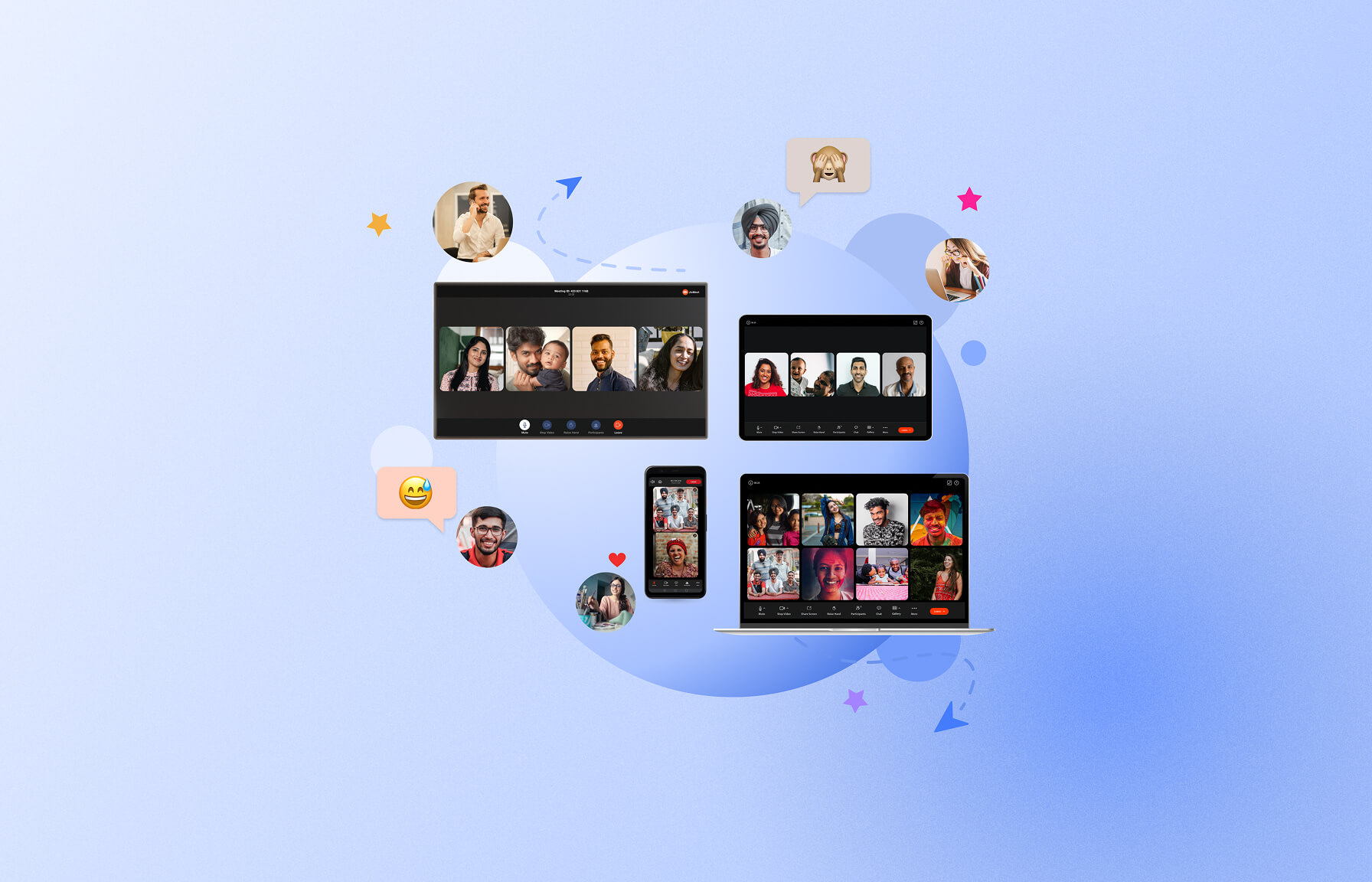
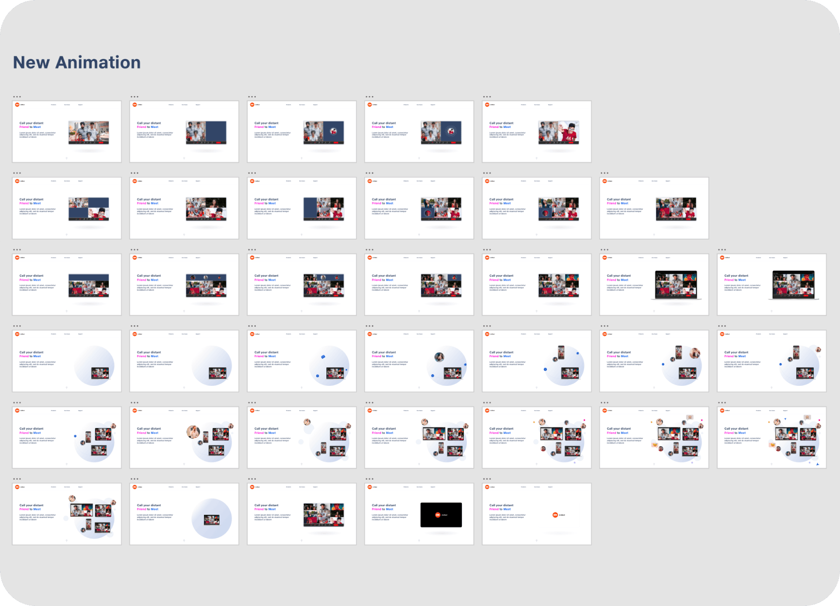
• Dynamic & Contextual Homepage Banner: Dynamic Lottie animations at key touchpoints aimed to provide a fresh, engaging, and relevant user experience. These included a homepage hero narrative animation conveying connection and collaboration, and adaptable illustrations on the personalized post-login dashboard for seasonal events — ensuring all interactions remained dynamic, welcoming, and fresh.
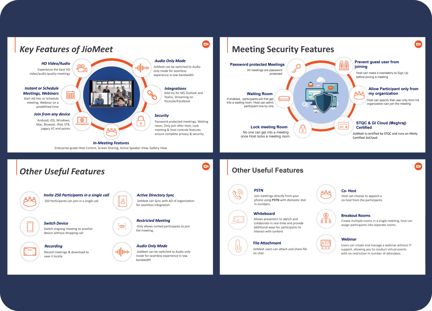
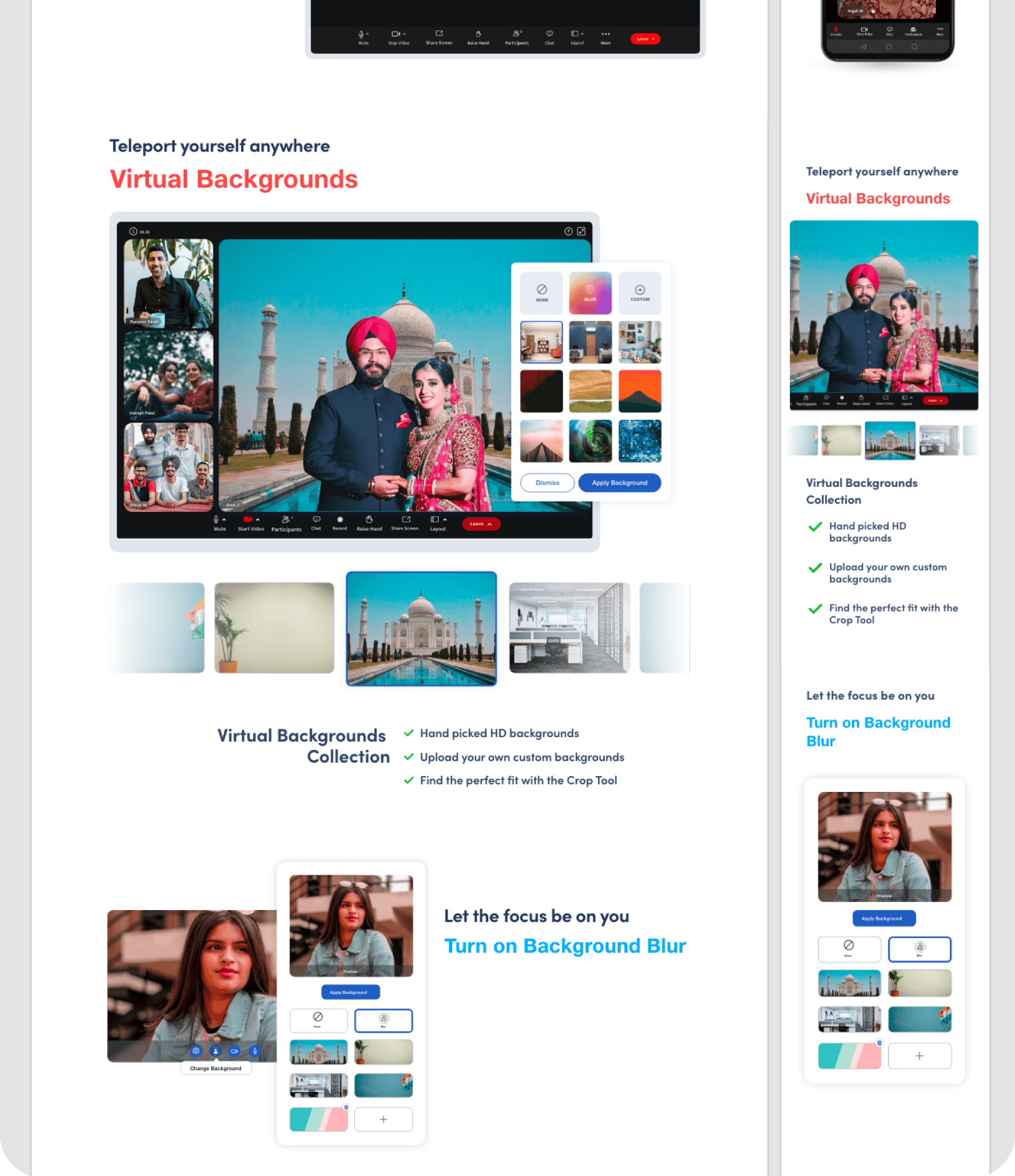
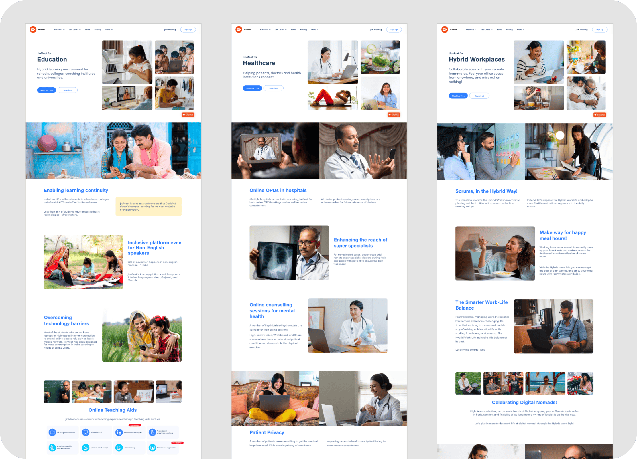
• Structured Product Pages: New product page layouts were designed for better scannability and comprehension. Features are presented with clear descriptions, icons, and visuals. Interactive elements, such as animations on clicking feature cards, were conceptualized to make exploration more engaging.
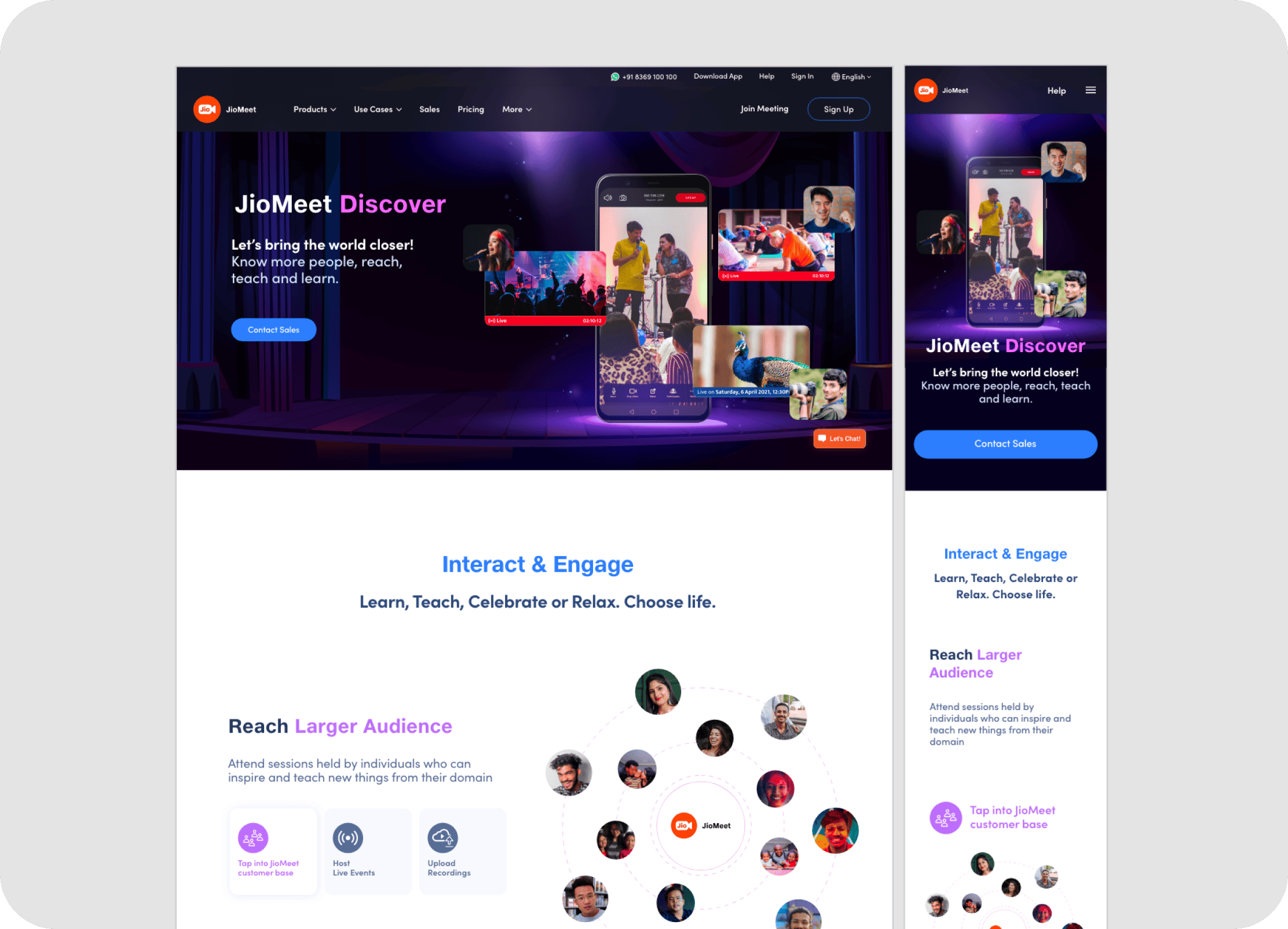
• Warm & Friendly Tone for Retail Users: The JioMeet Retail product pages, in particular, were designed with a "social, warm, and friendly tone" to resonate with the public audience.
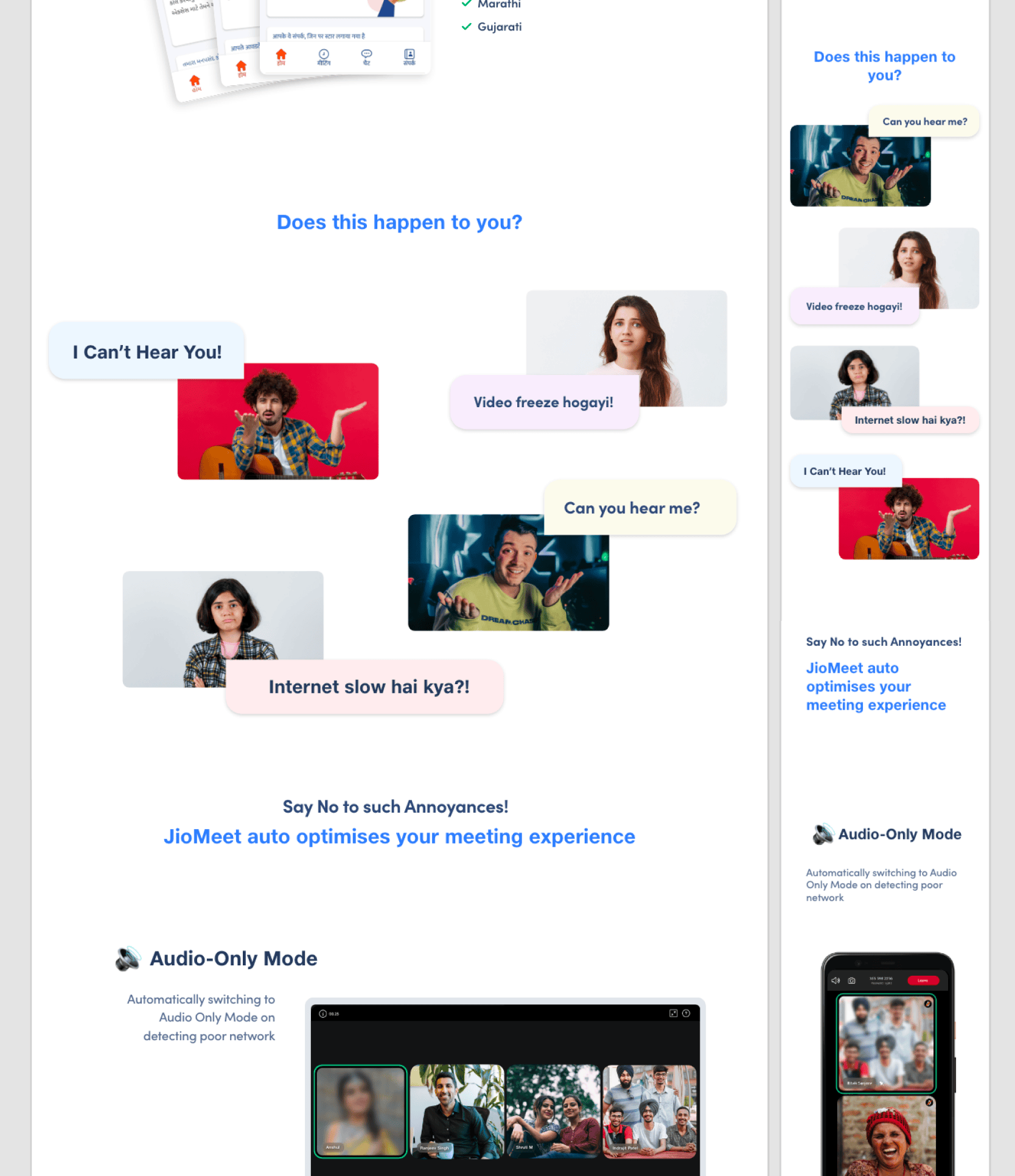
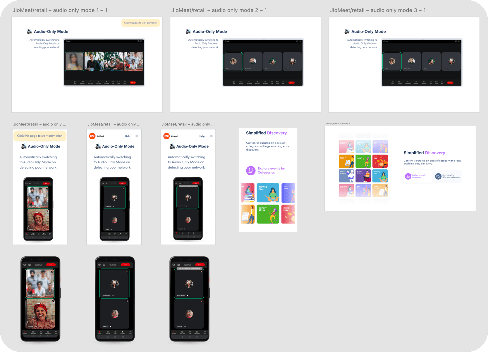
• In-View Feature Animation: The audio-only mode feature was conceptualized with an in-view animation to dynamically draw attention to and explain this key capability.
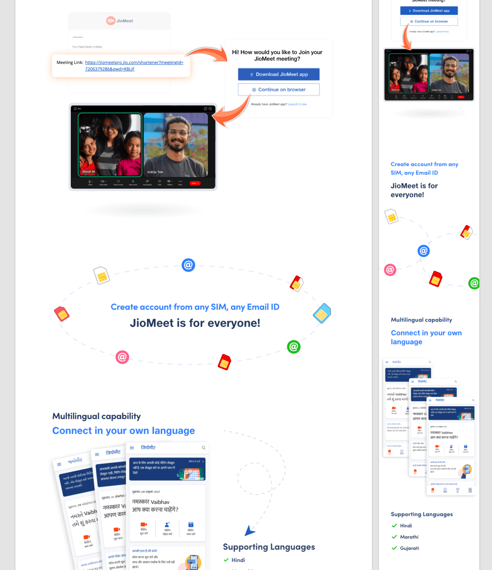
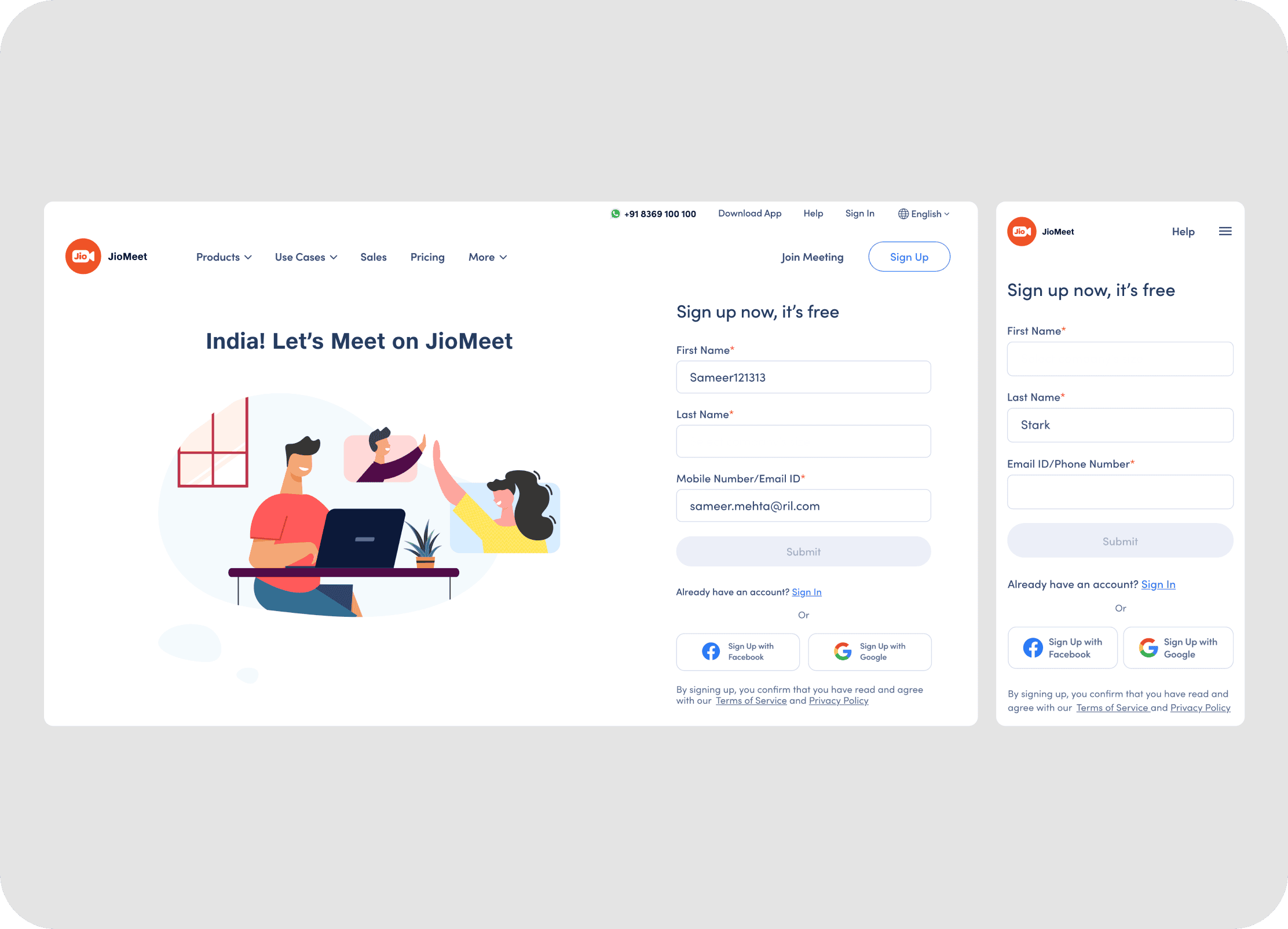
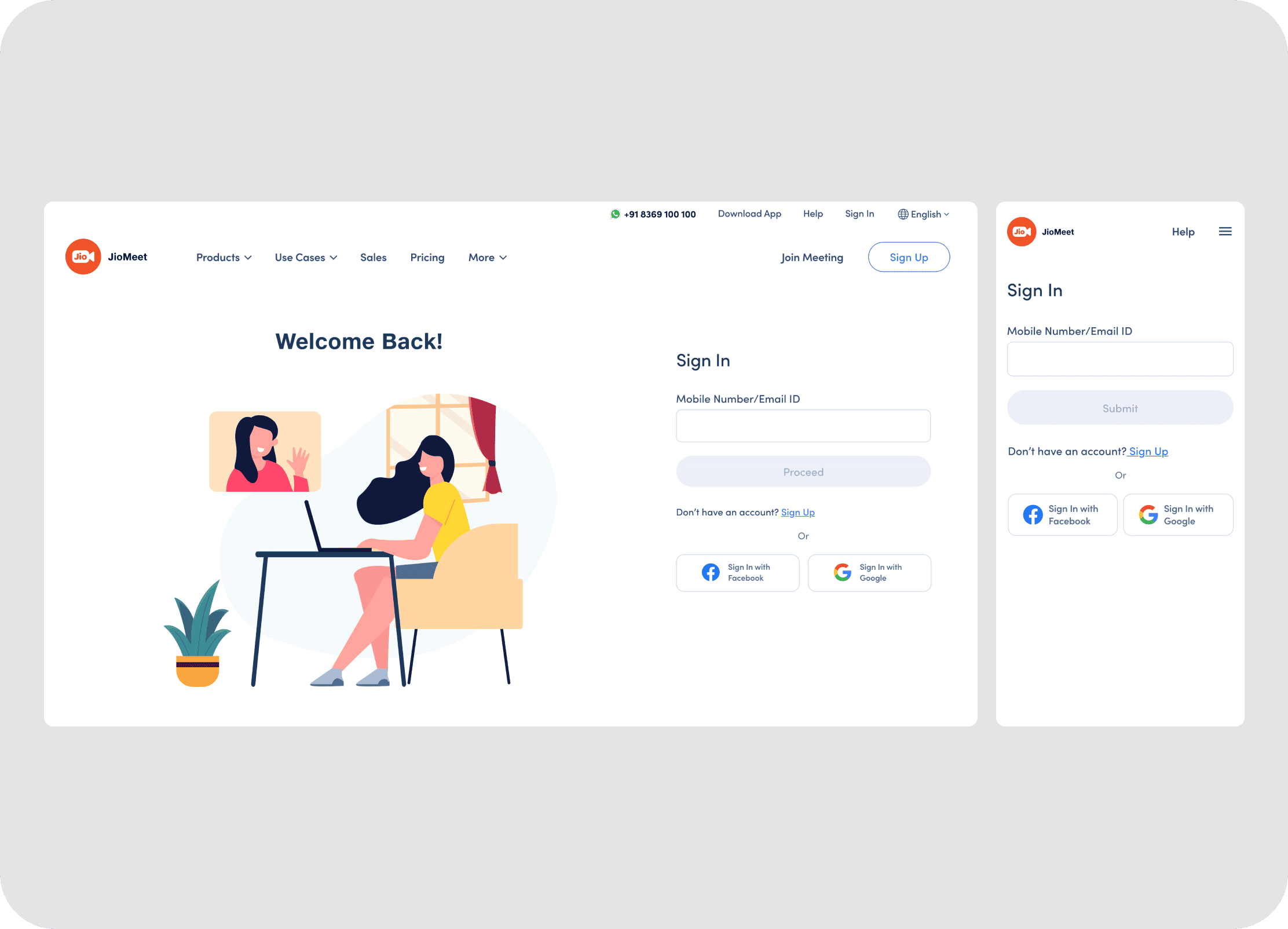
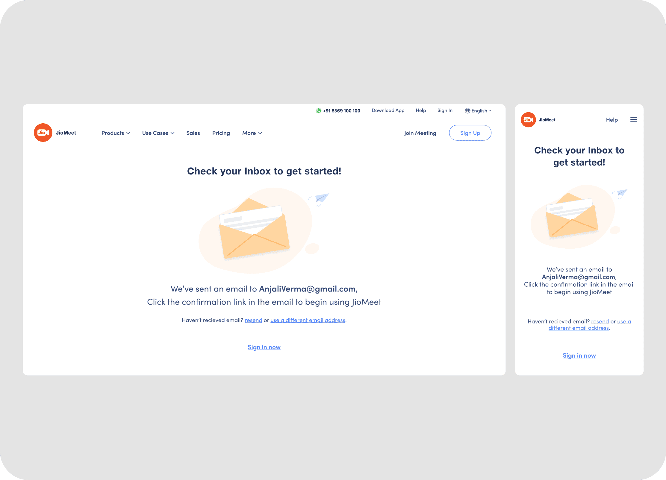
Modernized Authentication Forms: The new sign-up and sign-in pages feature a cleaner, more contemporary design.
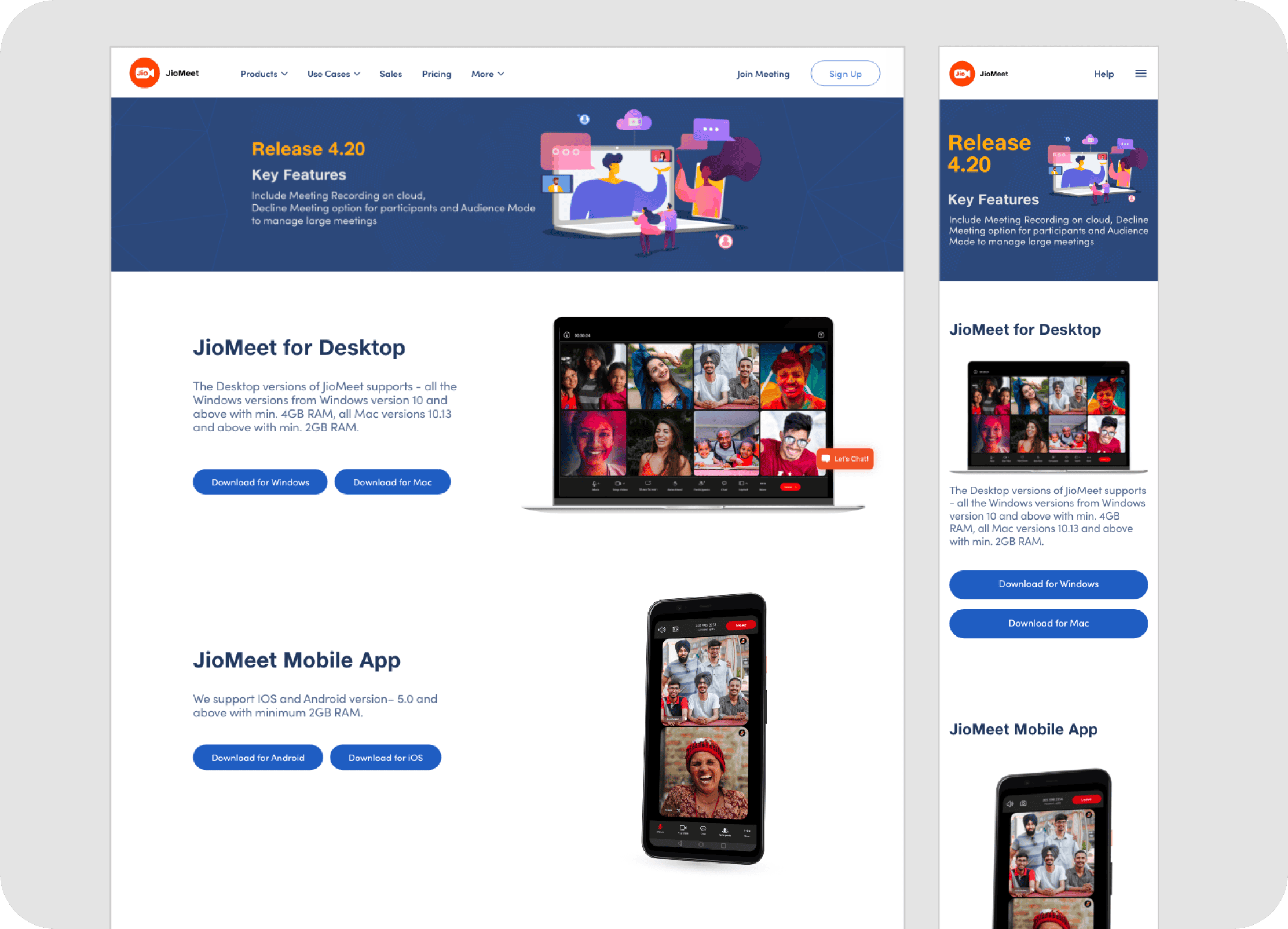
Centralized Download Hub: The new downloads page now serves as a clear, centralized hub for all JioMeet applications.
• Engaging Case Study Presentation: The new case studies section presents success stories in a more compelling and visually engaging manner.
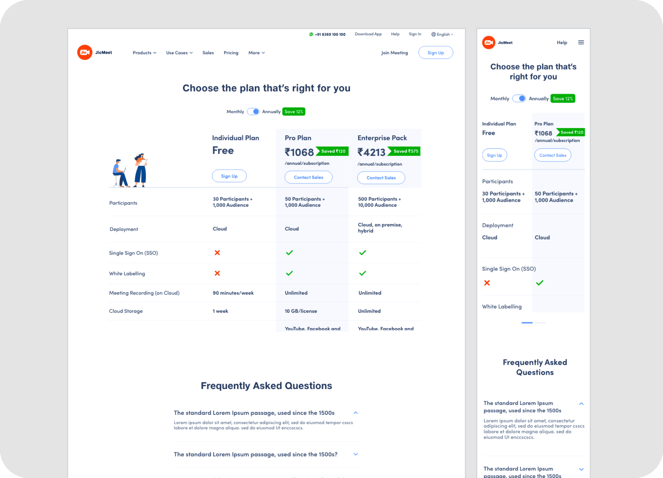
• Clear Pricing Page: The redesigned pricing page offers clear, easily comparable information about different plans. A sticky header was designed for both mobile and desktop versions to ensure key navigation and plan selection elements remain accessible while scrolling.
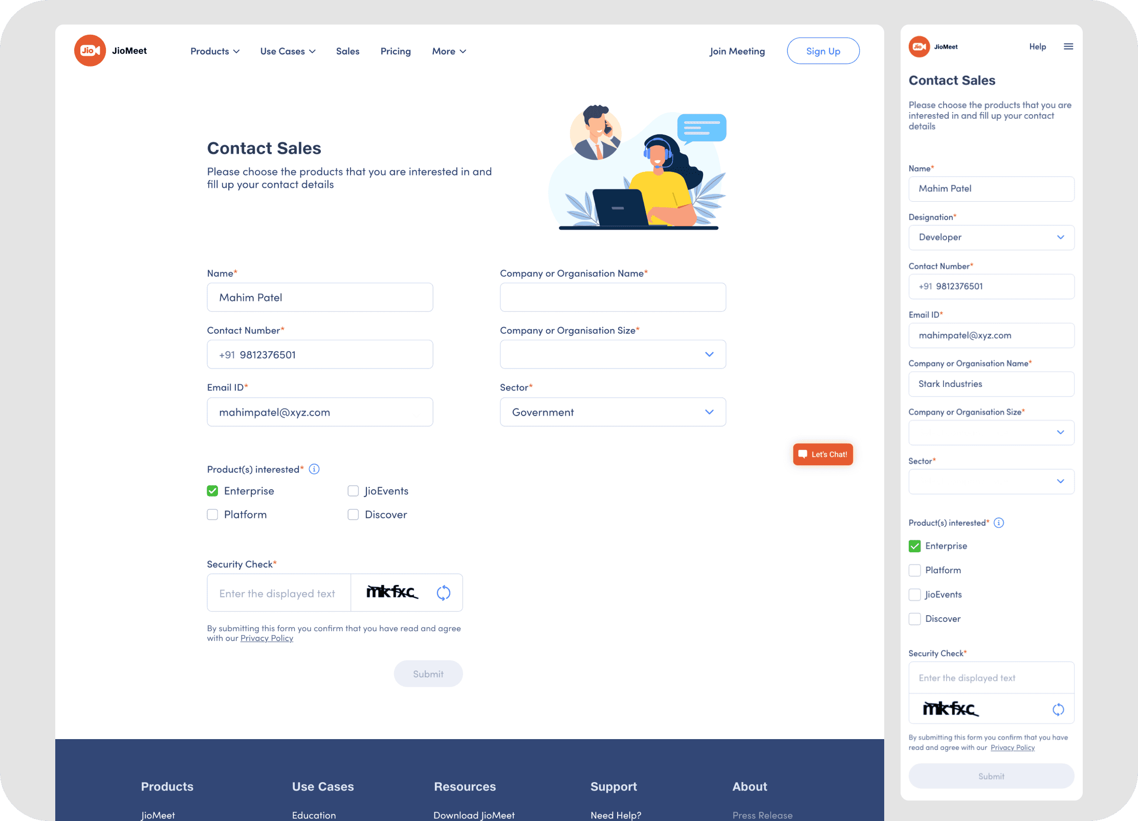
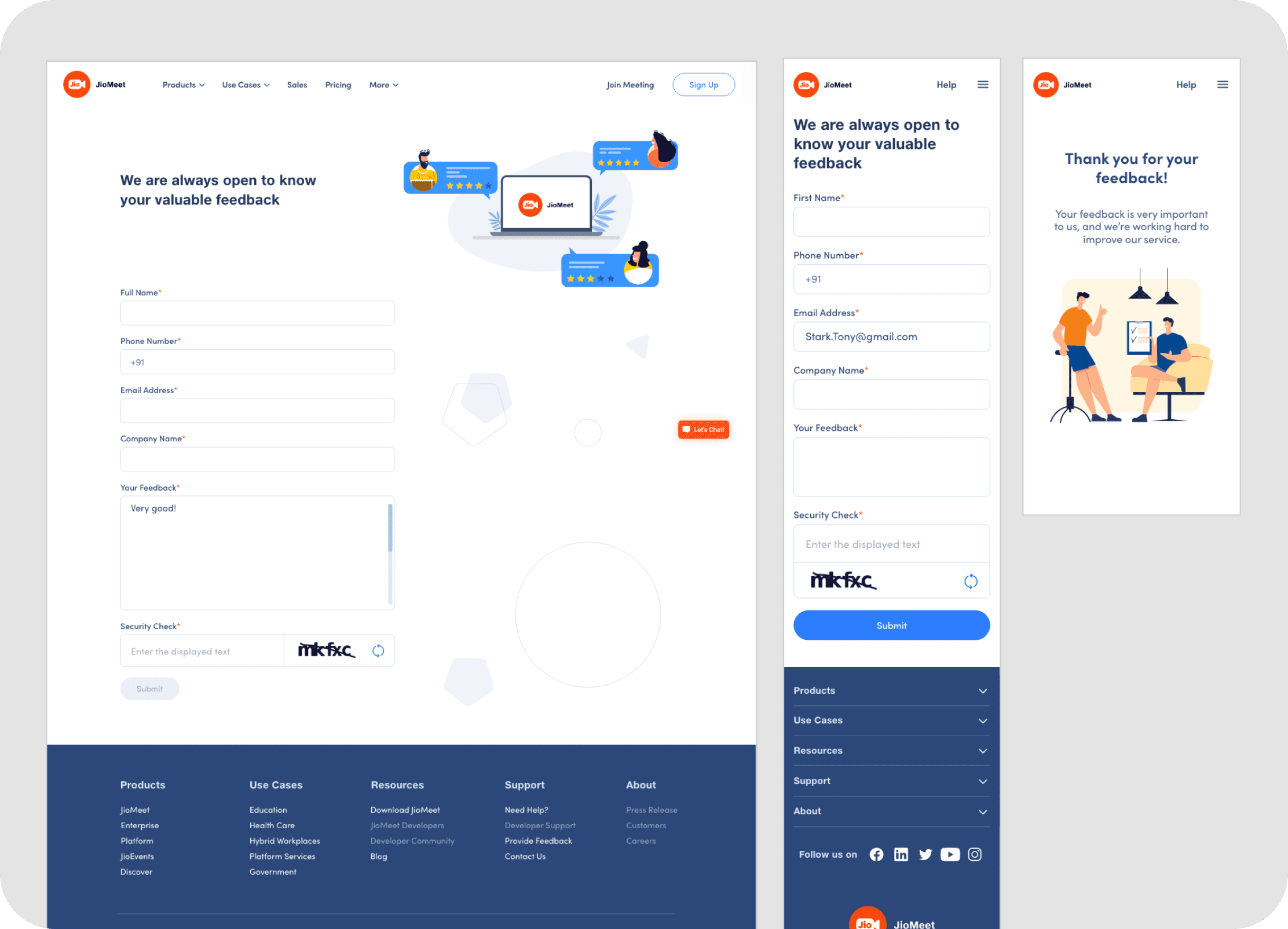
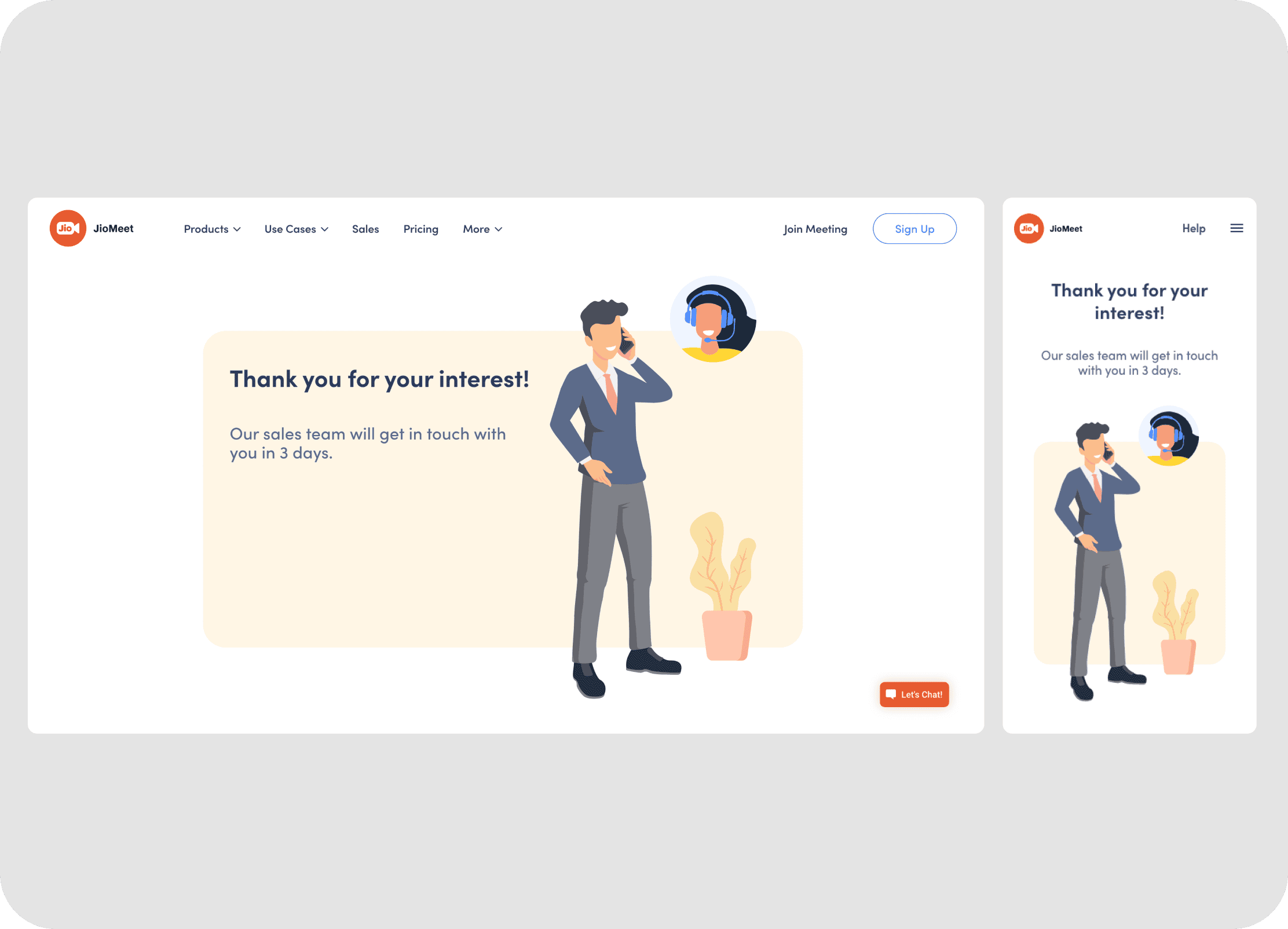
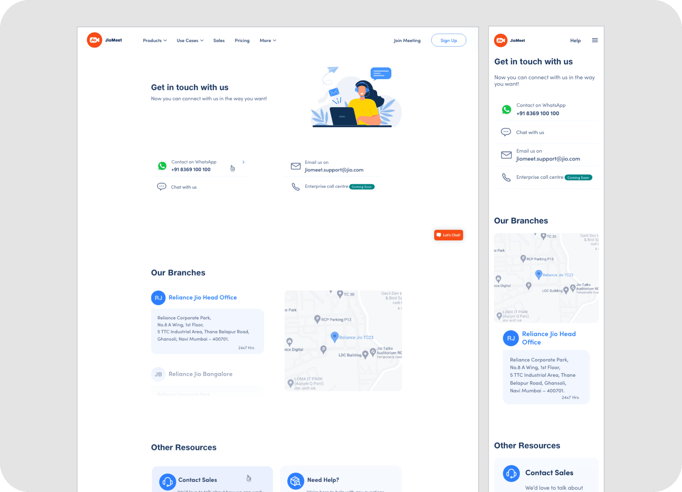
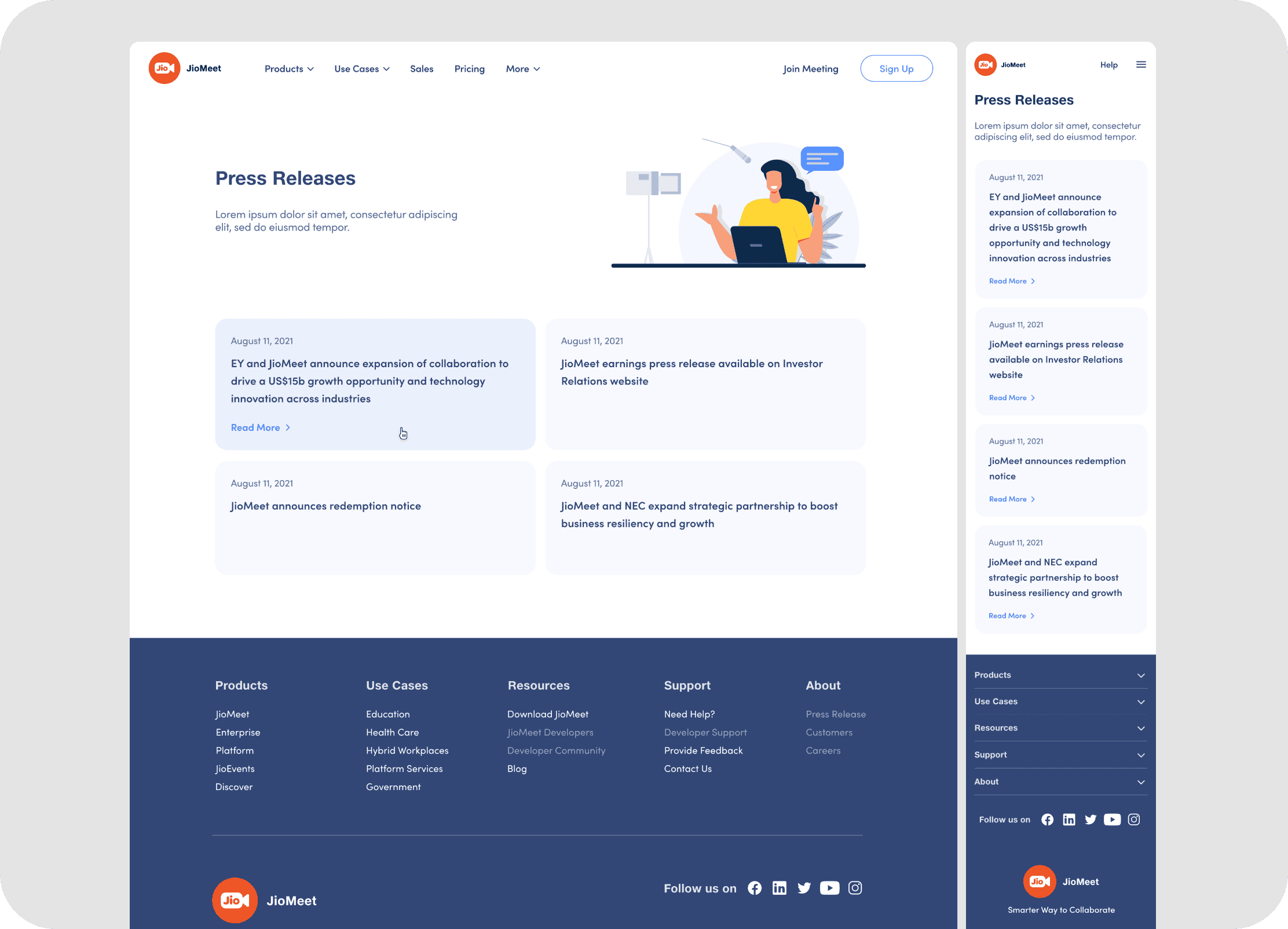
User-Friendly Support Hub: New designs for help and services, contact forms, sales inquiries, feedback mechanisms, and press releases provide clear, accessible pathways for users seeking assistance or information.
Impact
The redesigned JioMeet website, launched towards the end of 2021, contributed significantly to JioMeet's expanding reach and user engagement, as part of the platform's overall impressive growth trajectory.
460%+
Growth in enterprise clients —
from 5 to 28+ companies by Nov 2022
The new platform empowered the sales team and product managers to secure major opportunities. This growth spurred further collaborations and feature requests, particularly from the education and IT sectors.
47%
Increase in Daily Active Users (DAU)
22%
Rise in web app meetings hosted
These metrics indicate that the clearer information, improved usability, and more engaging experience of the new website successfully encouraged more users to adopt and actively use the JioMeet platform directly via the web.
The redesigned direction was approved quickly by senior stakeholders, with feedback reinforcing stronger quality, clearer confidence, and readiness to move into development.

“I really like the design!... no other comments”
Sameer Mehta
Senior Vice President, Jio

“Definitely, it's much better than the previous one... let's proceed for development... we should go live before the end of the year.”
Gaurav Duggal
Senior Vice President, Jio

“I really love the designs you made for the website ❤️...”
Utsuk Srivastava
Product Head, JioMeet
The successful launch garnered congratulations from across the entire department. My contributions were specifically recognized with the Star Award 2022 | Jio Platforms for "extraordinary performance & ownership mindset in the JioMeet Design team."

Learnings
This large-scale website revamp was a journey filled with valuable lessons, challenges, and moments of pride.
Successfully managed diverse stakeholder expectations and complex inter-team dependencies within a large product ecosystem.
Championed design quality while pragmatically navigating scope, ambitious deadlines, and resource limitations.
Fostered strong collaboration and shared responsibility across diverse teams (Design, Dev, QA, PM) to achieve common goals.
Confidently led end-to-end design for a large-scale, multifaceted website overhaul, from strategy to delivery.
Leveraged enhanced web-tech understanding to effectively mediate design-dev discussions and advocate for robust solutions.
Actively mentored colleagues (junior and senior) and cultivated a supportive environment for shared learning and skill development.
Maintained a persistent drive for optimal outcomes while navigating evolving requirements and high-pressure timelines.
Reaffirmed that robust processes, clear communication, deep collaboration, and dedicated skilled resources are critical for future large-scale success.
Continue Browsing