Design SystemsAI WorkflowToken GovernanceFigma PluginInternal Tooling

MakeMyTrip Internal Tooling

Reducing Design-System Drift in Holidays, Tours & Attractions

Built a Figma plugin and AI-assisted workflow to audit, explain, and repair text-color token drift across large MakeMyTrip design files.

AI Design Ops plugin UI over a MakeMyTrip Figma file

7,883

Total issues surfaced on one legacy Tours & Attractions page

4,442

Visible issues requiring review or repair

6

Workflow steps Scan → Understand → Review → Fix → Rescan → Trust

My Role

Lead Designer and individual contributor across problem definition, rule logic, AI-assisted prototyping, and plugin workflow shaping.

Scope

Documentation-first system modeling, internal audit tooling, token cleanup workflow, CSV review output, and AI-agent-ready handoff.

Tools

Figma, Figma Plugin API, Cursor, Claude Code, Codex, Antigravity, Markdown design-system docs, and MakeMyTrip design files.

Status

Self-initiated working prototype and design-ops exploration focused on making token drift measurable and repairable.

Challenge

The problem was not wrong grey. The problem was design-system drift at file scale.

A text-color cleanup request in MakeMyTrip Holidays and Tours & Attractions — escalated from the CPO through an Associate Director of PM — exposed the real issue: many layers looked fine visually while staying structurally disconnected from the foundation system.

A layer can look correct on the canvas and still be wrong if it is not linked to the right token, style, or surface rule.

Visual correctness hid structural debt

Layers looked correct on canvas while bound to raw hex values instead of foundation tokens.

Surface context changed the right answer

The same color value could be correct in one place and wrong in another — surface determined the fix.

Manual review did not scale

Thousands of text layers and hidden rows per file — manual review was too slow and inconsistent to be reliable.

AI generation needed explicit system rules

AI-recreated designs could pass visual review while using the wrong bindings — close enough to look right, wrong enough to matter.

The Short Version

A plugin made the drift measurable, reviewable, and safer to fix.

The MakeMyTrip Text Color Auditor reads the surface behind each text layer, classifies the token-binding problem, and suggests or applies the safest valid repair.

Plugin table as the new audit surface

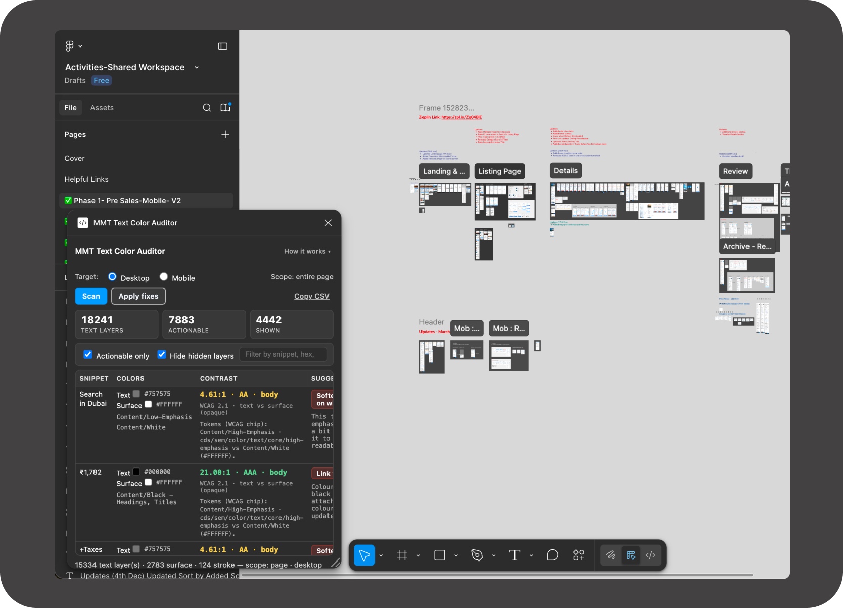
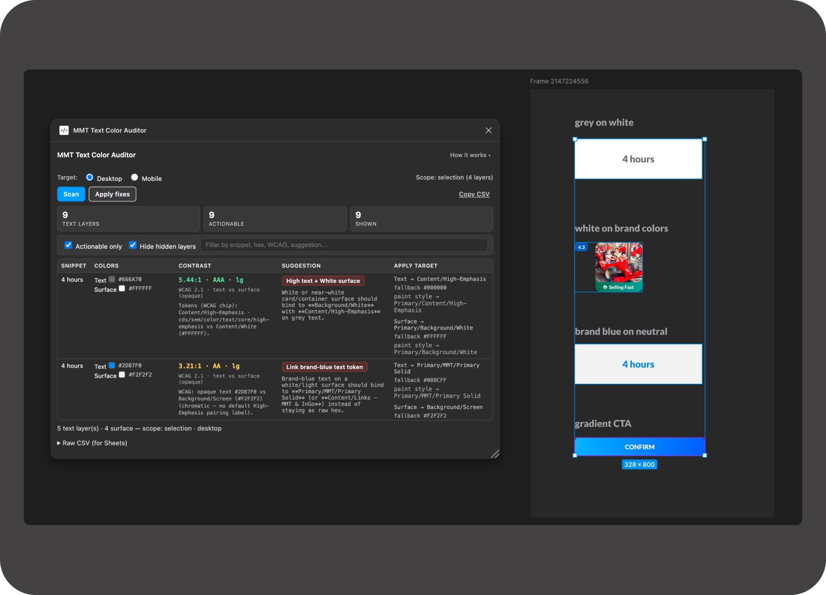
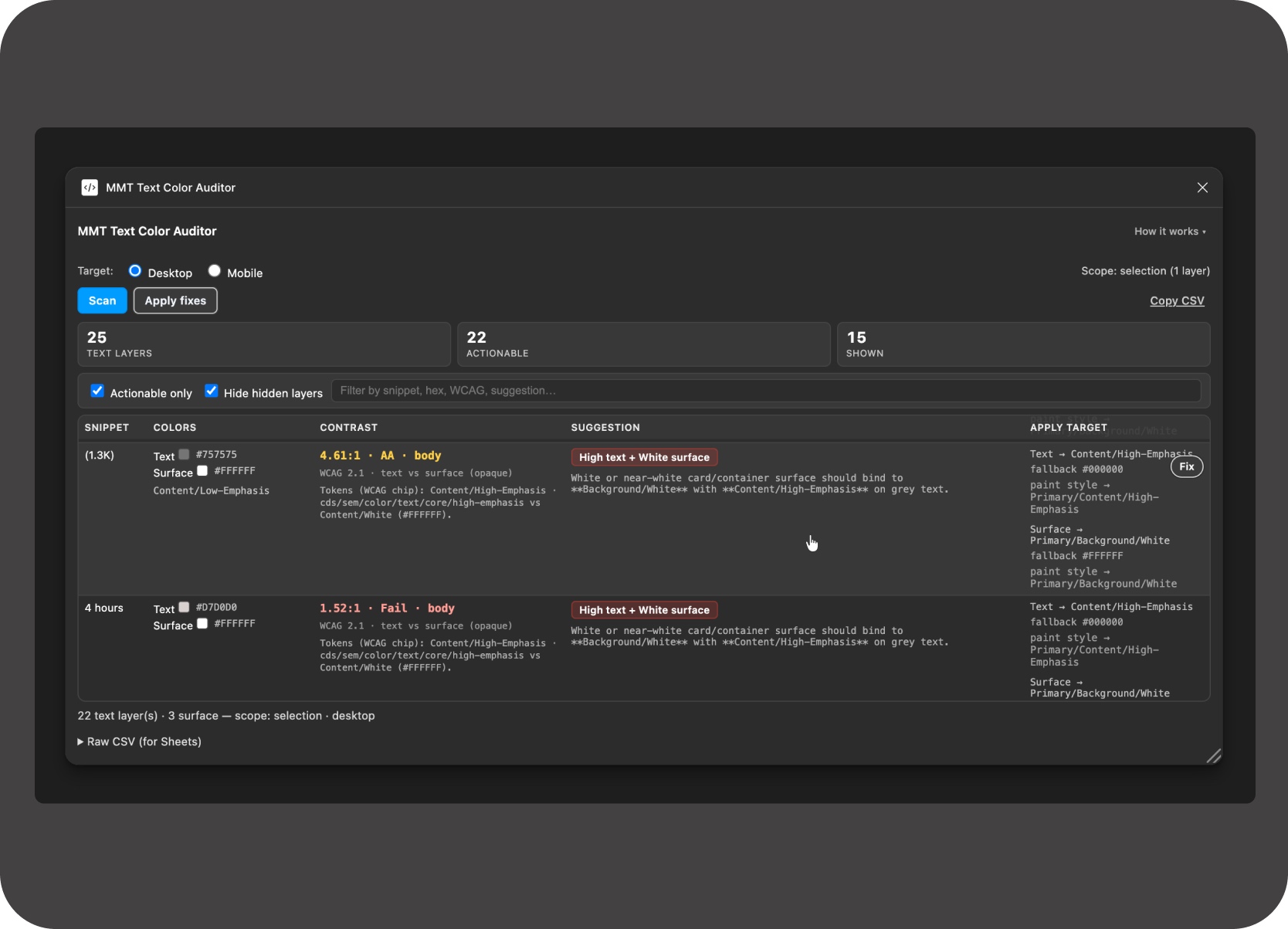
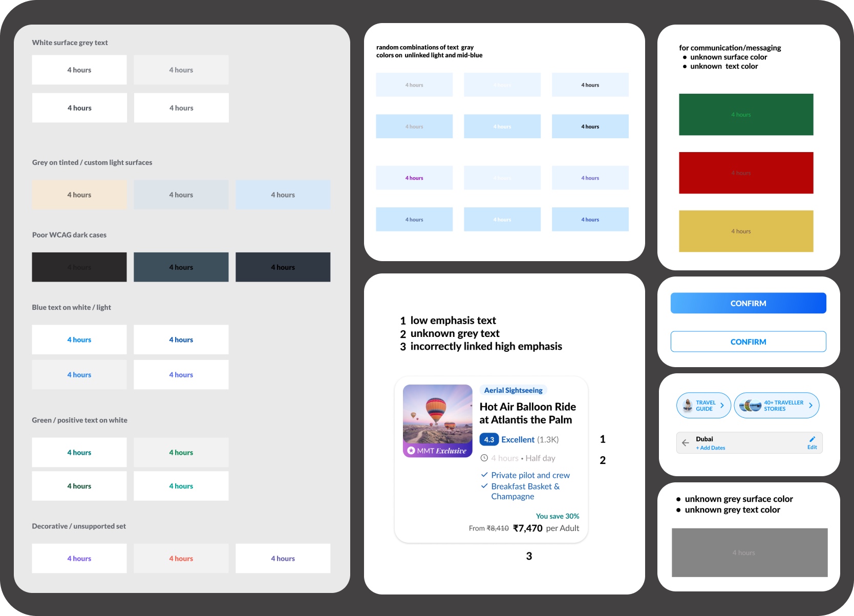
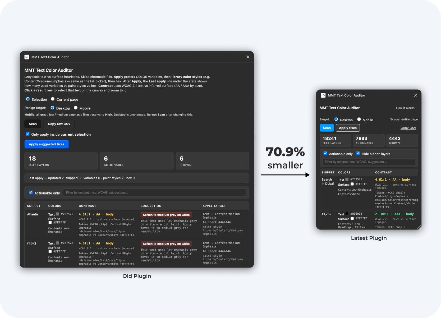
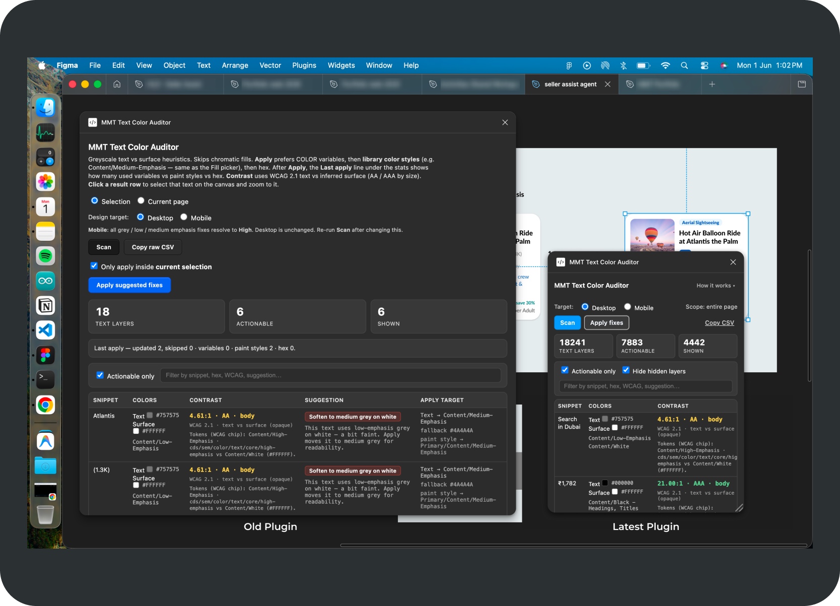
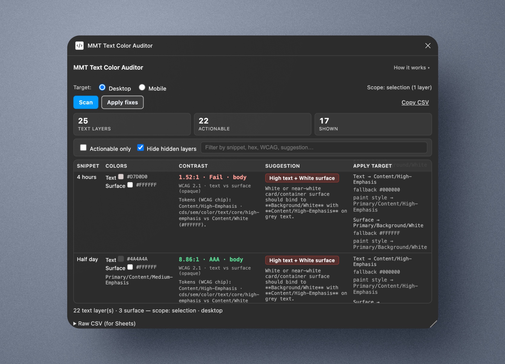
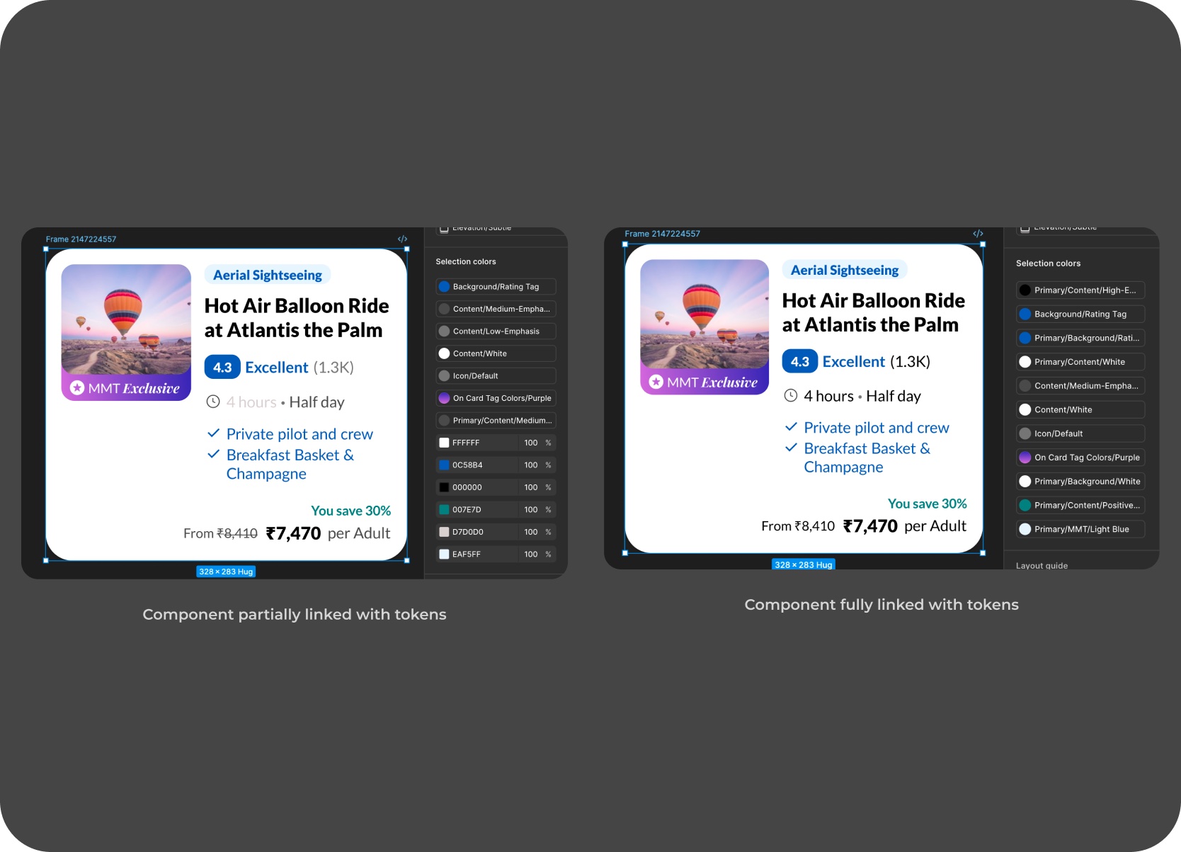
The correct fix depends on the surface behind the text. The plugin distinguishes whether text sits on a:

  • White surface or light neutral
  • Tinted card or brand chip
  • Gradient CTA or secondary button
  • Unknown background

Each surface changes the right answer, which is what turns invisible token drift into a visible, reviewable table.

On one legacy Tours & Attractions page, the audit surfaced 7,883 total issues. Of those, 4,442 were visible and required active review; the rest were hidden, but still contributed to long-term file debt.

Plugin scan table showing issue counts, row notes, and reviewable output

Plugin table screenshot showing issue counts, row notes, and reviewable output.

From manual checking to repeatable audit

Before

After

Designers manually inspected text layers.

A scan turns drift into a review table with counts, row notes, and surface context.

Cleanup quality varied by file, reviewer, and available time.

The same rules and categories are applied every time.

The issue looked like scattered styling mistakes.

The issue becomes measurable design-operations debt.

Problem Framing

This could not be solved with a simple find-and-replace.

The correct fix depended on the surface behind the text, the semantic role of the color, the existing token binding, and whether the case was safe enough to automate.

The MMT design foundation used styles that looked like variables but weren't. Tokens had been renamed without documentation, Figma had evolved past the design foundation, and attaching files to the Figma Make library introduced typography drift and token mismatches rather than fixing them — including in AI-generated designs. Surface inference, not token lookup, was the only reliable path.

UI situation

What the tool needed

Grey text on white or light neutral

Usually needs medium-emphasis treatment

High-emphasis text on neutral

Should stay high-emphasis or be correctly bound

White text on brand chip or dark surface

Should preserve white or inverse token

Blue link text

Should map to a brand or semantic token

Gradient CTA or tinted chip

Needs separate surface-aware treatment

Unknown chromatic text

Needs manual review, not unsafe auto-fix

Surface-aware examples

Grey on white

Low or unknown grey on a light neutral surface should usually move to medium emphasis.

White on brand chip

Inverse text should be preserved instead of normalized into a neutral token family.

Blue link on neutral

Semantic or brand blue should bind to the right brand token, not be treated as generic text.

Unknown chromatic text

Ambiguous semantics are routed to manual review instead of unsafe auto-fix behavior.

Surface-aware rule examples covering grey on white, white on chips, links, and manual review

Surface-aware rule examples covering grey on white, white on chips, links, gradients, and manual review.

My Role

The design work was in translating messy system behavior into clear audit rules.

This was not primarily plugin UI work. The deeper challenge was deciding what the tool should trust, what it should explain, and where it should stop.

System logic before interface polish

The non-obvious part was realizing the correct fix couldn't be determined from the text color alone — it depended on the surface behind it, which the plugin had to infer and sometimes refuse to guess.

The goal was to create a workflow that designers, developers, and future AI agents could all understand and extend. The plugin UI was one artifact; the more durable deliverable was the documented system logic behind it.

Markdown docs, workflow references, and plugin logic notes

Markdown docs, workflow references, and plugin logic notes used to shape the audit system.

Guiding Principle

Audit first. Fix only when the system is confident.

The plugin was intentionally conservative. It should reduce repetitive inspection work, but not pretend automation can replace design judgment.

Three states

Already correct. Actionable fix. Check manually.

Workflow loop: text layer → detect fill → infer surface → check binding → suggest fix or manual review.

What I Built

The plugin was proof. The workflow was the product.

Fix-order logic, reviewer-friendly output, and portable documentation turned it into a system, not just a one-off utility.

  1. A Figma text-color audit plugin
  2. A surface-aware rule engine
  3. Token binding with safe fallbacks
  4. CSV export and AI-agent-ready docs

1. A Figma text-color audit plugin

The plugin scans the selected frame or current page and produces a review table. Each row includes:

  • Layer name and text snippet
  • Node ID and current text color
  • Detected token or style, and inferred surface
  • WCAG contrast information
  • Suggested target token and explanation note
  • Hidden-layer flag and fix state
Plugin scan table showing audit rows, issue details, and review columns

Plugin scan table showing audit rows, issue details, and review columns.

2. A surface-aware rule engine

The key challenge was not reading the text color. It was understanding the surface behind the text so the plugin could tell whether a color should stay, strengthen, bind to a token, or move to manual review.

Surface-aware rule engine showing inferred surface decisions and review context

Surface-aware rule engine showing inferred surface decisions and review context.

3. Token binding with safe fallbacks

A visual match was not enough. The plugin attempts fixes in a deliberate order: variable first, then linked paint style, then canonical hex only when necessary. That kept the workflow aligned with the foundation system instead of creating more cleanup.

Token binding workflow showing safe fallback order and repair behavior

Token binding workflow showing safe fallback order and repair behavior.

4. CSV export and AI-agent-ready docs

Audit output could be exported to Sheets or Excel for handoff and review. I also documented the rule logic in Markdown so other designers, developers, or AI agents could understand how the system worked and where it should be extended. What started as a verification aid also became a practical developer artifact when someone needed a manual list of mismatches outside the plugin UI.

Workflow video showing CSV export, spreadsheet handoff, and documentation flow.

CSV export and AI-agent-ready docs showing sheets, exports, and documentation views

Reference image showing export structure, sheet output, and AI-agent-ready documentation views.

AI Workflow

AI was used as a production and systems-thinking accelerator.

Four elements worked together to turn a manual design-operations problem into a repeatable workflow:

  • Explicit Markdown documentation to define system rules
  • AI-assisted coding tools to prototype and iterate the plugin
  • Repeated testing against real MakeMyTrip design files
  • Human review to catch what automation would have missed

From generation to governance

Before the plugin, a prior project had produced eight Markdown files — 66kb of MakeMyTrip Holidays design-system documentation covering tokens, components, and surface rules. Sharing those files with any lightweight AI model was enough to generate MMT-fidelity layouts without touching a Figma library.

Documentation-first modeling was chapter one. The plugin was chapter two — the same rule logic applied in reverse to audit existing files instead of generating new ones.

AI workflow process showing generation, governance, and documentation context

Plain-text documentation structured enough for a machine to generate MMT-fidelity layouts — which proved the rule system was already complete. The plugin just applied it in reverse.

Figma Make generating an MMT Holidays Italy card from the design-system documentation

MMT Holidays Italy card generated from documentation alone — no Figma library attached. Proof that the docs were doing real system work, not just serving as reference.

The goal was not "AI-made design." The goal was AI-assisted design operations.

Design Decisions

Trust mattered more than automation theater.

The most important product-quality work was deciding when not to fix, how to explain edge cases, and how to make repeated scans believable.

Do not auto-fix ambiguous cases

If the background, contrast, or semantic role is unclear, the plugin should ask for review instead of making a risky edit.

Explain the reason, not just the error

Each row should say why it is wrong: low-emphasis on neutral, unbound white text, chromatic review, or already-correct token behavior.

Keep row-level control

Bulk apply helps, but the reviewer still needs a one-row fix loop while staying close to the Figma canvas.

Keep hidden layers visible but filterable

Hidden layers still contribute to file debt. The plugin can scan and export them, while giving the reviewer a way to hide them from the working table.

Make rescans trustworthy

After a correct fix, the next scan should collapse that issue into already-correct instead of producing no-op work.

Decision-support video showing row focus, hidden-layer filtering, manual review, and rescan-result trust checks.

Scale

From isolated cleanup to measurable design-operations debt.

The Tours & Attractions Figma file covers 20 pages of desktop and mobile designs across multiple funnels. One older desktop page alone surfaced 7,883 total issues, with 4,442 requiring active review. That is one page, from one product area.

7,883 total issues

Total text-token issues surfaced on one older Tours & Attractions page.

4,442 visible issues

Visible rows that required active review, action, or confirmation.

Hidden debt still counted

Hidden rows remained relevant because they still contributed to long-term file complexity.

One funnel of many

T&A is one product area. The same drift pattern exists across Holidays, Flights, Hotels, and every other MakeMyTrip funnel.

Page-level scan at 10× speed showing issue counts and category spread across the audit surface. The progress bar reflects how much text content the plugin is processing — quick on a single component, noticeably slower on a dense legacy page.

Process

From a token cleanup ask to a reusable audit-and-repair loop.

Each iteration tightened the rules, improved review quality, and made the next scan more trustworthy.

The earlier Cursor-led version helped expose the problem but was wide enough to block the canvas. Figma centers the selected node in the visible window — the older panel extended far enough across the horizontal midpoint that the target could land behind it.

The later Claude Code and Codex passes turned it into a tighter, resizable audit surface built for repeated scanning, faster review, and higher trust after each apply-and-rescan cycle.

  1. 01Started with a token cleanup ask

    The initial problem was outdated low-emphasis text usage and broken text-color bindings.

  2. 02Mapped the edge cases

    I documented how text behaved across white cards, tinted chips, secondary buttons, gradient CTAs, and semantic surfaces.

  3. 03Built the first scan

    The first version detected text colors and turned hidden debt into issue rows.

  4. 04Added surface intelligence

    The plugin evolved from color detection into surface-aware reasoning.

  5. 05Added repair and row-level fixes

    The workflow moved from audit-only to audit-and-repair with variable, style, and hex fallback logic.

  6. 06Hardened for trust

    Later iterations improved hidden-layer filtering, gradient recognition, progress behavior, and rescan idempotency.

Latest plugin compared against the older larger panel, showing the compact trust-oriented audit workflow

Latest compact plugin state. The panel is smaller, resizable, and focused on current-page review, so the issue table stays usable without covering the centered target Figma brings into view.

Older larger plugin state beside the later compact version, showing the workflow before the UI and process were tightened

Earlier larger plugin state beside the later reduced panel. It helped prove the audit gap, but its width and fixed footprint made target inspection harder once Figma centered the selected issue on canvas.

Outcome

The value was not only the plugin. The value was the workflow.

The project turned manual text-color cleanup into a repeatable audit-and-repair loop that made design-system debt visible, actionable, and safer to manage.

The plugin was presented in a cross-functional review with the Head of Design, design manager, design director, a UX Designer II, the Associate Director of PM, and developers. It was well-received. It was subsequently shared with other designers on the team, who began using it in their own workflows. There are plans to build on top of it further.

The longer-term next step was to share the codebase so developers could port the same audit logic into their own environment — AI agents running the same rules, no Figma access required. The more immediate path was the exported CSV: a structured output developers could use directly to triage and fix issues on their end.

The durable asset was the documented repair system — rules, outputs, and handoff logic that could keep working even after the plugin UI stopped being the main entry point.

  1. 01Scan
  2. 02Understand
  3. 03Review
  4. 04Fix
  5. 05Rescan
  6. 06Trust

Foundation drift made measurable

7,883 issues on one T&A page — invisible debt turned into a countable review table.

Explicit rules made AI a reliable collaborator

Documented rules let AI generate correct logic — not just code that looked right.

Designer-led leverage, no sprint needed

Rules, plugin, edge cases, documentation — one designer, no engineering sprint.

The system can outlive the plugin

The intended handover was the full codebase — so developers could use their own AI agents to run the same logic without the plugin UI.

Reflection

The most leveraged design work isn't always customer-facing.

The strength of this project is not market polish. It is systems leverage, design judgment, and operational clarity.

What this proved

A lead designer's highest-leverage work is not always on the customer-facing screen. Sometimes it's creating systems that help a whole team move faster and make fewer foundation mistakes.

Debt becomes easier to solve once it is visible

Token drift went from a vague concern to a table with counts, fix states, and a clear path forward.

Documentation makes AI more reliable

Documented rules gave AI tools enough context to generate useful logic. Human review caught what automation missed.

Internal tools need trust, not just automation

No auto-fix, explain the reason, make rescans safe to repeat — every decision was about building confidence over repeated use.

Designers can build reusable infrastructure

Audit rules, surface inference, repair order, CSV export, docs — defined by one designer, extensible to developers and AI agents on any future file.