Limited Self-View
The educator wanted a full-screen view of their own video feed during classes for better self-monitoring and engagement.
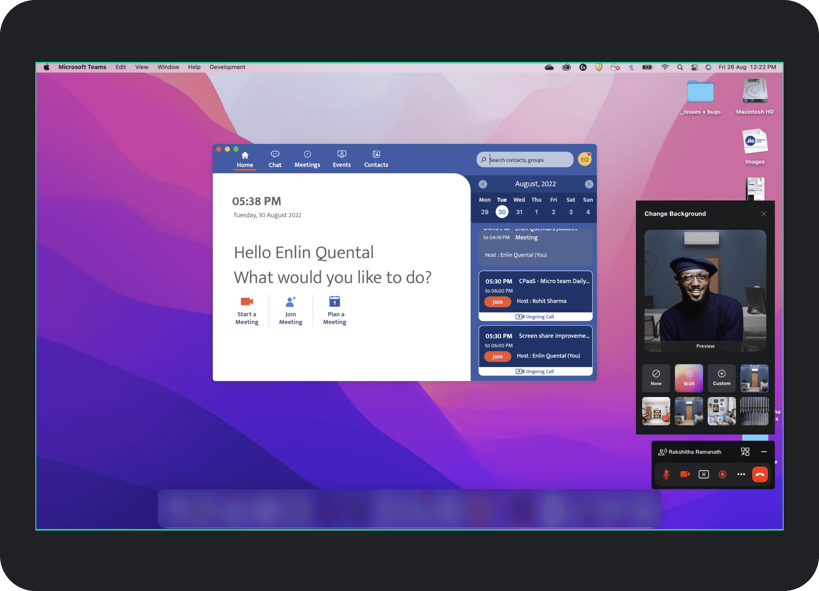
JioMeet PIP & Screenshare Refresh
Driven by critical user feedback highlighting a major experience gap in JioMeet's existing 2020 screenshare and Picture-in-Picture flow, this three-week redesign significantly improved usability and achieved up to an 82.5% reduction in PIP clutter.
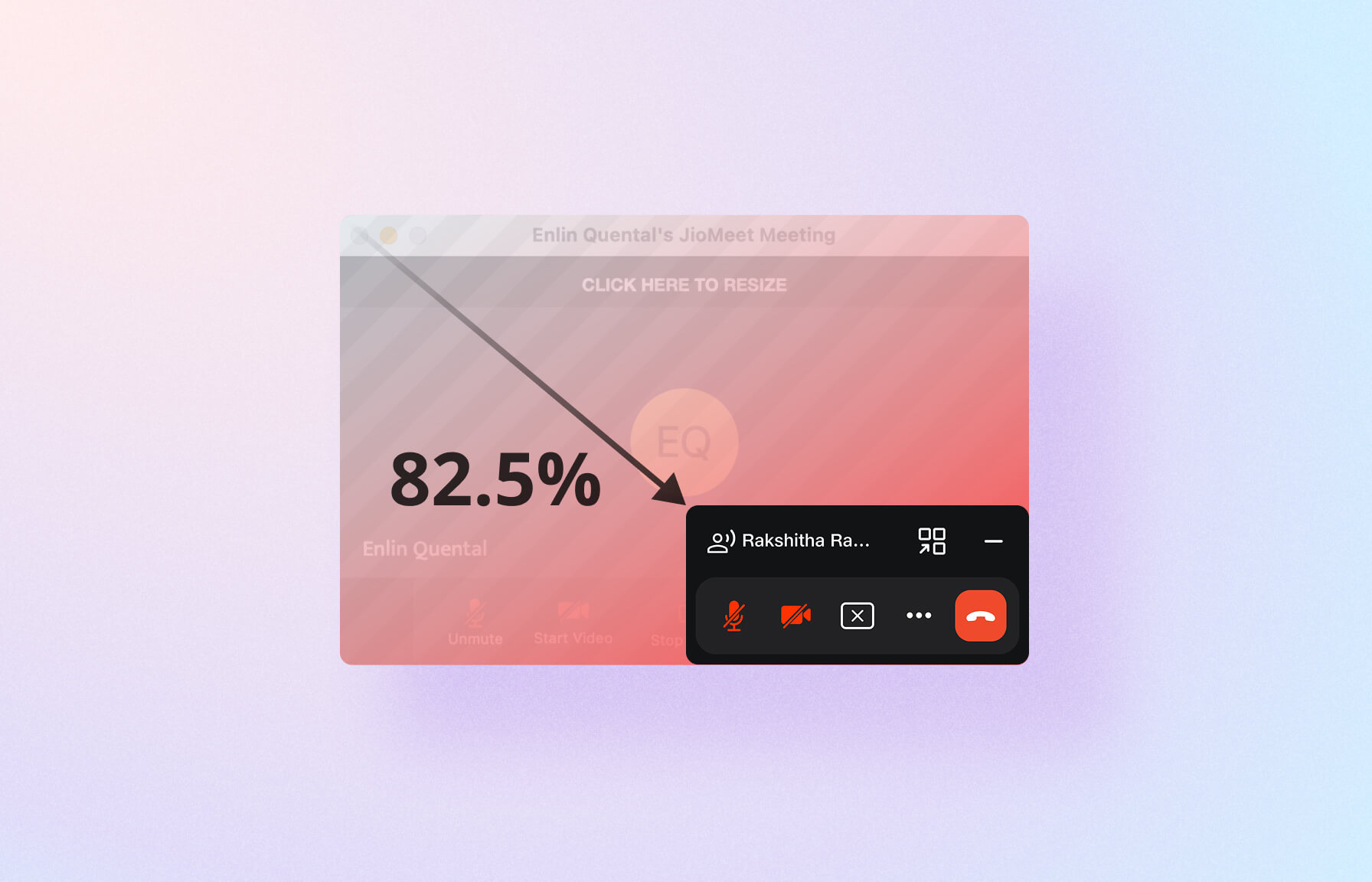
82.5%
Maximum reduction in PIP clutter
90%
Rise in high satisfaction ratings post-launch
85%
Reduction in reported usability issues
My Role
Responsible for research, benchmarking, ideation, design, testing, and delivery of key modules and feature areas.
The Team
1 designer,
1 product manager,
5+ engineers
Timeline
Aug 2022 · 3 Weeks
Delivery Constraint
Improvements had to be meaningful but still fit a rapid implementation window with minimal technical change.
Challenge
Critical feedback from the education segment exposed a major usability gap in JioMeet's existing screenshare and Picture-in-Picture flow.
The educator wanted a full-screen view of their own video feed during classes for better self-monitoring and engagement.
They also needed a screensharing experience that felt more intuitive and far less cluttered than the existing flow.
This feedback mattered because education was a key JioMeet use case. The opportunity was to rapidly deliver improvements that reduced friction in core collaboration moments while keeping technical change intentionally constrained.
Role
As the sole designer on this initiative, I owned the end-to-end design process and worked within a pragmatic delivery model.
Focused on the most impactful design changes that could be implemented with minimal technical change and rapid delivery.
Worked closely with the product manager and engineering team to define scope, feasibility, and implementation priorities.
Kept the educator's feedback and the broader need for a calmer, more intuitive experience at the center of the redesign.
Moved quickly from research and analysis through ideation, prototyping, and testing to reach the strongest solution inside a three-week window.
Research
To understand what was broken and what better looked like, the work combined heuristic evaluation, benchmarking, and synthesis of the strongest UX gaps.
Misleading Icons: The screenshare icon resembled an "open in new tab" action, creating confusion. The entire toolbar set also felt outdated and no longer aligned with JioDesign System 2.0.
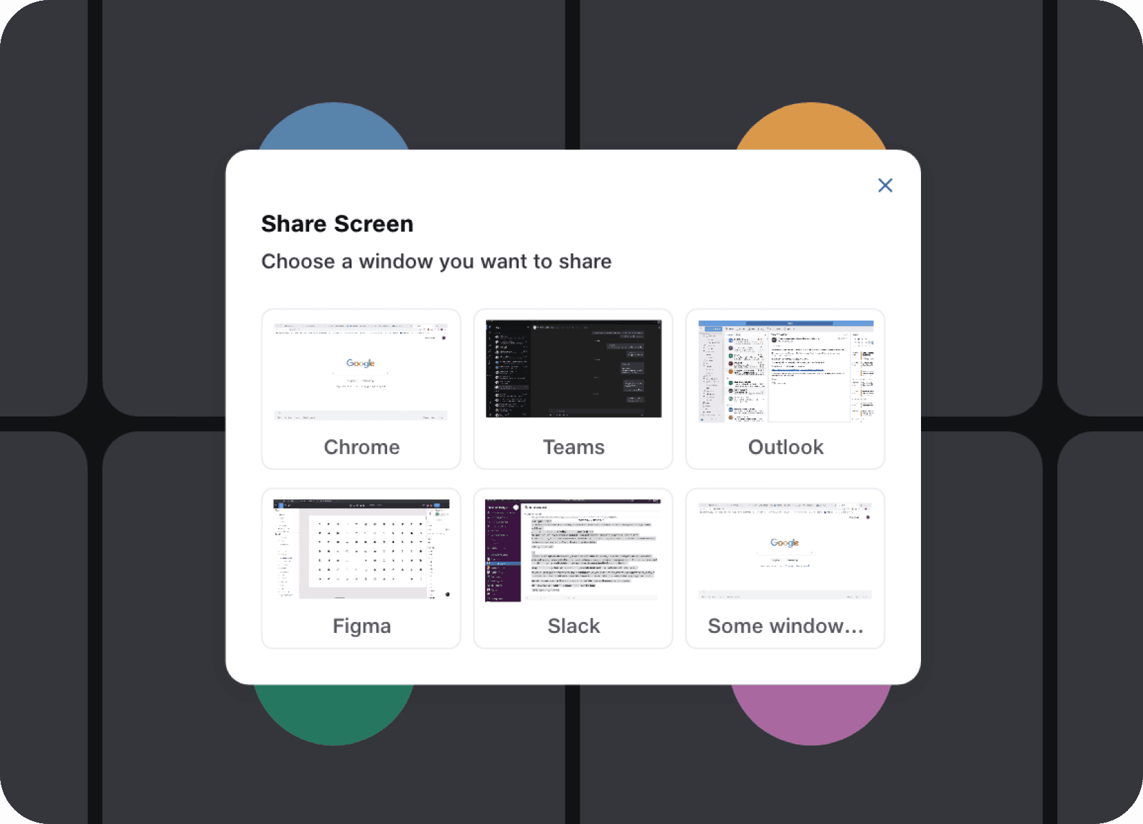
Limited Sharing Options: The share window only supported open application windows and lacked direct ways to share the full display or a whiteboard.
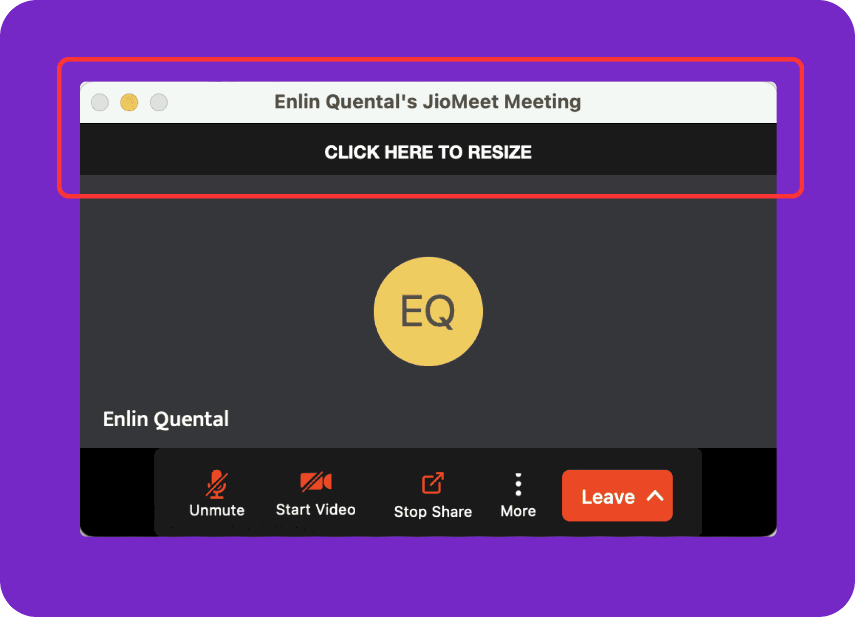
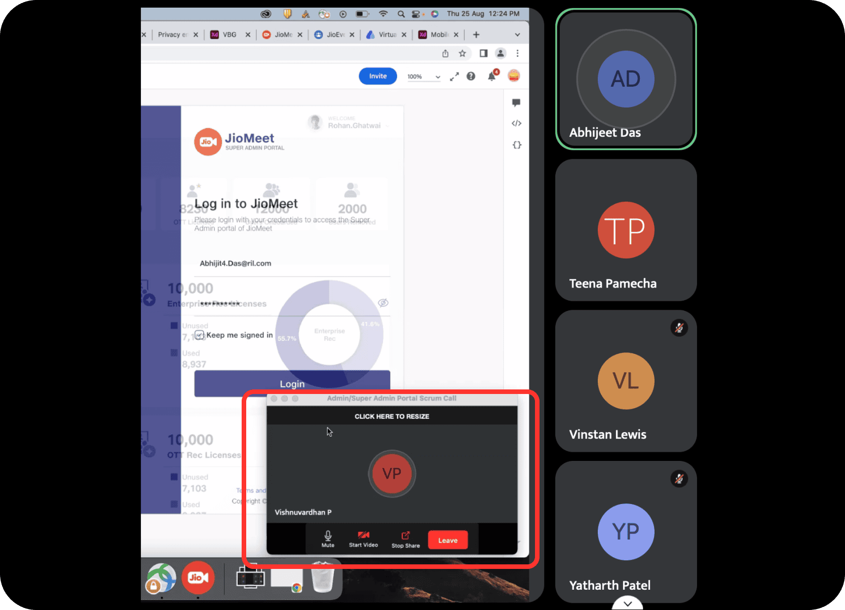
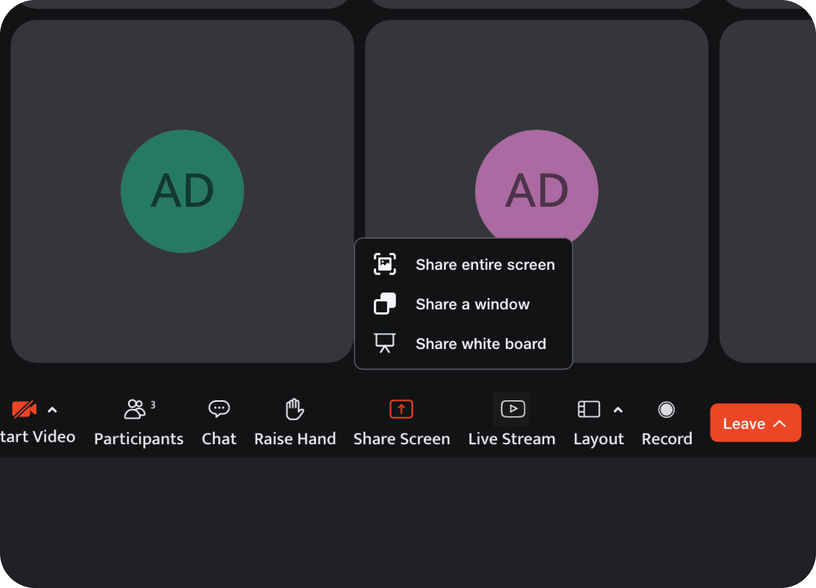
Excessively Large PIP Window: During screensharing, the PIP consumed too much screen real estate and distracted from the content being presented.
Outdated PIP Icons: The controls inside the PIP did not follow JDS 2.0.
Hidden Audio Sharing Settings: Users struggled to locate settings for sharing media audio, breaking presentation flow.
Redundant UI Elements: Underused elements like the resize strip and system buttons added visual clutter without improving the experience.
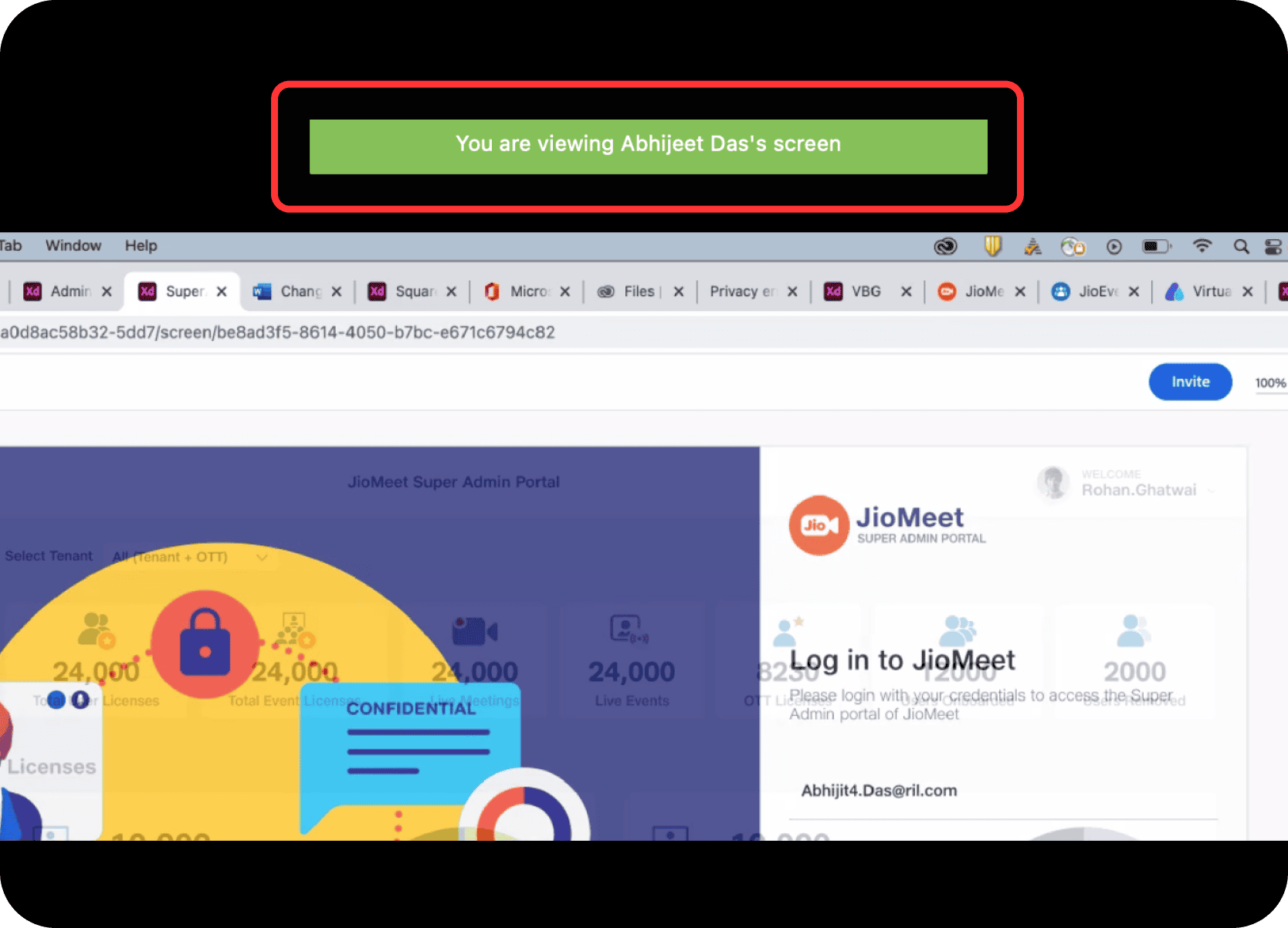
Distracting Presenter Indication: A bright green presenter badge pulled too much attention for viewers.
Limited Viewer Layout Options: Viewers could not hide participant tiles to expand the shared content.
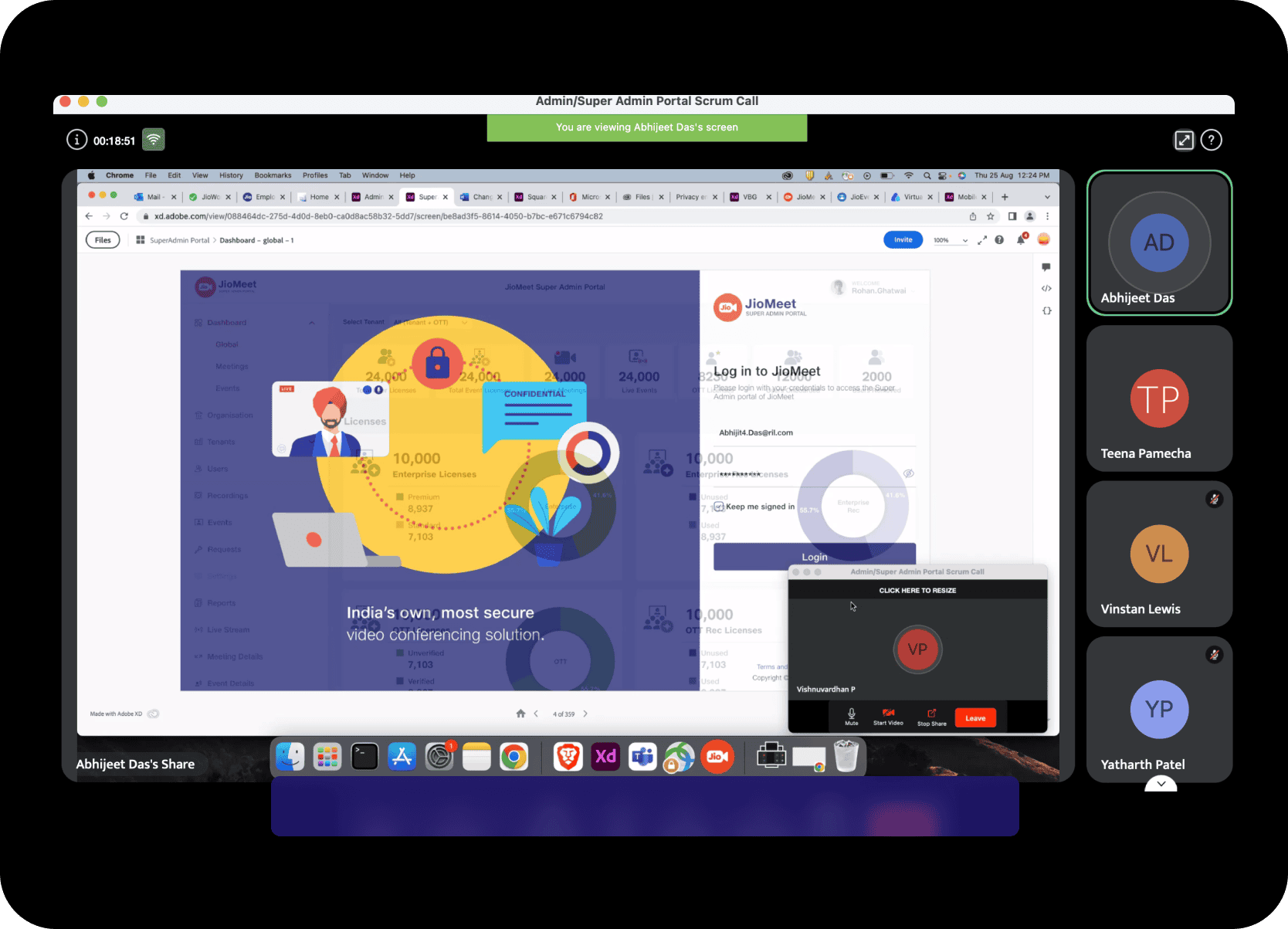
Unnecessary Presenter PIP for Viewers: Viewers could still see the presenter's PIP window even though it was irrelevant to them.
Lack of Feedback: There were no strong loading indicators during presenter transition and no clear confirmation that sharing had actually started.
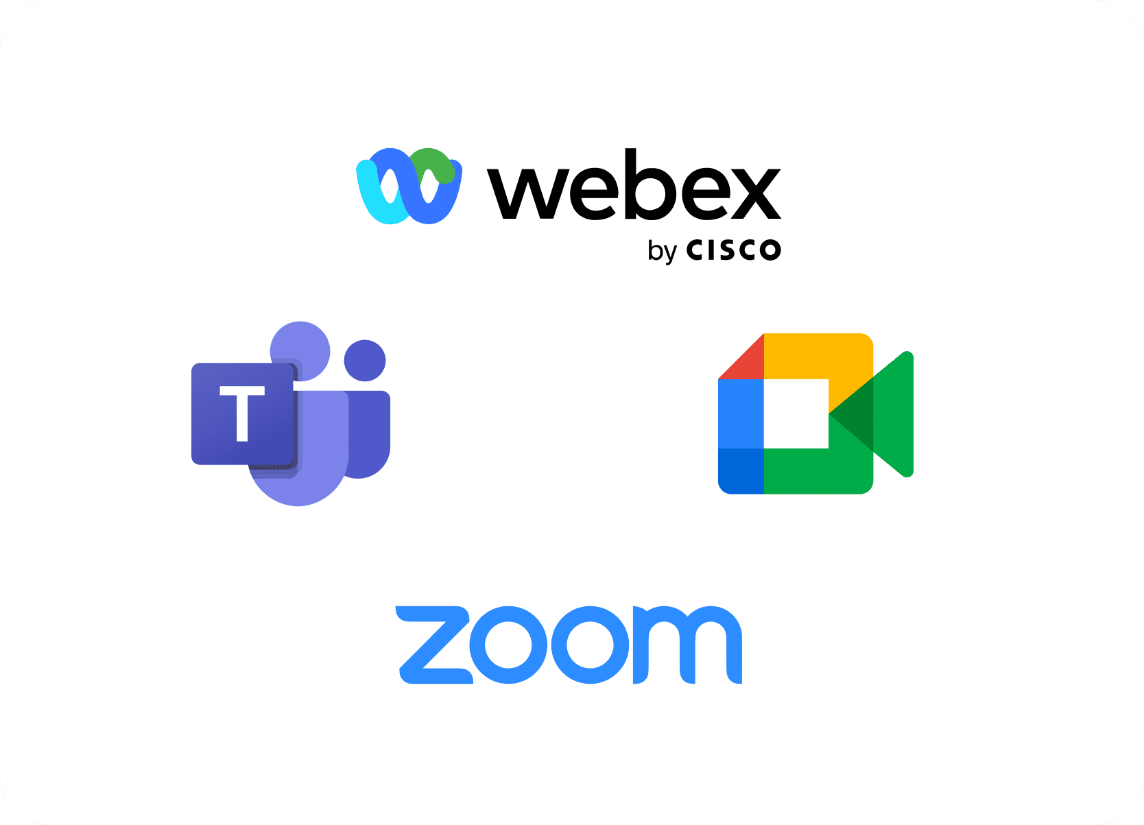
Analyzed screensharing and PIP behaviour across Microsoft Teams, Zoom, Google Meet, and Webex, then worked with the PM and design teammates to categorize features across presenter view, viewer view, and hidden elements.
The original PIP and screenshare flow was visually noisy and difficult to parse in moments where users needed clarity.
Users, especially educators, needed a more focused environment with fewer distractions and clearer control priorities.
The redesign needed to align controls and visual language with JioDesign System 2.0 for consistency across the product.
Loading states, active-share status, and confirmation cues all needed to become more explicit and reassuring.
Solution
The redesign focused on decluttering the interface, improving contextual controls, and delivering much clearer feedback throughout the screenshare flow.
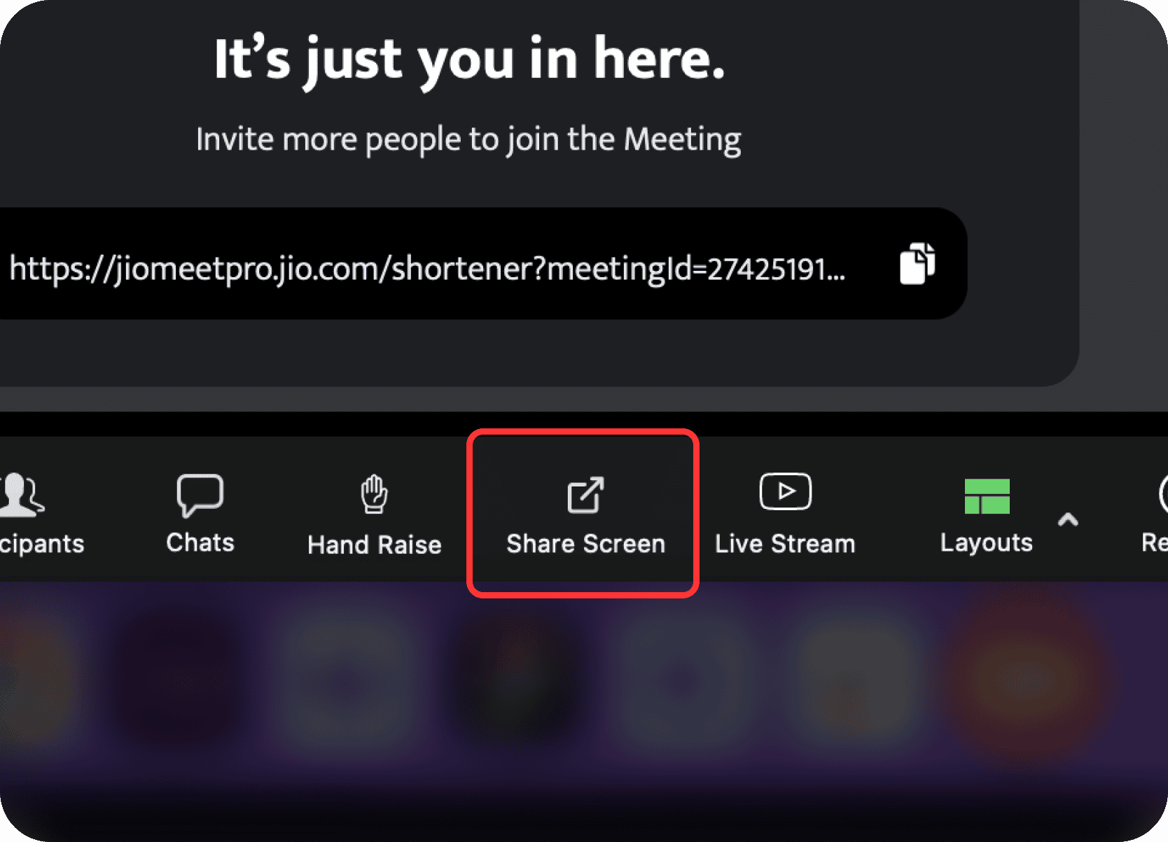
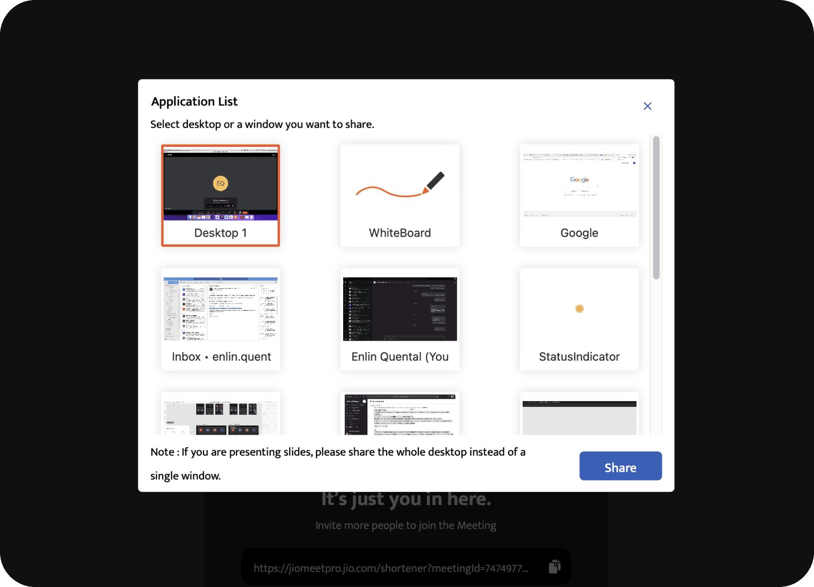
Clearer Options: The redesigned share menu offered three direct choices: share entire screen, share a window, or share white board, each with updated JDS 2.0 iconography.
Visual Window Previews: Users now saw thumbnails of open application windows for quicker, more accurate selection.
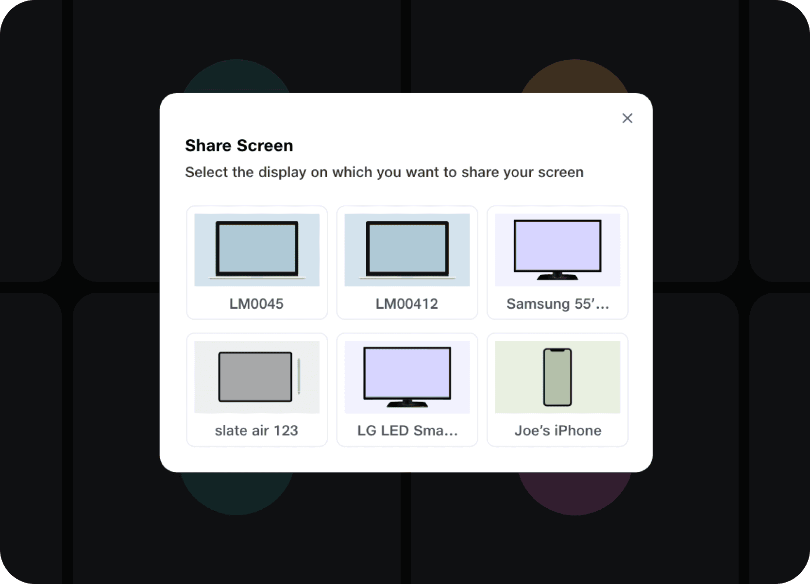
Multi-Display Support: Connected monitors were represented visually, prompting users to choose the desired display clearly.
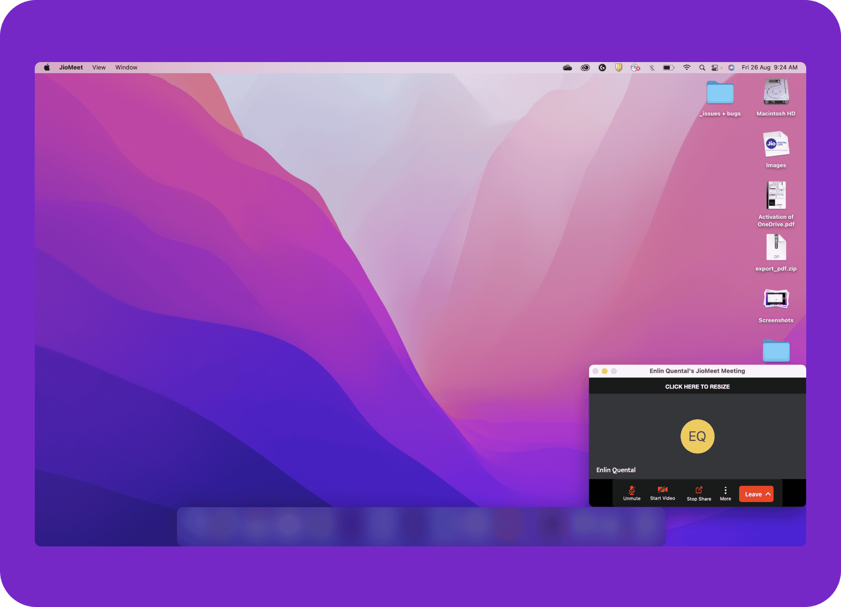
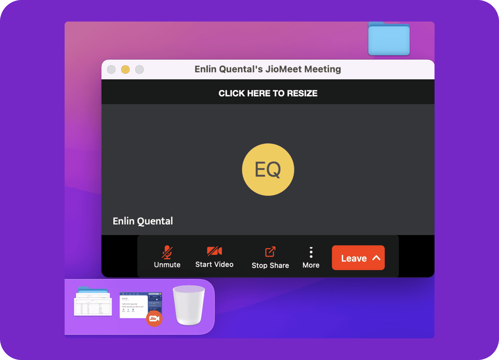
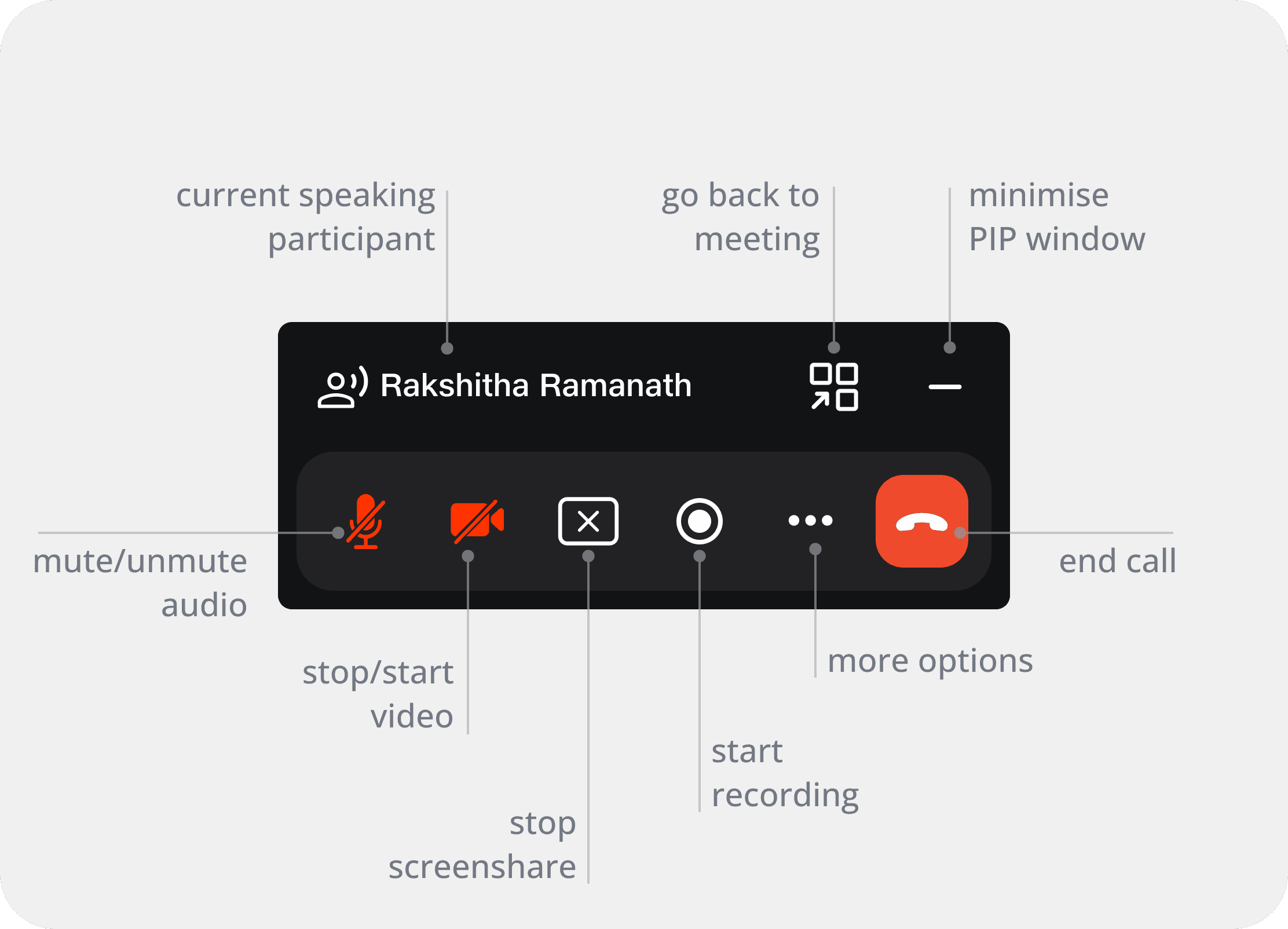
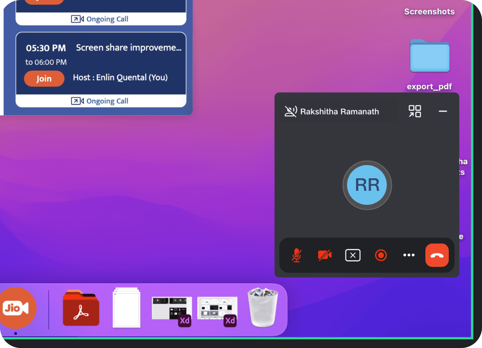
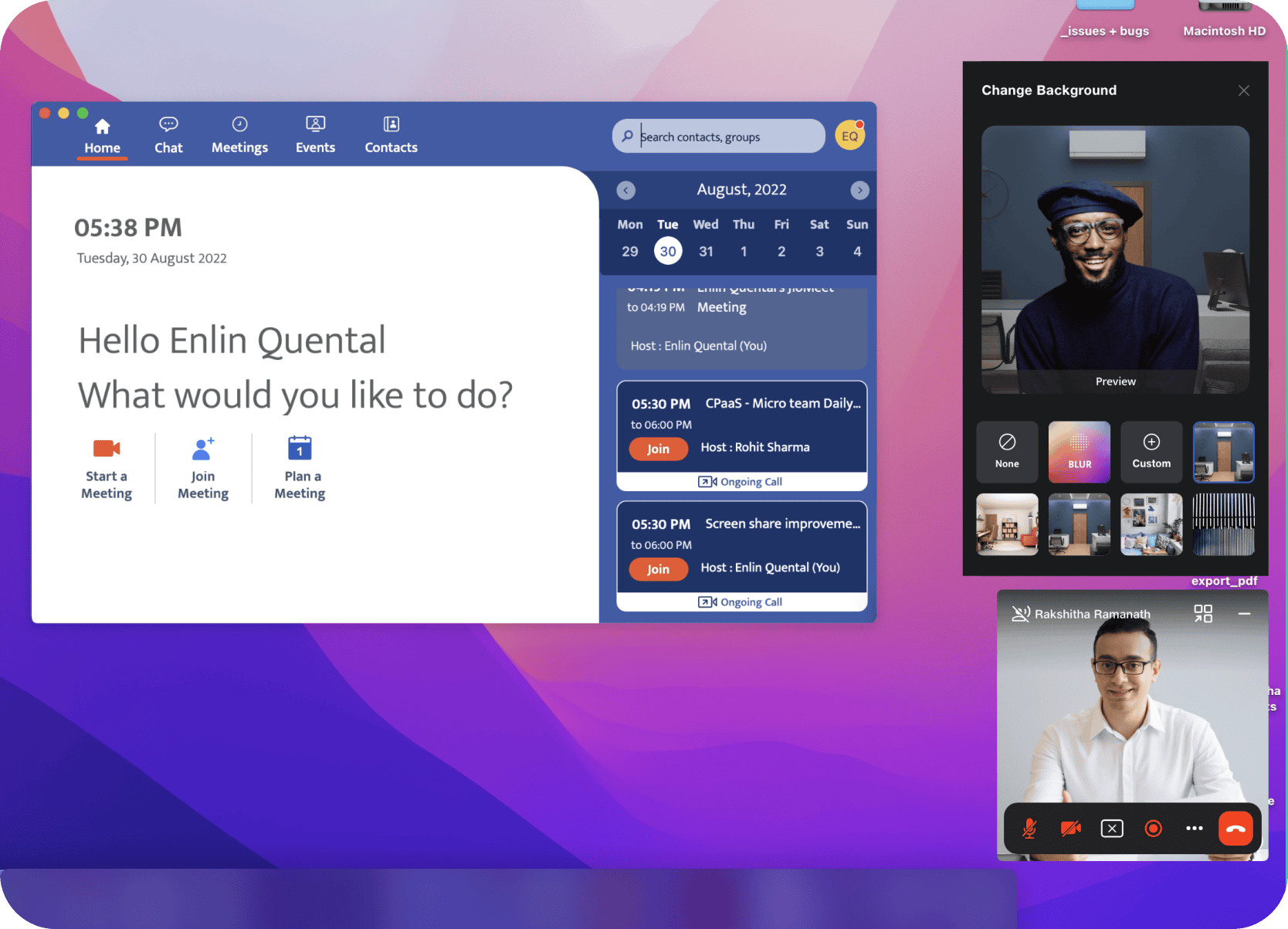
Compact & Minimalist Design: The new PIP became significantly smaller, carrying only the participant name and essential icon-based meeting controls.
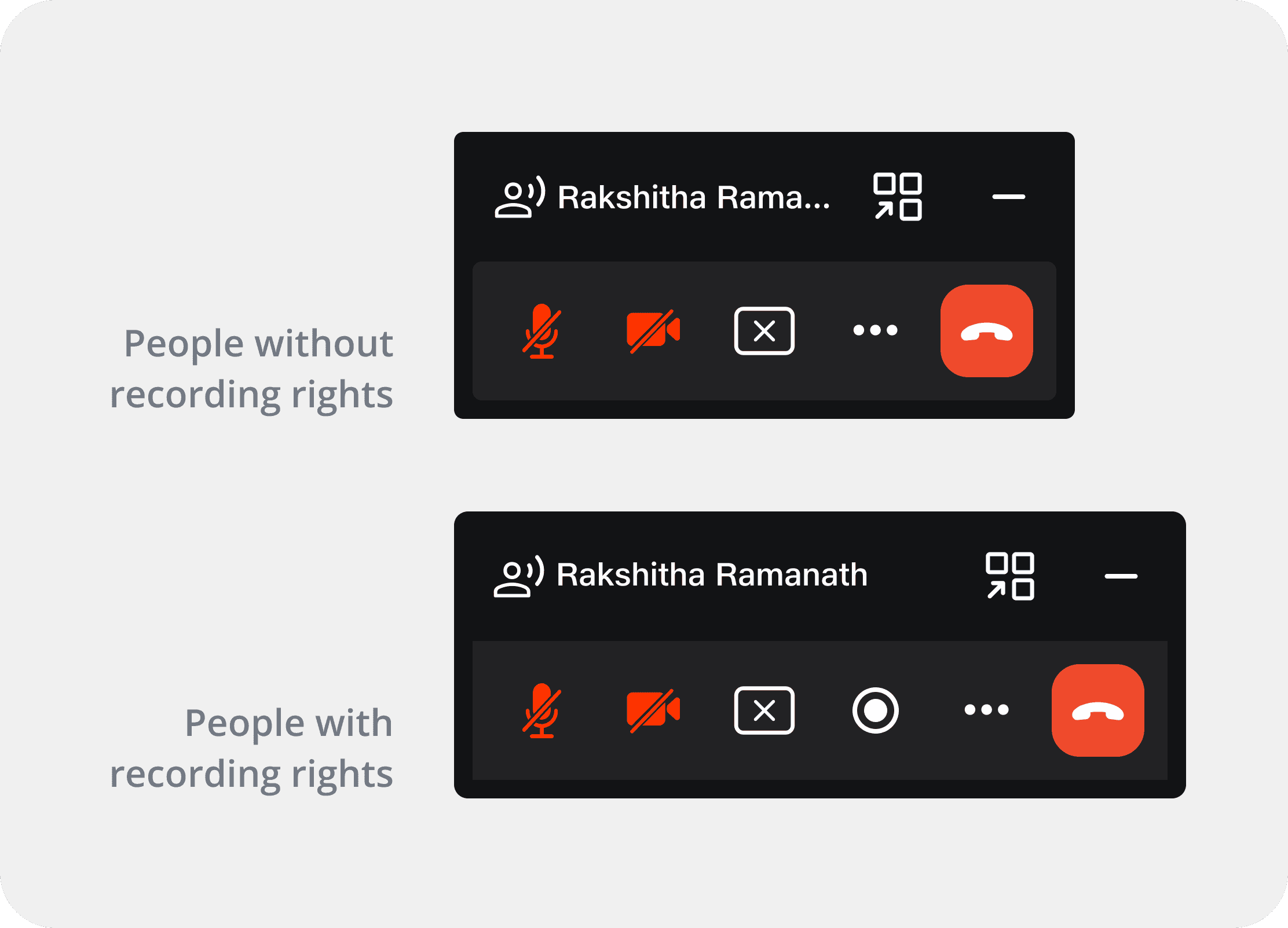
Contextual Controls: Mute, video toggle, stop share, recording, more options, and end call stayed directly accessible, with clearer visual states for active muted or stopped conditions.
Space Efficiency: The redesign achieved ~44.8% area reduction with the recording button, ~59.4% without it, and up to 82.5% reduction in audio-only mode compared to the original video-centric PIP.
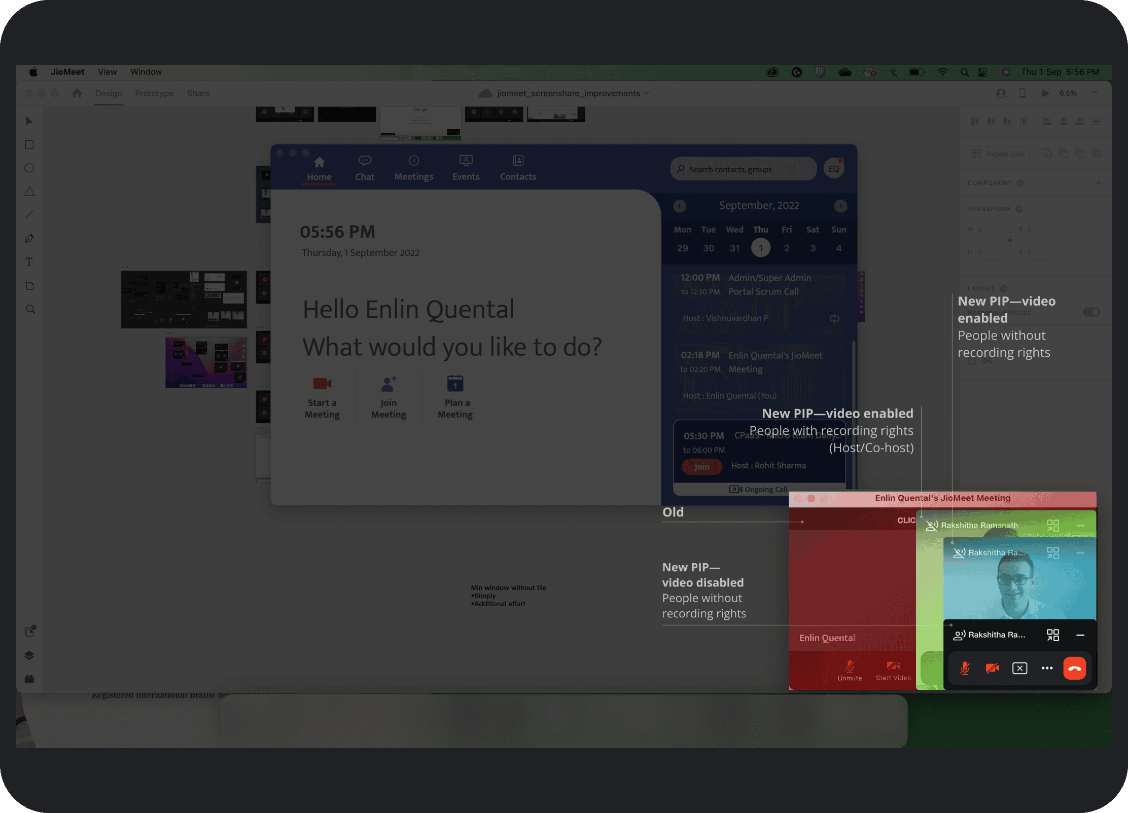
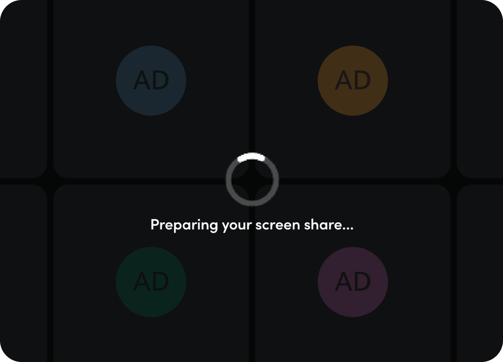
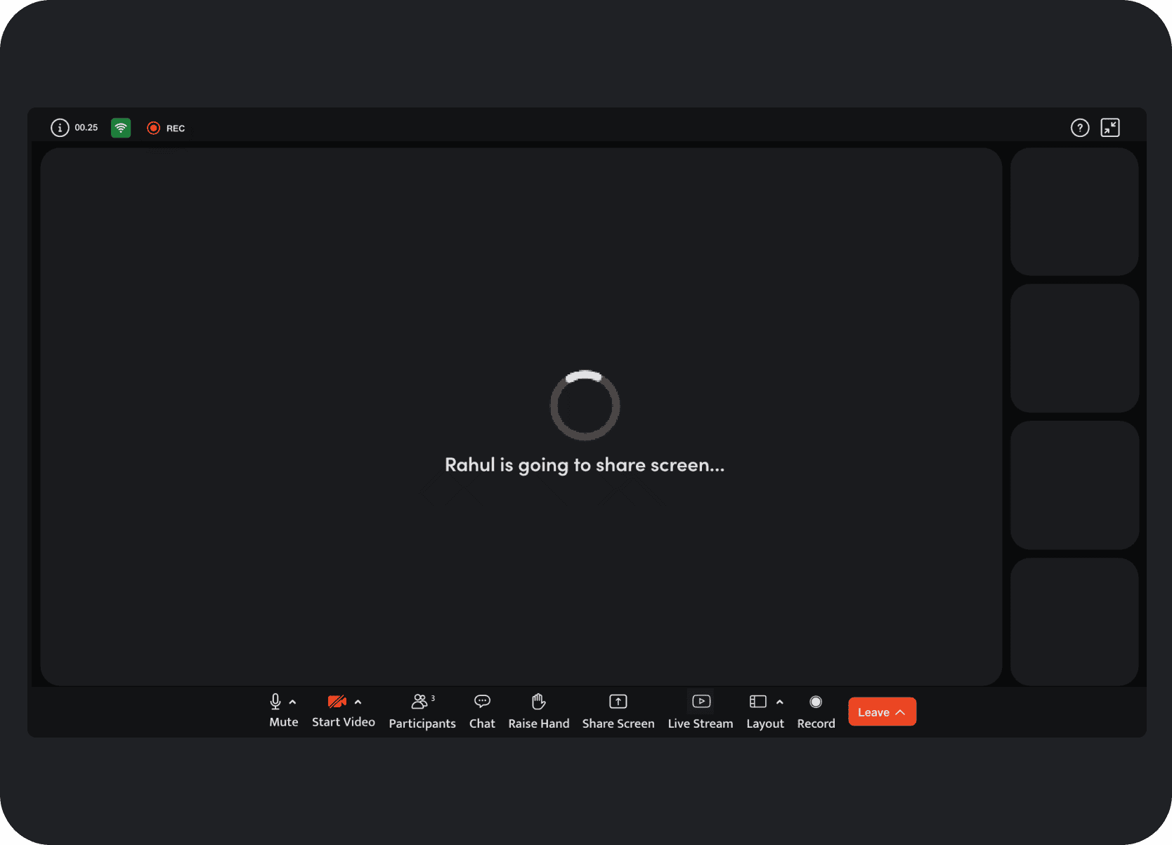
Clear Loading Indicators: Added "Preparing your screen share..." for presenters and "[Presenter Name] is going to share screen..." for viewers.
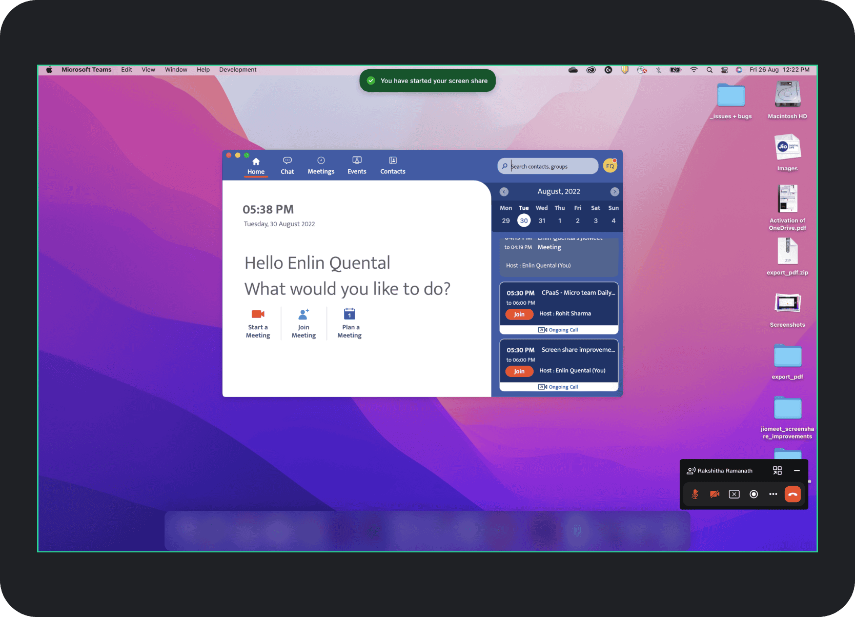
Persistent Floating Control Bar and Subtle Sharing Indicators: Presenters received a movable PIP control bar, while the old bright green presenter badge was replaced with a brief confirmation banner and a subtler shared-screen border.
Minimized PIP Thumbnail: When collapsed, the PIP became a small persistent preview that still preserved awareness and made restoring it easy.
Improved Notification Privacy: Presenter-specific notifications such as hand raises remained visible to the presenter but stayed hidden from viewers.
Full-Screen View Prompt: Viewers were encouraged to try a fuller viewing mode through a clear prompt around the extend-view action.
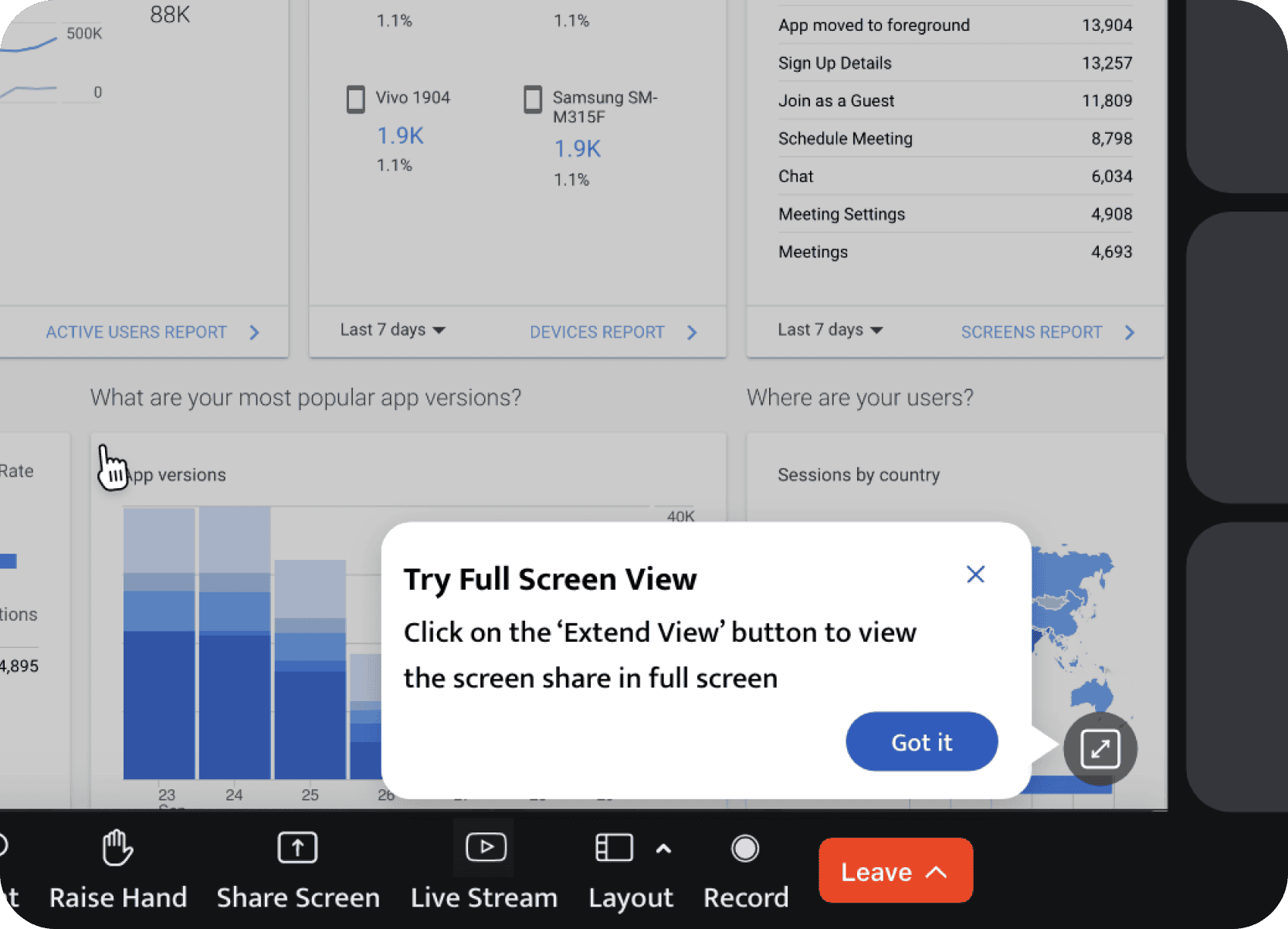
Immersive Full-Screen Sharing: All unnecessary meeting interface elements were hidden so viewers could focus entirely on the shared content.
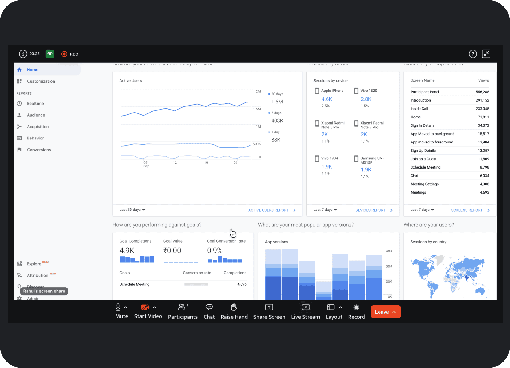
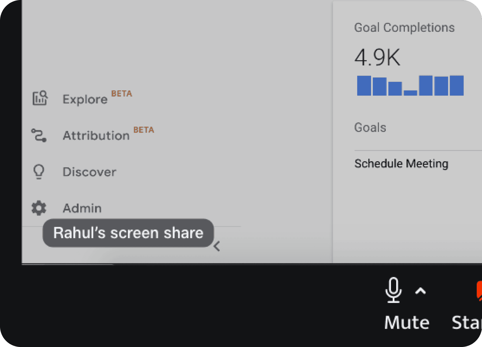
Integrated Presenter Tile Indicator: Active share status and the presenter's name were folded into the presenter tile for viewers instead of relying on a separate top banner.
PIP More Options Menu: Secondary actions like apply background and share-audio toggle were surfaced through progressive disclosure instead of cluttering the default view.
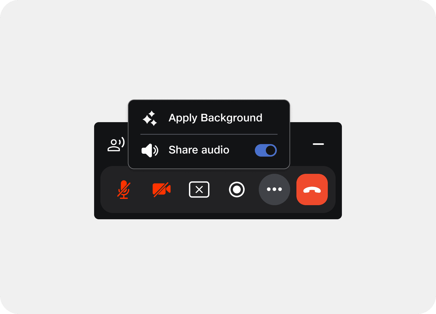
Draggable Change Background Menu: A floating menu with visual thumbnails made it easier to change backgrounds during screensharing.
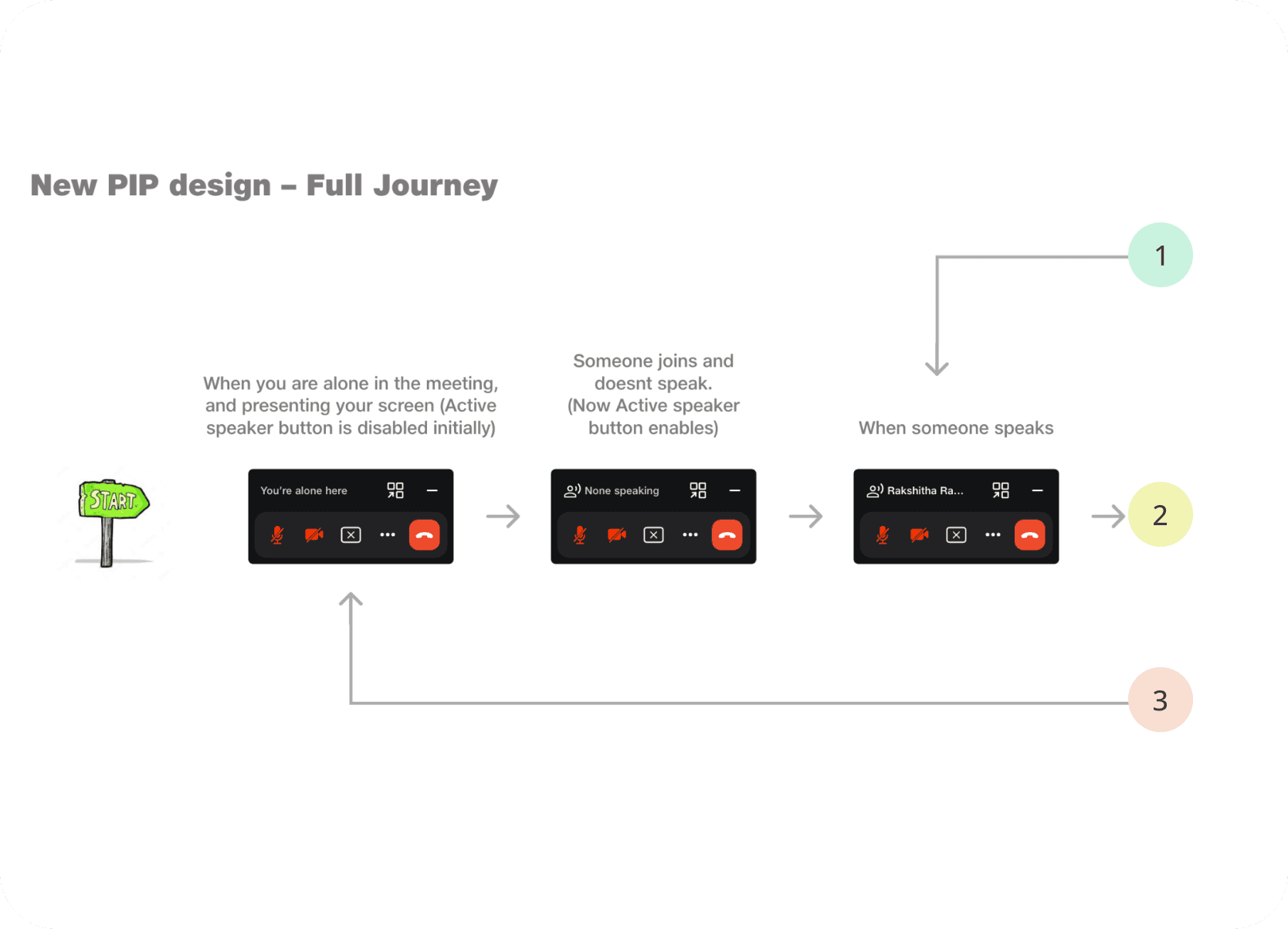
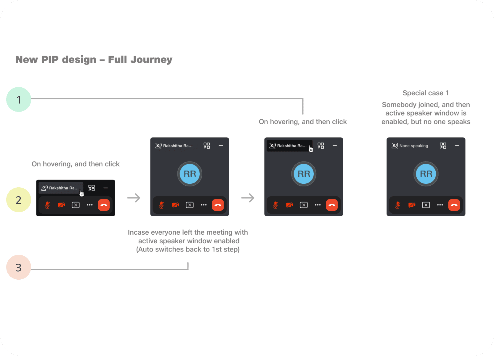
Dynamic PIP Expansion for Video: The PIP could expand vertically to show one participant's video feed when their camera was on.
Full PIP User Journey:
Testing
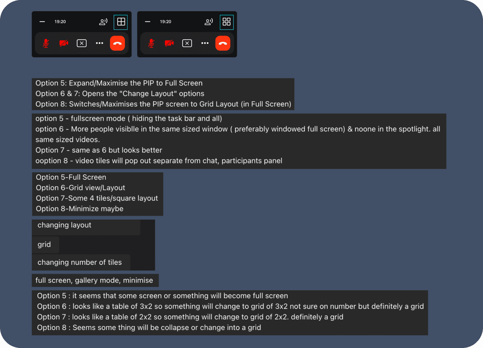
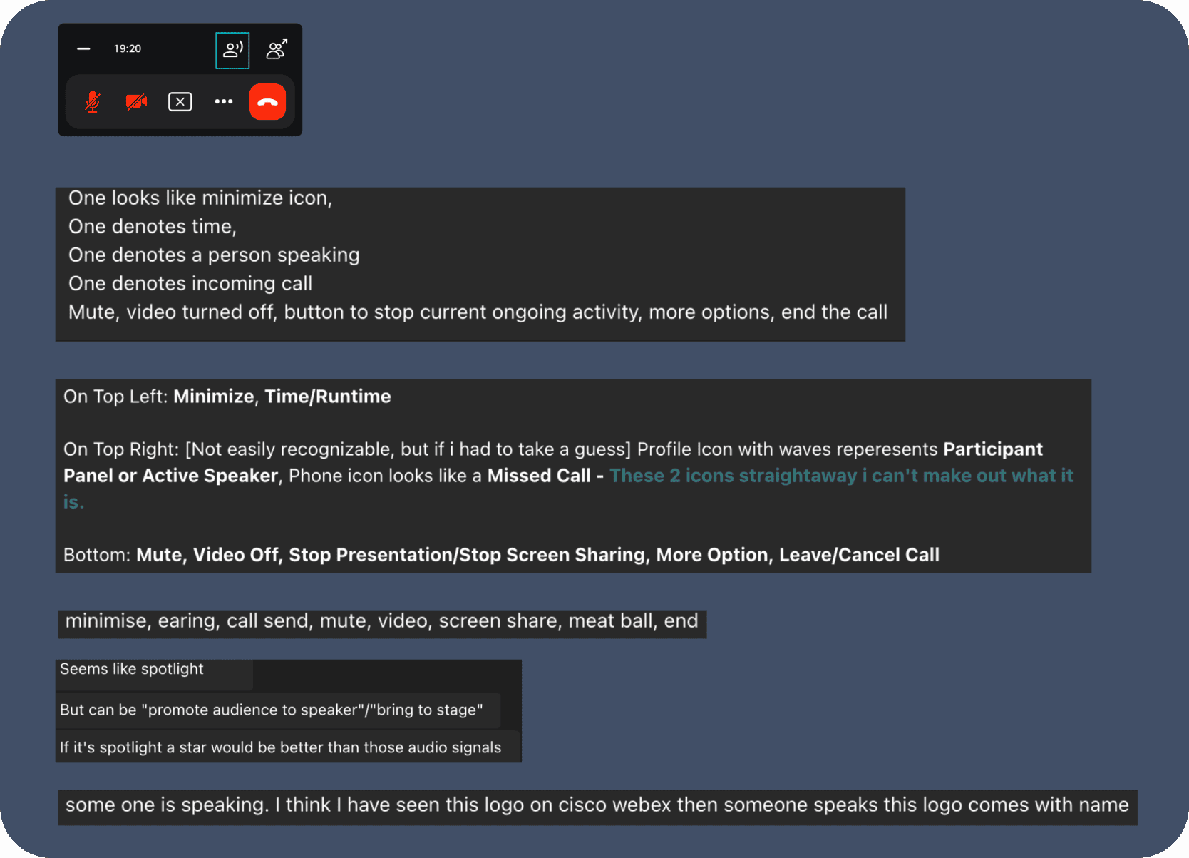
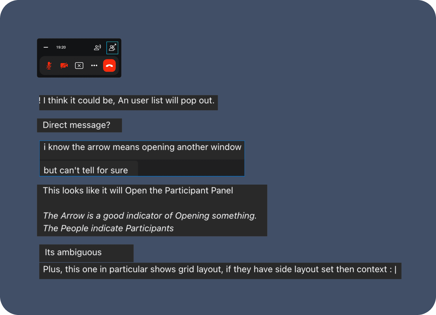
Given the rapid timeline, testing focused on the most ambiguous new elements rather than the entire flow.
Participants: Eight participants were included in testing. Focus: Clarifying the meaning of two new icons in the top-right corner of the PIP. Outcome: The icon set with the highest consensus was prioritized for the final design.
Impact
Even within a tightly constrained redesign, the work produced clear gains in usability and reduced friction in one of JioMeet's most important collaboration surfaces.
Achieved through optimized layout, icon-based controls, and context-aware sizing, especially in audio-only situations where the original PIP had been too intrusive.
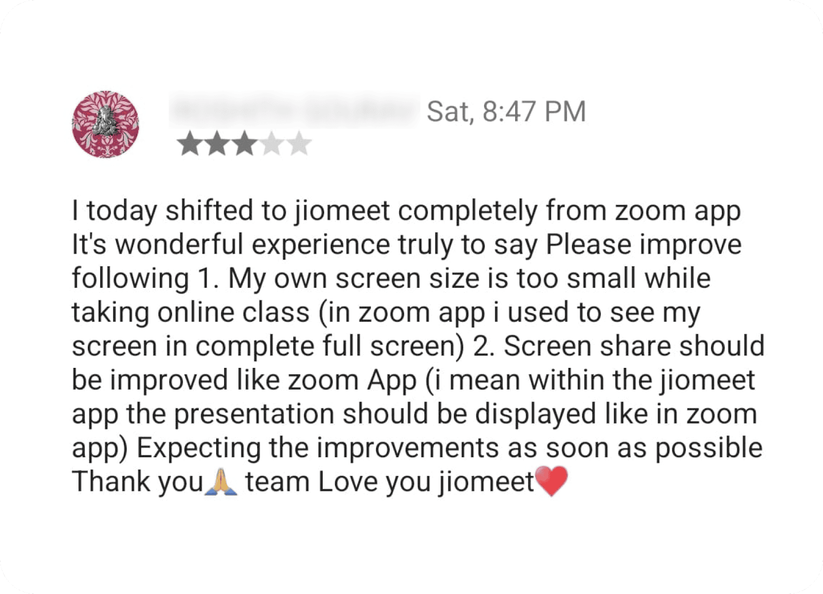
Post-launch in-app feedback showed a strong rise in high satisfaction ratings for screen sharing and PIP usability, backed by noticeably fewer complaints.
Reported design-related usability issues around screen share and PIP controls dropped sharply, reflected in fewer support tickets and PM escalations within three weeks and sustained afterward.
The redesign directly responded to the initial educator feedback by creating a less distracting, more presentation-friendly teaching environment.
Key interface surfaces were successfully updated to align with JioDesign System 2.0.
Conclusion
This rapid redesign showed that targeted UX work can materially improve a high-frequency feature without requiring a full technical rebuild.
The project successfully addressed critical user feedback and significantly improved the usability of JioMeet's screensharing and PIP features within a tight three-week timeframe and strict technical constraints. Heuristic review, competitive benchmarking, and iterative design were enough to turn a cluttered experience into one that felt calmer, more confident, and easier to use.
Direct feedback from key personas like educators is invaluable for identifying high-priority areas for improvement.
Balancing user needs with minimal technical change can still produce fast, meaningful UX gains within a tightly bounded scope.
Loading indicators, active states, and intuitive controls materially reduce uncertainty and help users feel more confident during sharing.
Clear constraints help maintain momentum and enable rapid delivery on the friction points that matter most.
Even lightweight validation added value by clarifying ambiguous icons and helping the final interface feel more immediately understandable.
Continue Browsing